Harrison Design on Tuxedo

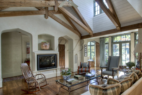
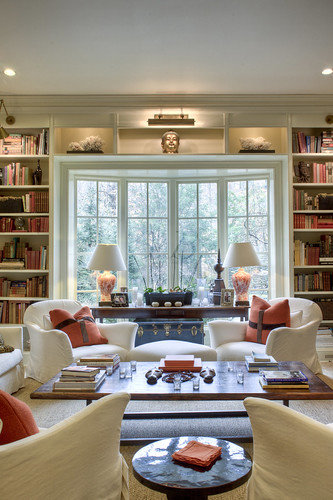
It is a beautiful home by Harrison Design Associates. Front There were some great shots in this home. Living room v Isn't this family room pretty? I love the orange (of course!) Living room And look at that mantel? Isn't it handsome? Fireplace detail
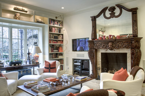
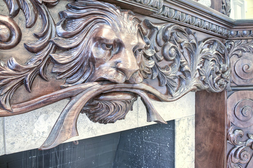
The mantel and overmantel are carved in mahogany by Alexander Zwalinski who's work carving the desk at the Clinton brought much fame.  This project took nearly six months to complete and is fully equipped with hidden compartments and signed by the artist himself.
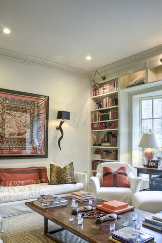
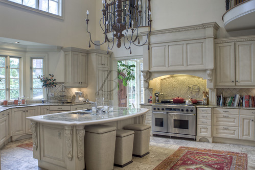
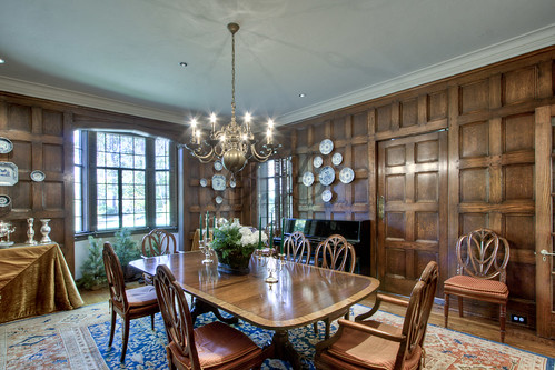
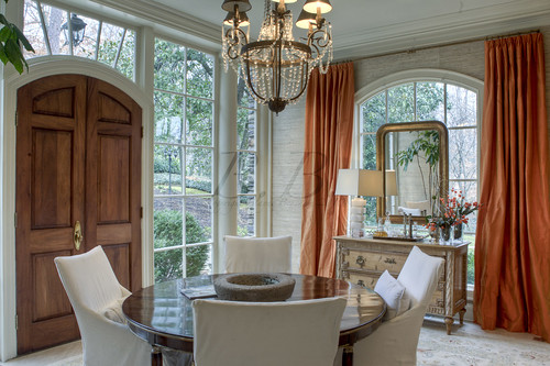
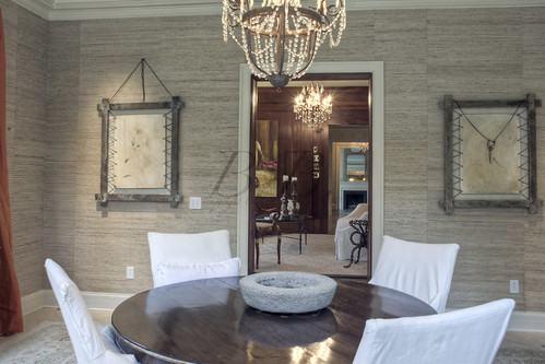
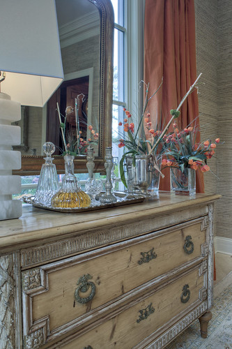
Living room v2 Love those built-ins! Kitchen isn't this a great kitchen? I like the chandelier a lot and the island too! Dining room 1 Here's the dining room. I love those curtains! They remind me of the ones in the dining room in this house. They might actually be the same... Dining room 2 Another view. Isn't that cool art? I love how it's sewn to the frame. Detail dining I thought this was a pretty detail shot. I think those flowers are called Chinese Lanterns. I tried to plant those in my yard last summer. failure! :) I do love them though. They look like tiny orange paper lanterns. Study 1
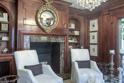
The mahogany in the library was "leftover" from buildout out of the Reagan library in Yorba Llinda California and meticulously installed by imported Craftsmen of the highest caliber.
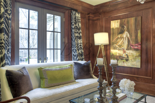
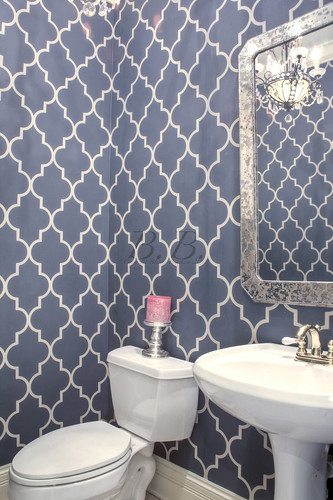
Study 2 I think that painting is by Susie Pryor, an awesome Atlanta artist and owner of Pryor Fine Art.black bathroom And lastly, I love this bathroom! isn't that wallpaper fantastic? Thought so! Have a great Wednesday! P.S. Dove update. It was too rainy today. They are coming to my house tomorrow. Matthew keeps sending me text messages that say "coo coo," which is AWESOME! Keep your fingers crossed they arrive safely!
In Medias Res -- The Story of a House

In medias res or medias in res (into the middle of things) is a Latin phrase denoting the literary and artistic narrative technique wherein the relation of a story begins either at the mid-point or at the conclusion, rather than at the beginning

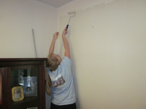
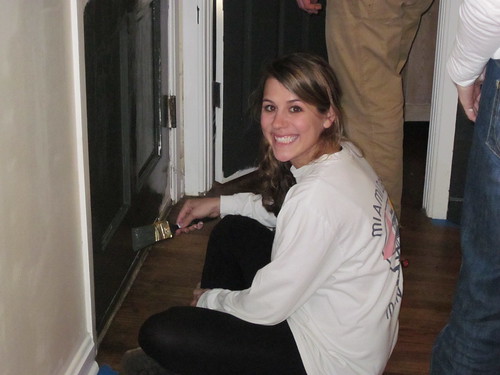
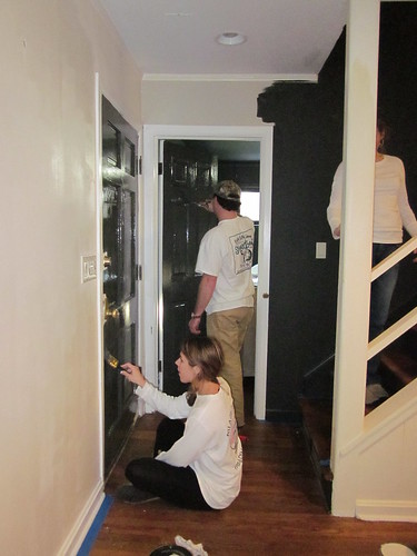
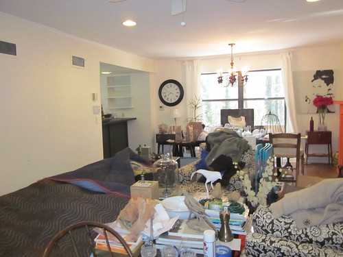
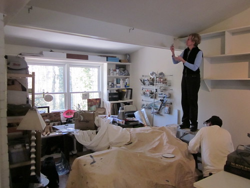
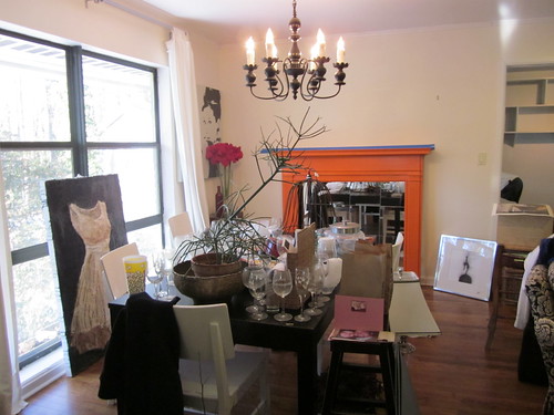
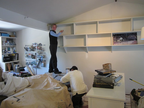
Well, here we are in the middle of a crazy snow-week-long house redo. It has been chaos. We are down to the wire, and I want to thank my wonderful friends so much for their help!

Here is the story of what we did this weekend...

IMG_0857IMG_0860IMG_0861IMG_0862IMG_0863IMG_0864IMG_0865IMG_0868IMG_0872IMG_0886IMG_0888

What do you think? Ha ha ha... Don't worry. It will all get done and look amazing... I can't wait to show you the final product!

Thank you so much my friends! I love you!

Laura, you are doing a great job.  Thank you!

My House in Simply Buckhead (so much work to do!)

The new magazine "Simply Buckhead"decided to feature my personal house in a upcoming issue! Thank you to Crisit at Charm Home and Claire at High Gloss blue for recommending me! (Please venture over to Decor Demon to see Claire's beautiful apartment featured.)Screen shot 2011-01-12 at 12.42.44 PM I am at once thrilled and terrified. I moved into my house in 2007 and have done little to change it. The walls are still white, and the countertops are still bright green. I talk a big game about all the things I want to do to it, but when it comes right down to it I haven't had a reason to actually go through with it. Sure I have done a few things here and there...

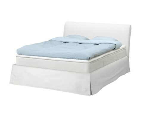
Screen shot 2011-01-12 at 12.45.20 PM This summer I finally bought that bed from IKEA I had been wanting... yes, I still love it.

I also hung some art and rearranged the furniture a little. I was so excited about the progress that I did a guest post on Charm Home about my house.Screen shot 2011-01-12 at 12.58.52 PM

We painted some this weekend. I would say we are about 45% finished... I was planning on finishing the house this week, but since Atlanta has been hit with a HUGE snowstorm I haven't been able to do it. In fact, I have been staying at my mom's house in case the power went out at mine... so I haven't even been to my house this week ... and I am totally freaking out!

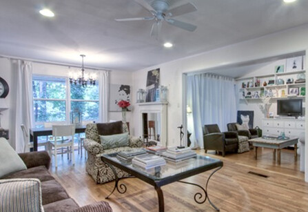
To calm my nerves I thought I would go through these photos and make a list of what I need to do. If you guys have any suggestions please make them! I need all the help I can get! My wonderful friend Laure Green Thome helped me pick paint colors (to come), and by friend Anne Williams picked all my furniture.

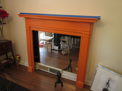
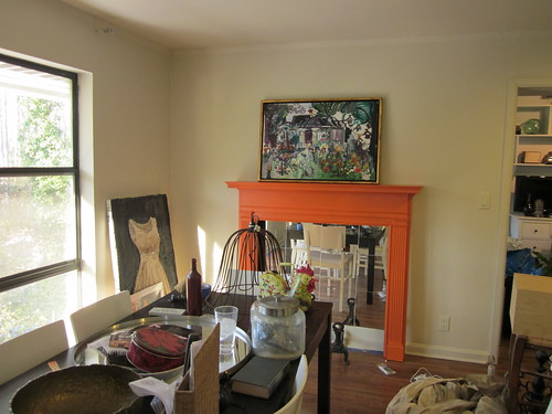
So, for the photo above, we are leaving the room white but are getting a rug. We are also painting the fireplace yellow (!!!) and doing a little work on the back window.

Screen shot 2011-01-12 at 12.59.02 PM

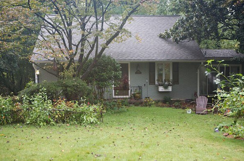
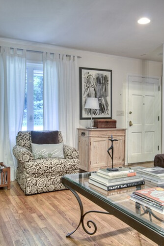
Here we are adding more curtains to the window and painting the front door.

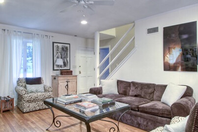
Screen shot 2011-01-12 at 12.59.08 PM We also need to paint the stairway! Yikes! I have no idea how to paint really tall walls, but I guess I'll be finding out :)
Screen shot 2011-01-12 at 12.59.14 PM

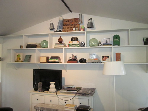
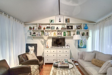
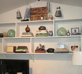
This is the Family room. It will be painted a light green and Laura and I are redoing the shelving.

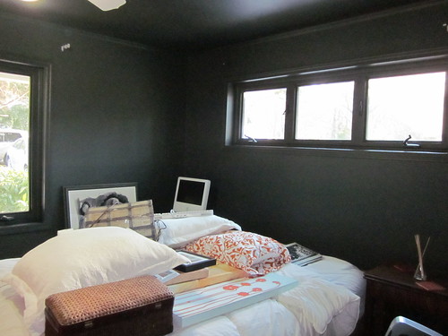
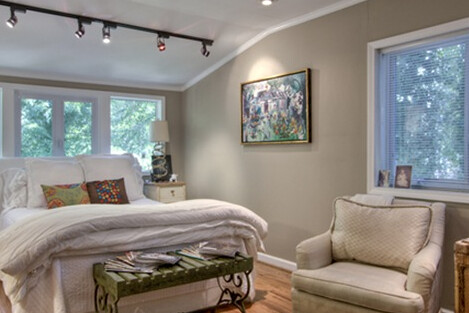
Screen shot 2011-01-12 at 12.59.30 PM And finally my bedroom. This has been painted, but I am trying to decide if I need to hang curtains.

I don't have a picture of the kitchen or the guest room, but I am getting both of those painted as well. The guest bedroom is finished, but the kitchen is only half finished.

Can you see why I am freaking out a little? There is so much to do!

Hopefully some of this ice will melt and I can get to work.

Keep your fingers crossed. And please make suggestions! I will post more pictures of the progress :)

Enjoy your snow day!!

Frazier and Bodin Classic

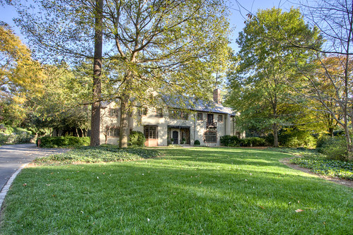
It's one of the best pieces of Atlanta Real Estate for sale today! 12-10 This home is a Frazier and Bodine classic in the heart of Buckhead.

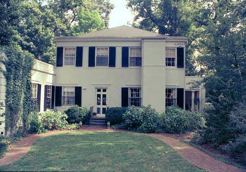
back of houseListed by Glennis BeachamThis home was built in 1927 and as a true Tuxedo Park classic. I was so excited we got the listing and I got to go photograph it!

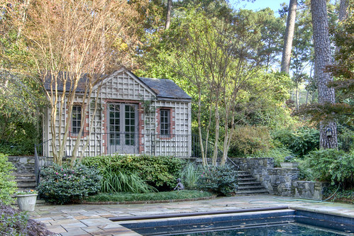
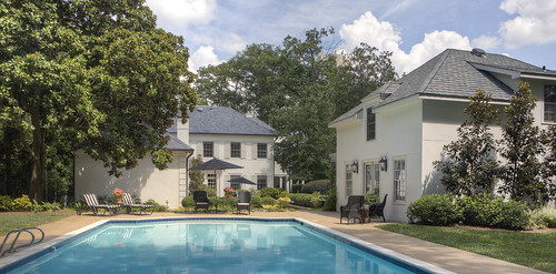
Pool House

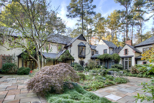
It sits on almost an acre and a half, and the landscaping is seriously spectacular. It almost feels like you are in a fantasy world... or at least on a huge manor in England! (basically the same thing, according to me!)

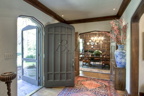
Entryway

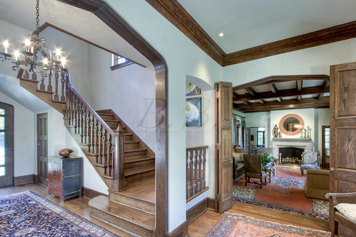
The foyer is beautiful and sets the tome for this handsome Tudor home. I love the Tudor arches in all the doorways!

Living room 2

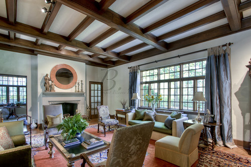
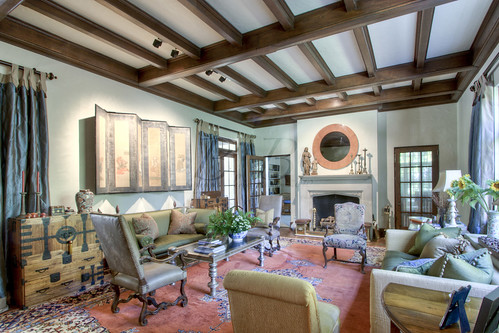
This is the formal living room.

Living Room

Isn't the light amazing? It actually reminds me of the Azalea House (also by Frazier and Bodin).mantel

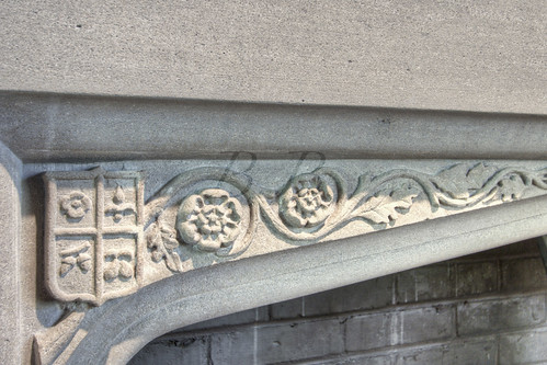
And the mantel shot!!! You guys know I'm a fan. It is so ornate, and I love the shield!

Office 1

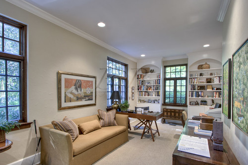
This is what I would consider the library. It's off the formal living room. I am a big fan of the arched bookcases :)

stairwell into living room

This shot is from the foyer into the formal living room. You can see the staircase here.

entry into dining v

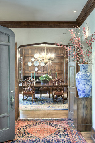
And this is from the foyer into the dining room.

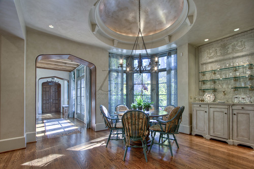
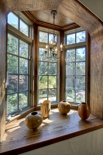
Dining room I love the coffered walls in this dining room. So handsome. And the bay window (is that right?) allows for a ton of light!

Breakfast into hallway

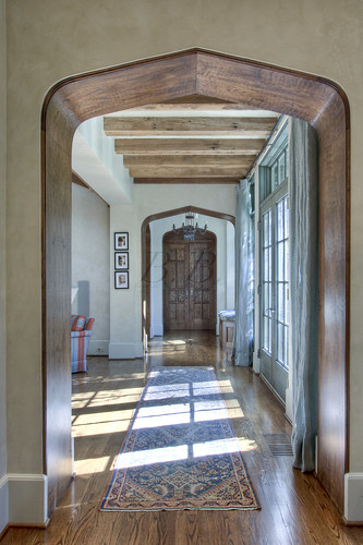
This is the breakfast room, which showcases that gorgeous hallway!

v down hallway

Here is a closer shot.

Kitchen

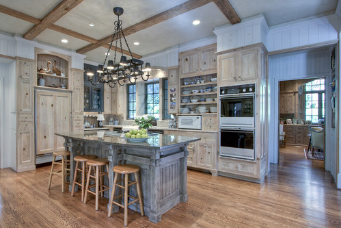
And the kitchen! Perfect for a cook :)

Family room

Here is the family room. Aren't the arches amazing?

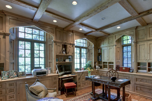
Office 2

And then of course we have the office. I love the arches above the windows. Such a perfect detail!

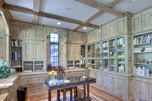
Office 2-2

And here is it from the other side :)

v out stairwell window

So do you love this house?

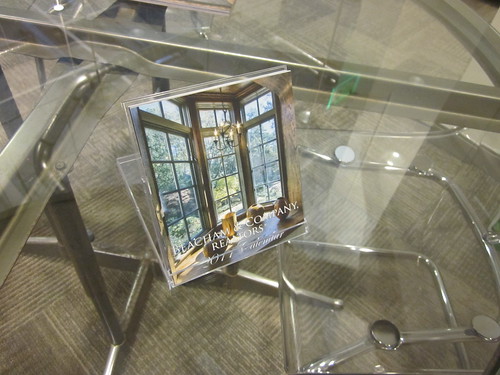
IMG_0719 If so, be sure to enter my calendar giveaway, because this house is on the front and back!!


My Favorite House- A Once in a Lifetime Post

Hello everybody!  How are you guys?  I feel like it's been forever since I've talked to you.  It has been so busy around here at Beacham & Company! You would not believe it!Anyway, while I LOVE to be busy I miss getting to spend time with you guys... so in order to make it up to you I am offering you a once in a lifetime post.

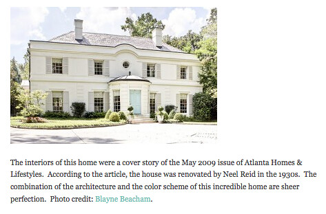
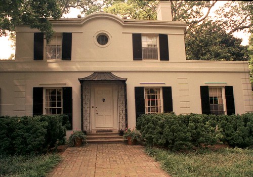
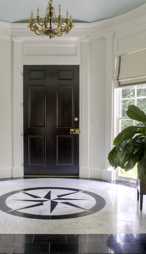
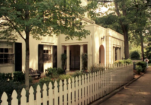
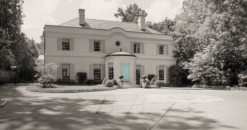
Front for evite If you've ever read my blog before, I'm sure you know my COMPLETE OBSESSION with this house. I have gone on and on about it in the past... In fact, in a very strange way it's the house that got me to start this blog. When I saw this post on Holly's blog "Things That Inspire," I contacted her to ask her a few questions. She told me a little about blogging, and here I am. Screen shot 2010-04-26 at 5.34.23 PM

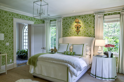
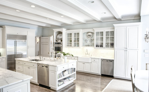
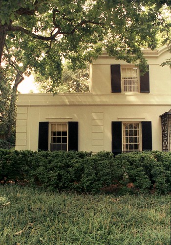
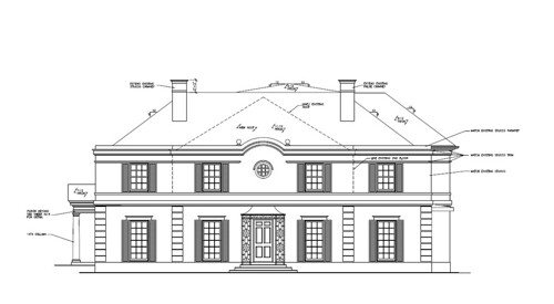
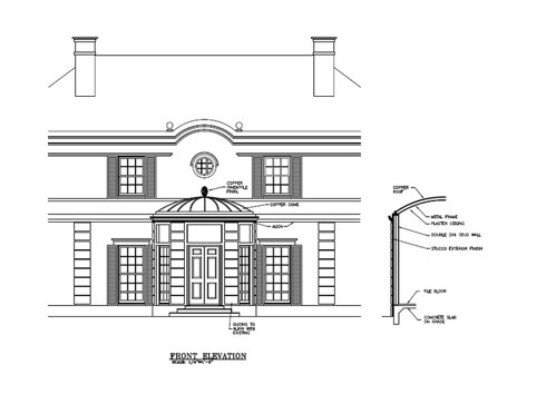
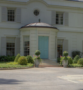
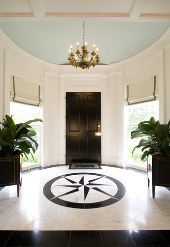
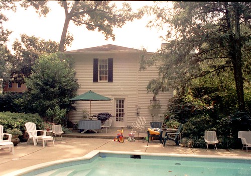
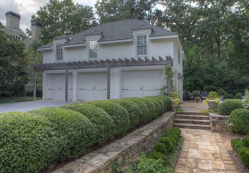
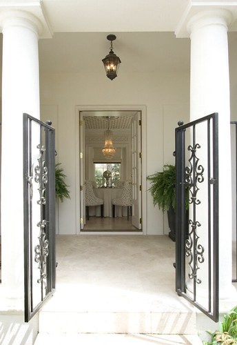
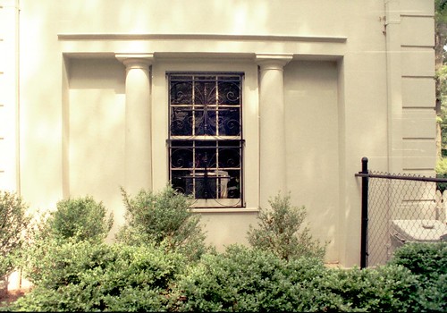
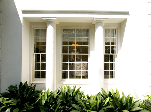
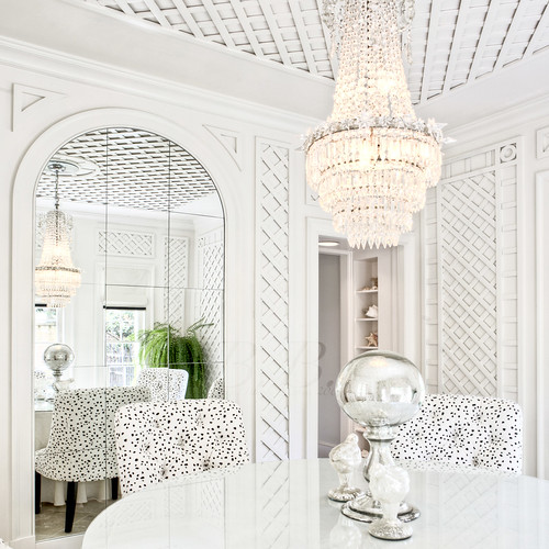
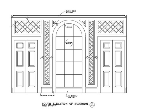
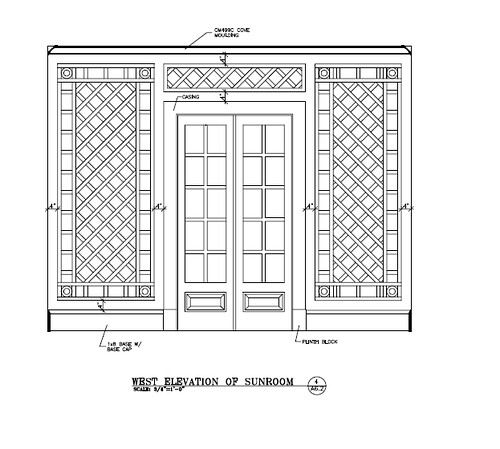
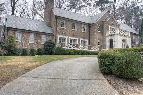
So, to continue with the story, I started this blog, but never featured the house... And then Holly wrote about the house again, but this time on the AH&L blog in a post called Twenty Beautiful Homes, Take Two.Green and white w m While that post was up, I decided it was finally time to feature the home on my blog and show some never-before-seen pictures of the house. And guess what? People out there were reading... Green Room Use first of all, I got to meet Margaret Bosbyshell, who was the interior designer for the home. I got to go to lunch with her and her daughter. I loved just sitting and talking to them... of course I went on and on about my love for the famous green wallpaper. Thank you again so much for lunch Margaret. I loved meeting you guys. Kitchen Someone else out there was reading too, and she agreed with me that this is the best looking kitchen she had ever seen, and you know what? SHE BOUGHT THE HOUSE!! (Home was listed by Linda Williams and Neno Schildgen of Beacham & Company) Can you believe it?? Is that the most amazing blogging story you're ever heard, or what? Well, it gets better. The lady who was buying the house asked me to lunch. So I got to meet her, and she's amazing! It's like we had been friends for years. We talked about our mutual love for the house, and there was an instant connection. And the story gets even better. Right after I had lunch with her I had to call architect Duane Stone about a completely unrelated topic, and we started talking about the house. I am not sure if I have mentioned this before, but he did a total renovation of the house. I wasn't sure until I started talking to him what exactly he was responsible for, but it turns out it was a lot. He agreed to meet me and the new homeowner over at the house and walk through it with us. And not only that, but he brought presents!Andrews-1010 Duane brought pictures of the house before he designed the renovation, and he also brought the plans. I was like a kid in a candy store. So, for this post I went back through all the pictures of the house I have taken while it's been on the market. Usually when I go shoot a house I take "test pictures" that I never end up using. In this case I actually saved them, so I have a few "undoctored" and never-before-seen pictures of my own I am going to show you just to give you a sense of how much the house has changed. The above picture shows the front elevation before Duane started working on it. You may notice it's missing the now famous rotunda. Andrews-1011 Here is a picture of the side of the front elevation. You can see how they expanded the top level... Screen shot 2010-11-08 at 9.29.30 AM This is the plan of the front elevation as he originally drew it. You can see it does not have the rotunda. It actually kept an entrance similar to the one on the original house, but before they started construction he and Sumter Bradwell (the builder) both thought it needed a little something more. Screen shot 2010-11-08 at 10.04.19 AM And that's how they created the rotunda! When we were there I noticed that the windows were actually curved, which I had never noticed. New FoyerScreen shot 2010-11-08 at 11.34.33 AMScreen shot 2010-11-08 at 11.34.44 AMScreen shot 2010-11-08 at 11.35.17 AM You can see the curved windows in these "test photos." Andrews-1001 He also showed us the photos of the original back of the house. The thing that looks like a chimney was actually an elevator shaft, which has since been removed. Andrews-1002 This view is of the side of the house. Pool This is a photo of what it looks like now. Can you believe the difference? Andrews-1009 And this is a picture of the garage/guest house before it was renovated. Screen shot 2010-11-08 at 11.34.25 AM And this is a picture of it now. This picture is from the front and the other picture is from the side, but you can see the improvements. Andrews-1003 This is a photo of the side porch that leads into what is now the dining room. Screen shot 2010-11-08 at 11.35.26 AM Here is a picture I took of the same area the first time I went to the house. It seems like the gate and columns are the same, but the dining room is all new. Andrews-1012 This is the side of the house looking into the dining room before Duane's renovation... Screen shot 2010-11-08 at 11.33.10 AM And this is the beautiful window he and Sumter added. Square Dining You may recognize the dining room from the cover of "The Beacham Series" a while back. Well, until I met with Duane I thought that the dining room was all Neel Reid. Wrong. Screen shot 2010-11-08 at 10.04.04 AM Does this look familiar? With this once piece of paper Duane convinced me he is a genius. He created the room I dream about. This space is always in the back of my mind, setting the bar for architectural elegance and mastery. Screen shot 2010-11-08 at 10.04.09 AM These are the doors we saw above through the columns. Even the drawing is breathtaking. I want to say a special thank you to new homeowner and for Duane Stone for including me in the meeting. It was better than meeting the author of your favorite book. Duane, you did a masterful job, and to this day it's my favorite home in Atlanta. Congratulations to all!