Flocking to the Gorge...

The Gorge rocked.  It was better than I could have ever expected!  Camping?  Great!  Phish?  Awesome!  New friends?  Sweet! The Gorge?  Amazing!

We flew into Seattle and met up with our friends Dani, Ryan and Graham.  We rented a car and started the trip to George, Washington (where the Gorge is located.)

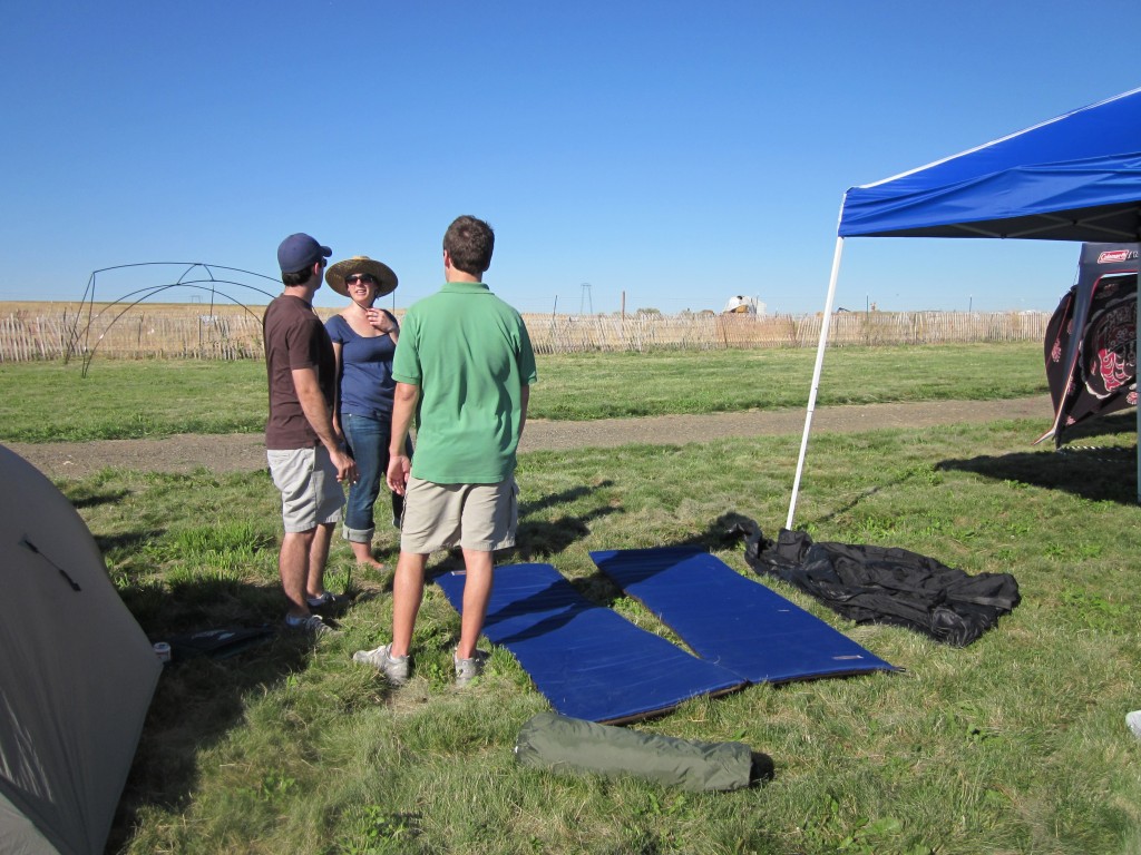
We stopped for a casual grocery store run on the way.  Dani (that's her on the right with her phone) and I thought we had the car packed pretty well, right?

Clearly the boys didn't think so....

Ha ha ha.  After they got it all fixed back the way they wanted we were back on the road.

We passed this beautiful windfarm on the way.  I have never seen one this close before, and it was beautiful...

I took this photo on the way into the Gorge on my phone.  I've never seen anything like this in my life.  It was so cool to look out and see all the boats (not in this picture).  I spend most of my time on Lake Lanier and Lake Blackshear, so this was very different :)

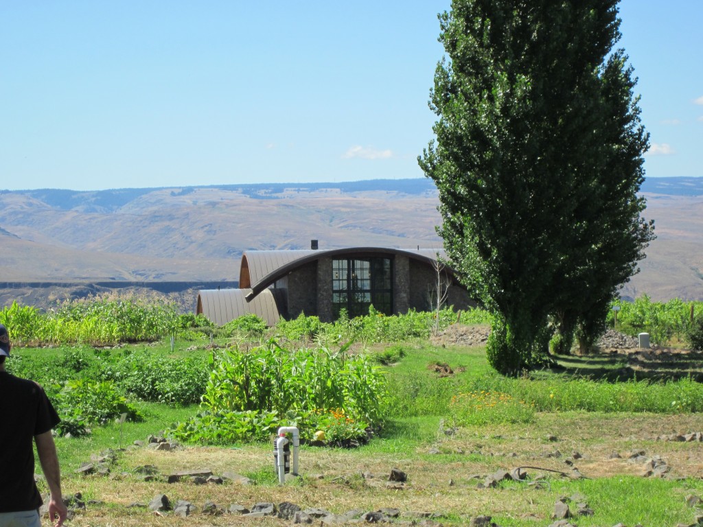
On the way in we stopped at this amazing hotel/winery.  It was called Cave B and was breathtaking.  It was about a mile and a half from our campsite.  I enjoyed the juxtaposition of the winery to the campsite.

This is a picture of the main building as we walked in from the parking lot.  I was immediately drawn to the roof line.  I did some research and found out that the hotel was designed by Olson Kundig Architects. Huge props to them.  The hotel had a very modern yet organic feel to it.... as if it belonged in the side of the mountain, but was still cutting-edge.

I grabbed this image of the view walking in through the vineyard from their website.  Do you love?

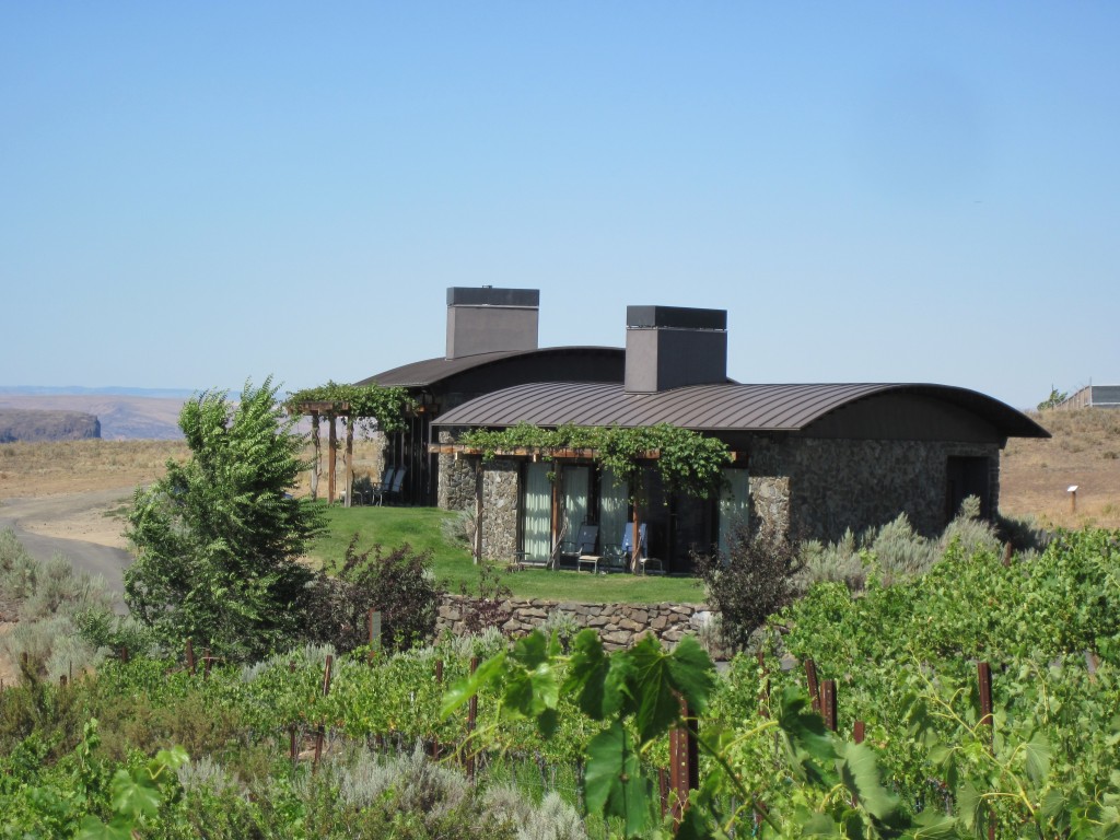
There were these very cool cliffside houses.

We of course walked up to the hotel to check it out.

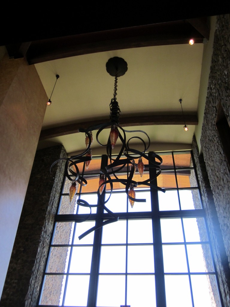
I saw this very cool chandelier inside, which I would describe as industrial organic.  Sorry for the terrible picture.  I did not want to take all my camera equipment, but was impressed by how well my Canon Powershot preformed.  This being the one exception.

Then we walked over to the winery for a wine tasting.  Doesn't everyone do this before a Phish concert?  Ha ha.  I thought so.  It was such a great deal... we got 10 tastes for $6.  It was a great way to spend an hour.

Before we head over to the campsite I want to take a moment to tell you about Dani (as I always say... it's my blog so I can do that if I want.  You thought you were coming here to look at houses?  he he)

Dani is the girl on the right.  She came with her awesome boyfriend Ryan, and we had a blast hanging out with them.

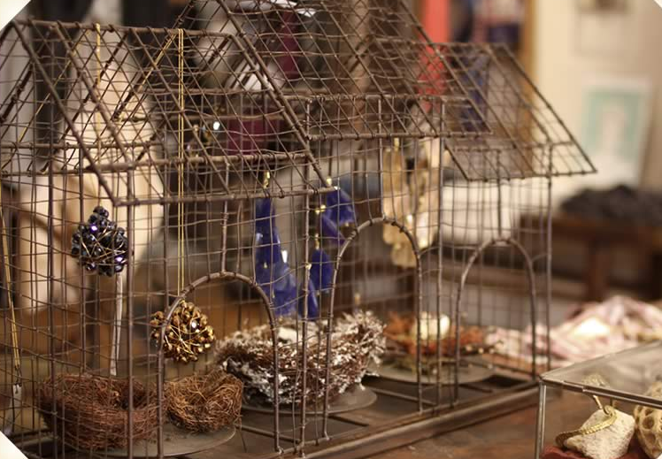
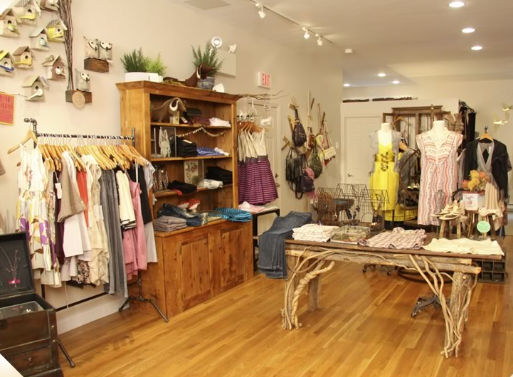
Dani has the best style ever!  I was totally obsessed with the necklace she had on at the tasting.  She owns an hip boutique in Boston called Flock. I really want to go to Boston just to shop there, but I am afraid I would come home with no money.  I love her website and her style.

If you know about my bird obsession you may be able to figure out why I like her style and the name of her boutique. :)  So if any of you guys are from Boston please go check out her store.... and then report back and make me jealous!

Back to the story of the Gorge :)

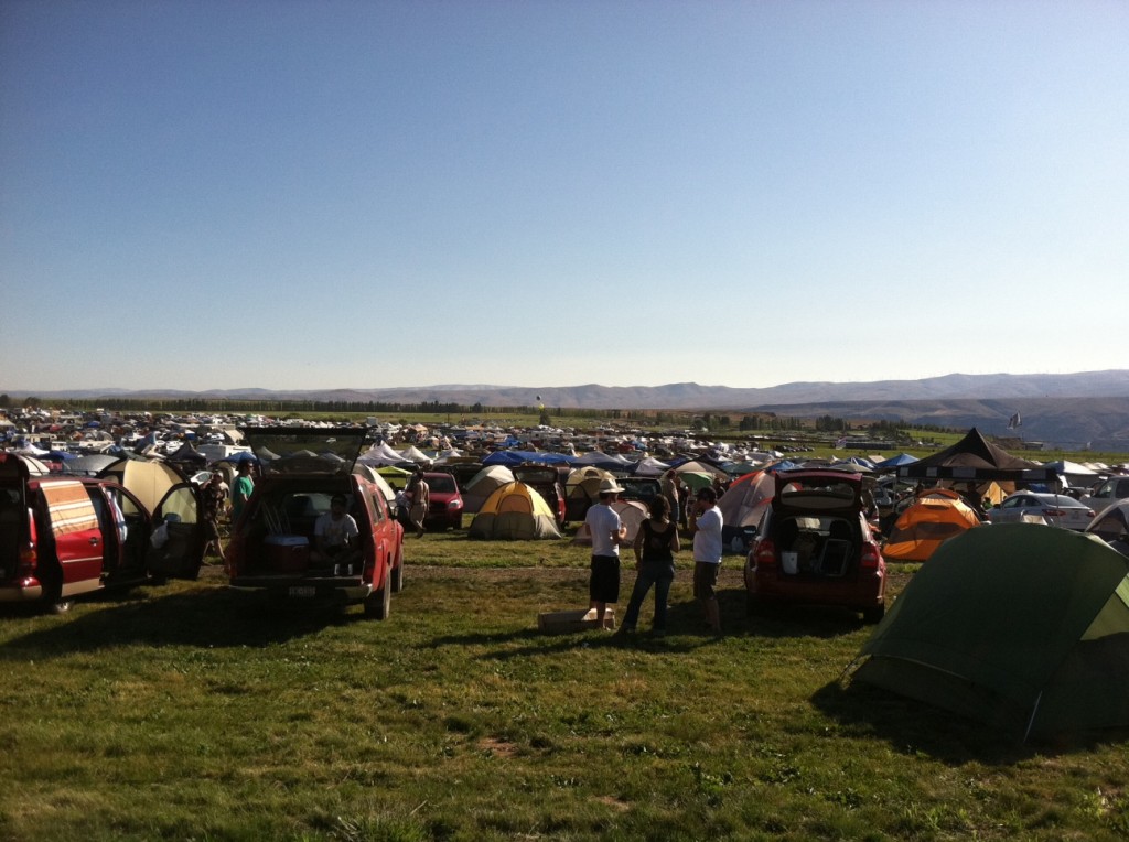
We went over and picked out our campsite, which was toward the back and fairly quiet (luckily)....

This was the view in front of us.  Not bad, huh?

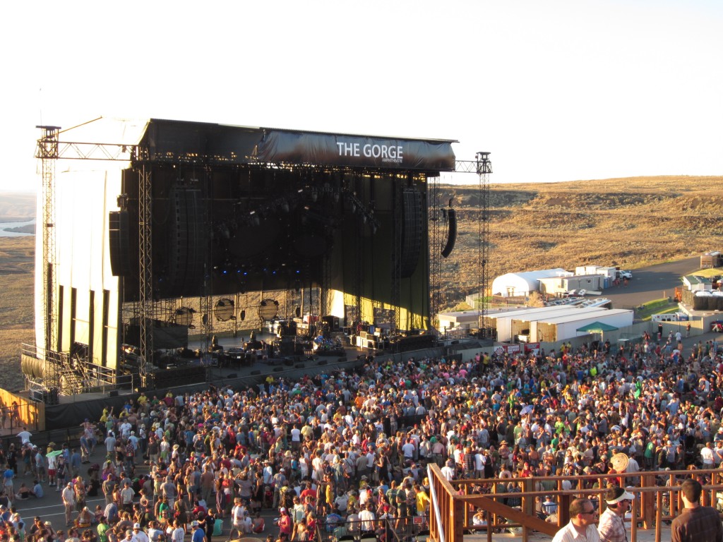
After we set up camp it was time to walk to the Gorge...  which was actually a pretty far walk....  and after you just didn't want to walk anymore you crested this hill and saw this...

Can you believe the view?  I have never seen anything like it.  Ever.  It's hard to get a sense of the scale because the stage is at the bottom of a huge hill, but the stage is massive.

This shows the perspective a little bit better.  :)

I love this picture.  For those of you who suffered with me through what to pack, what do you think?  Good choice?  It was a fairly painful packing process, but I was pretty happy with what I chose.  I even rocked those feather earrings, which is a fairly bold choice for me, but I thought it was appropriate.  :)

Saturday afternoon we hung out at the Cave B pool and just relaxed before the show Saturday night.

Both shows were absolutely amazing.  If you are into Phish at all I highly recommend downloading the shows.  Some of the best I've ever seen.

Thank you guys so much for putting up with my totally personal posts :)  You won't regret it!  I'll be back with an amazing house later this week.  Until then you can occupy your time on the Flock website...

Phish... and a kitchen?

I'm sure you guys were longing for a more personal post from me considering my recents writings have been strictly business.  Ha ha.  I'm kidding... kind of... This was one of the most serendipitously awesome weekends of my life.  Yes.  I said that.

Phish has been my favorite band since 2000.  I love them in a way I have never loved any other band.  I am not talented enough at writing to really explain why other than to say that they provide an entire community experience/language with their music... either you know what I mean or you don't.  If you don't then I would suggest listening and trying to figure out what I'm saying.

Side Note: This weekend I decided I'm in awe of people who can write about music.  They are equally as talented as the musicians.  It reminds me of the kid in Almost Famous.  I wish I could channel his talents for just a moment, but I guess I will have to just stick to writing about houses... at least you guys humor me by reading that :)

After two great shows in Atlanta last week, I was super bummed that my Phish concerts were over for the summer...

But to my great delight, I got the opportunity to go see the next two shows in Charlotte and Raleigh.  Did I want to go?  Duh.

The Friday night Charlotte show (click the link to see a video) was hands down the best show I've ever seen (click here to check the set list).  I am not sure if it was because we were so close I could see everything/everybody (usually there are a lot of tall people in front of me and I have to jump up and down and check the giant screens), or if it was because IT WAS SO AMAZING, but either way it was something I'll never forget.

Again cue the fact that I don't know how to write about music other than overusing the words awesome, amazing, cool and other lame adjectives.

On Saturday we drove from Charlotte to Burlington, NC (which was an hour from the next show in Raleigh).  We were staying in my friend Jimmy's grandma's house.  It was beautiful.  Burlington was a nice town, and the house was located in a quintessential Southern golf neighborhood.  I was impressed by the house as we drove up, but was ill-prepared for what was inside waiting.  We went into the house through the side door that opened to the most beautiful kitchen.  I was in awe.  How is it that in the middle of the greatest music weekend of my life (bold) I happened upon a magazine-worthy kitchen in North Carolina?  My two favorite things at once!  Coincidence?  I don't think so.... I think the universe was just trying to get me to write about Phish on my blog!  ha ha.

Please let me preface this part by saying I did not bring my camera.  Unlike most people who break out their cameras on vacation because it's something new and different, I spend 90% of my life with a camera in my hand and like to use my vacations as a break from hauling a camera.  Thank the lucky stars (or the universe again) I traveled with my ipod and used it to snap a few pictures.  Please don't judge me on the quality of these.  I wouldn't have posted, but you guys NEEDED to see this kitchen.... so look past the cell phone-iness of them.  Thanx.

Additional side note:  You may notice my writing change once we discuss houses (I'm such a nerd).

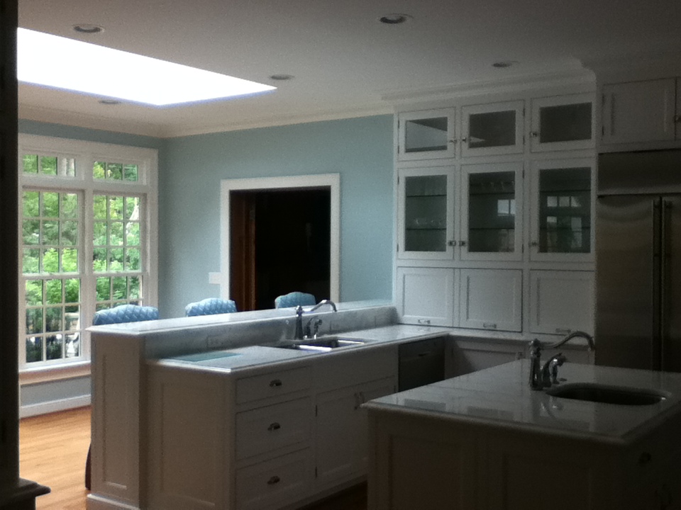
Here is the view as you walk in the side door.  Blue and white is obviously one of my favorite color combinations, so I'm already sold.  Also, you can't beat natural light, and there was a huge skylight (top left corner).  I want to mention the floors too.  Today there is such a trend toward dark floors, and while I think they are beautiful, the lighter wood here adds a certain warmth that ties the whole thing together perfectly.

Here is a better shot of the skylight, but it also shows the French door leading to the patio.  This kitchen has ideal flow for a dinner party where the guest could mingle on the patio and in the bar area while the host works in the kitchen.  This openness is something I lack in my own kitchen, so I am hyper-aware of it when I see it in others.

Here is a little bit better picture of the eat-in bar.  It's such a nice height, and I like that you can fit three stools there comfortably without feeling cramped.  Going back to the party, this would be an ideal place to set out appetizers, or you could take the stools away and let people set their drinks there as they chat.

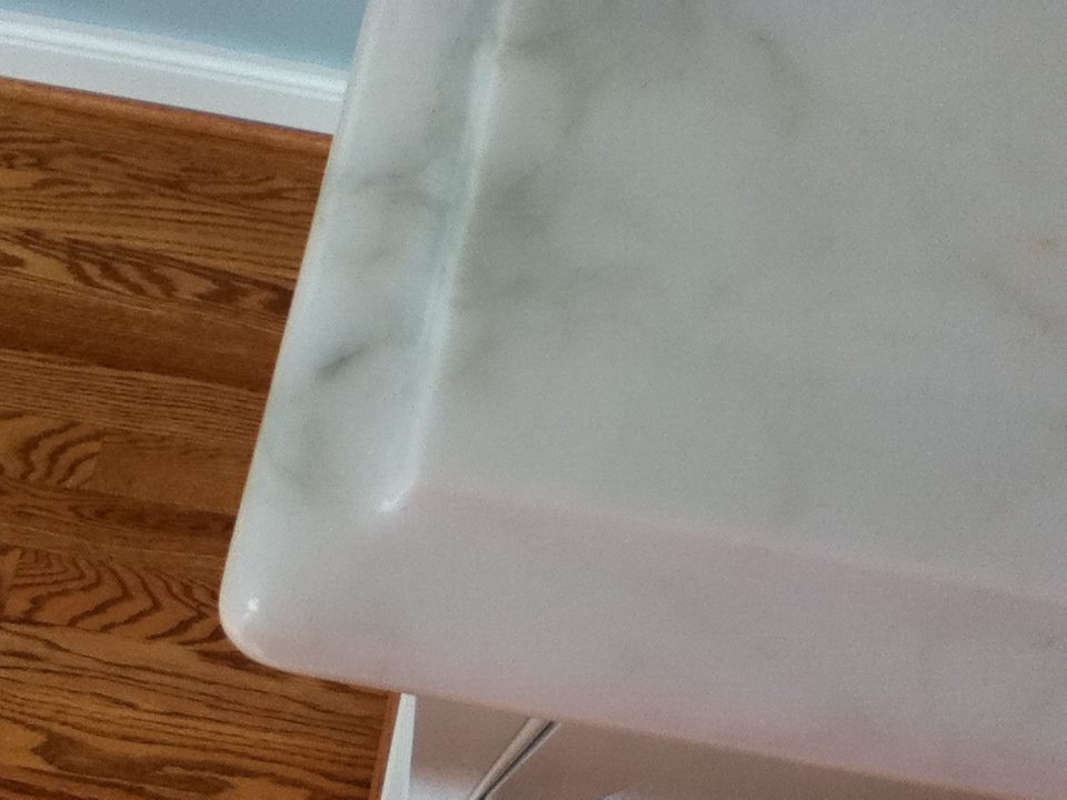
I wanted you guys to be able to get a closer view of the marble.  I'm not sure how much you can tell from the photo, but it was intricate and beautiful.

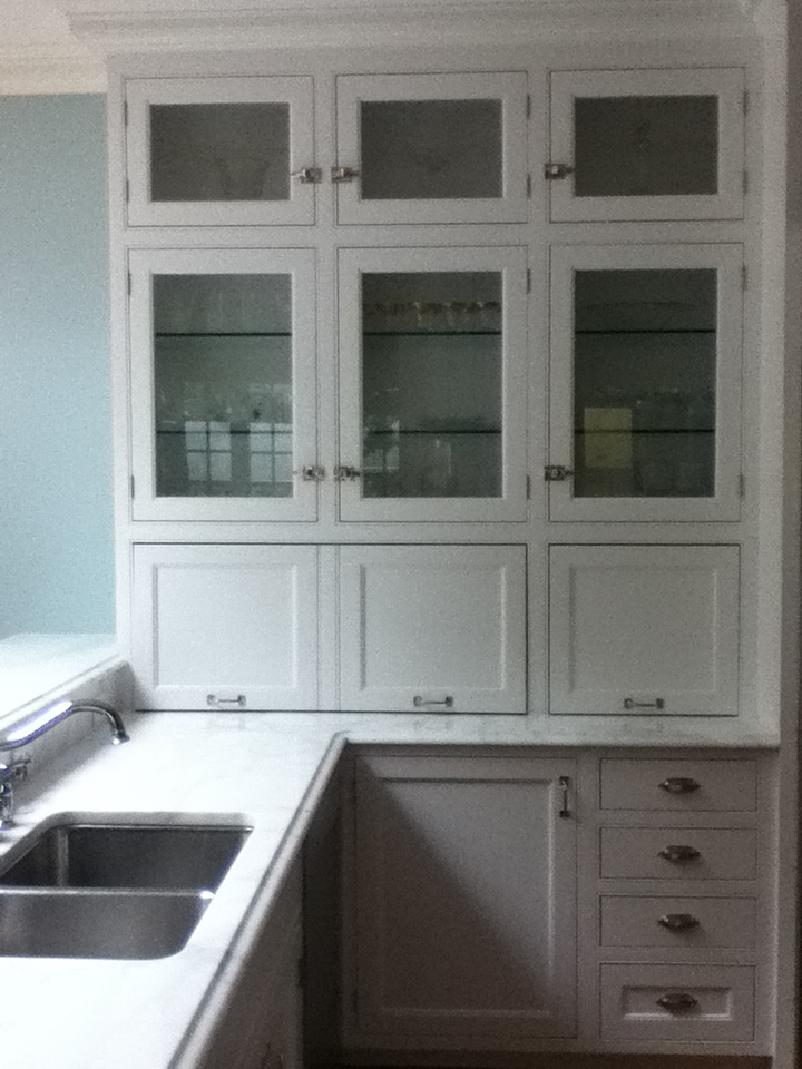
This is the area to the right of the eat-in bar.  I took this to show the brilliant use of under cabinet storage.  Again, this is something I lack in my own home and covet in others.  I took the liberty (sorry Jimmy) of checking out the storage situation, and there was room for several medium-sized appliances.  Thus we can affectionately use the term "cook's kitchen" here.  One more thing I wanted to point out was the use of glass panes and glass shelves in the cabinets, which were filled with glasses.  The whole thing created a very pretty visual and created the feeling the glasses were floating.

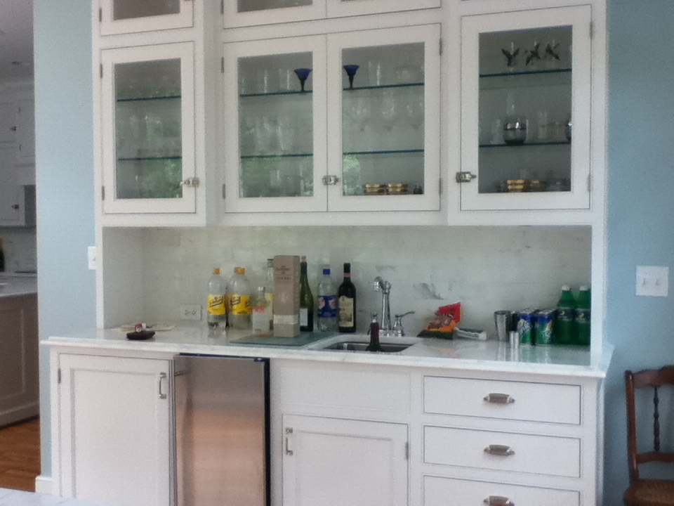
This bar was to the right as you walked in the side door.  Can you see the backsplash tile?  It is so pretty... white with veins of gray.  It looked to me like the same marble as the counters, but with more of a highly polished finish.  I could be wrong about that...

This door hardware is great.  It reminded me of a suitcase latch :)  Take a moment to check out that glass on glass action.... almost like an optical illusion... you can also see me lamely standing there with my ipod... brilliant.

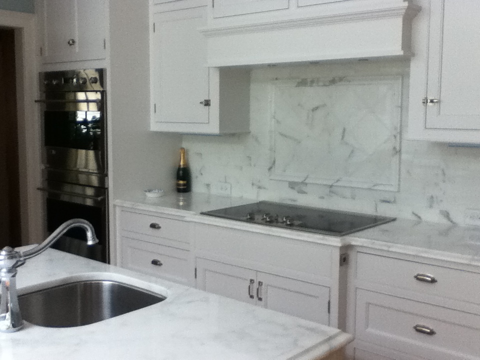
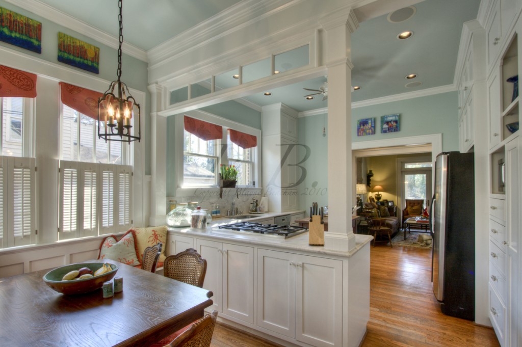
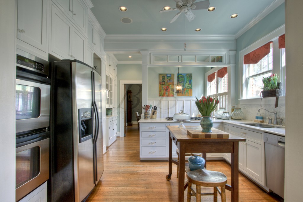
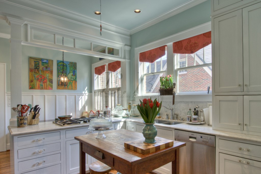
This is a closer photo of the island and range.  There are a lot of things I love here.... firstly, I like that the ovens are in the corner and out of the way.  There are also two ovens, which is always nice!  The diamond pattern of tile on the backsplash is also worth noting.  It breaks it up and adds interest without distracting.  So classic.  And finally, I may be in the minority here, but I adore an electric range.  I have an electric range at my house, and it is so easy to clean and gets hot really fast.  I cook a lot, and it's nice to be able to just wipe up when you're finished.  My mom has a gas range at her lake house that I cook on a lot.  It feels more substantial to cook on it, but I always spill something, and it's a pain to clean.  So for me, electric>gas.  :)

And finally we have this view from the other side of the kitchen.  I am not sure it shows us anything new, but maybe gives a better idea of the space?  This is a huge kitchen, and that is coming from someone who walks into 2-3 kitchens a day.  I will also say it's the most awe-inspiring kitchen I've seen in a while.  Honestly, can anyone even remember the last time I did an entire post on one kitchen?  This may be a first.  Jimmy told me his aunt made all the choices for the kitchen, and I want to say she did a fantastic job!  So thank you to Jimmy for inviting me, thank you to Jimmy's grandma/family for letting me stay there, and thank you to Jimmy's aunt for having great taste.

For those of you who are interested, the Saturday night Phish show in Raleigh was AMAZING (ha ha... I did that as a joke... but also because I could not think of what else to say... remember, we are back to talking about music).  But honestly, it was a great show, and they played Ester, which I am told is a rarity.  Great weekend.  Great music.  Great kitchen.  Can it get any better?  For me?  no.

Hope you enjoyed the personal post :)

Love ya! BB

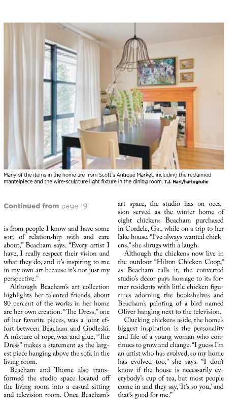
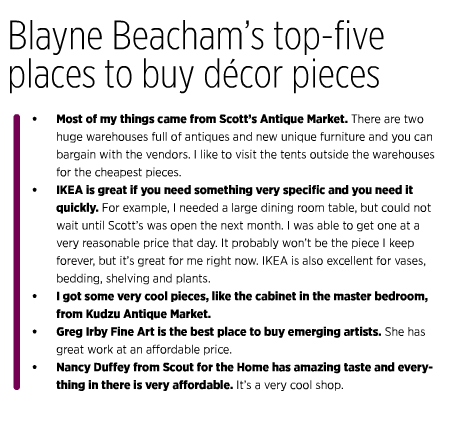
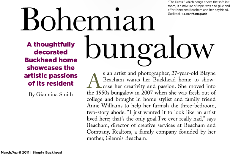
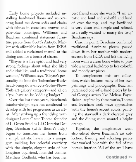
My House in Simply Buckhead!

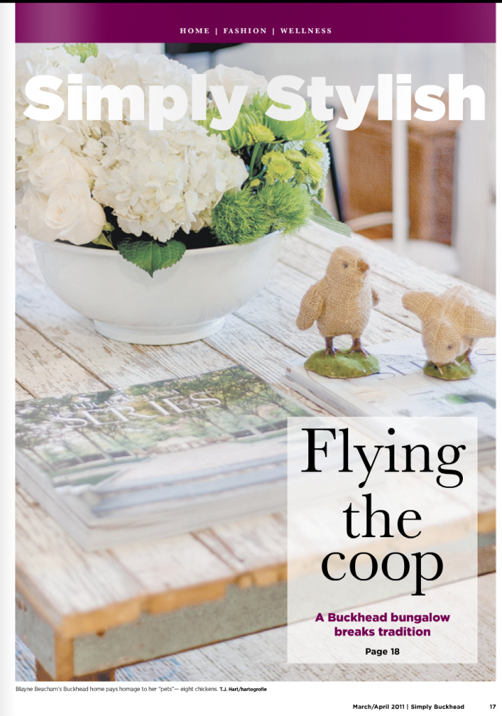
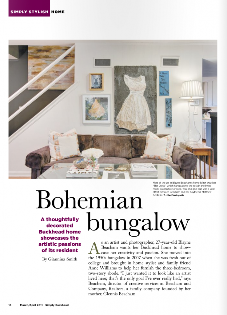
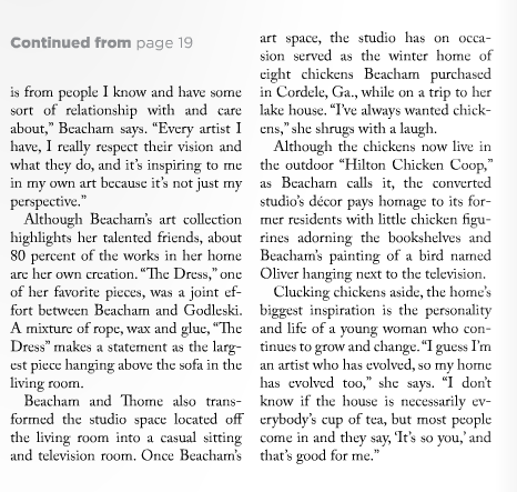
The newest edition of Simply Buckhead came out this weekend!  This is the issue that has my house in it.  To see the before pictures you can check out this blog post. I am so excited for the article!  A hundred thousand thanks to Laura Green Thome of L. Green Studios for all her help!!

A little larger...

I want to add a little note here that the amazing painting in the back left corner is by the immensely talented Melissa Payne Baker. She is represented by Huff Harrington Fine Art.

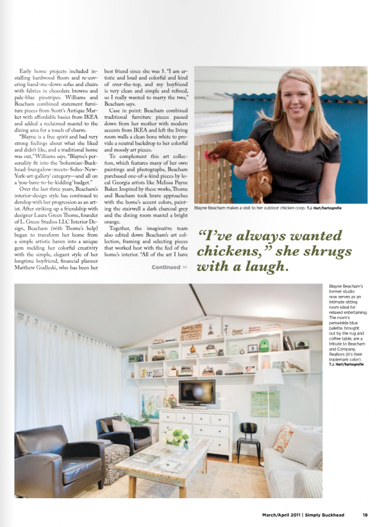
Thank you so much to Simply Buckhead for featuring me!

Here is the text a little larger in case you can't see it..

One House, Two Styles (under contract in 24 hours!)

Well here I am at my new Wordpress blog.  What do you guys think?  Isn't it clean?  I am so pleased with the new look of it.  Now I am just going to have to buckle down and figure out how to work it (easer said than done).  This is my first post in the new space, and I am very excited!

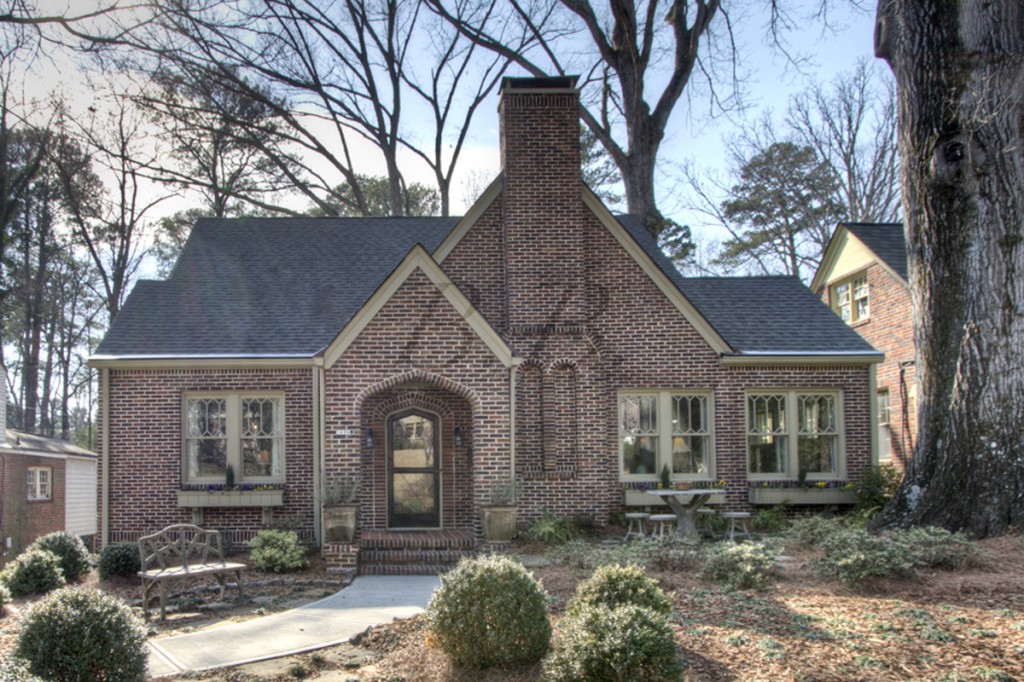
Sheila Gray and Erin Yabroudy got this Morningside home (1696 North Pelham Road) under contract in 24 hours!  This is a testament to two fantastic agents and one amazing house!  The best part about this house is it's two completely different styles.  The main level is a traditional Morningside Tudor home, circa 1929.  There are classical architectural details everywhere.  The terrace level is a hip urban loft.  And how do these two styles go together in one house?  The answer is because of the amazing interior design work of Catherine Wilson of Catherine Wilson Interiors.

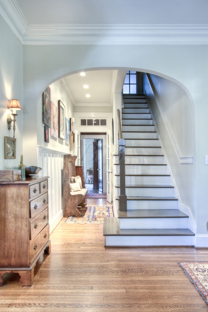
I fell in love with it the minute I walked in the front door.  I am such a sucker for arches!


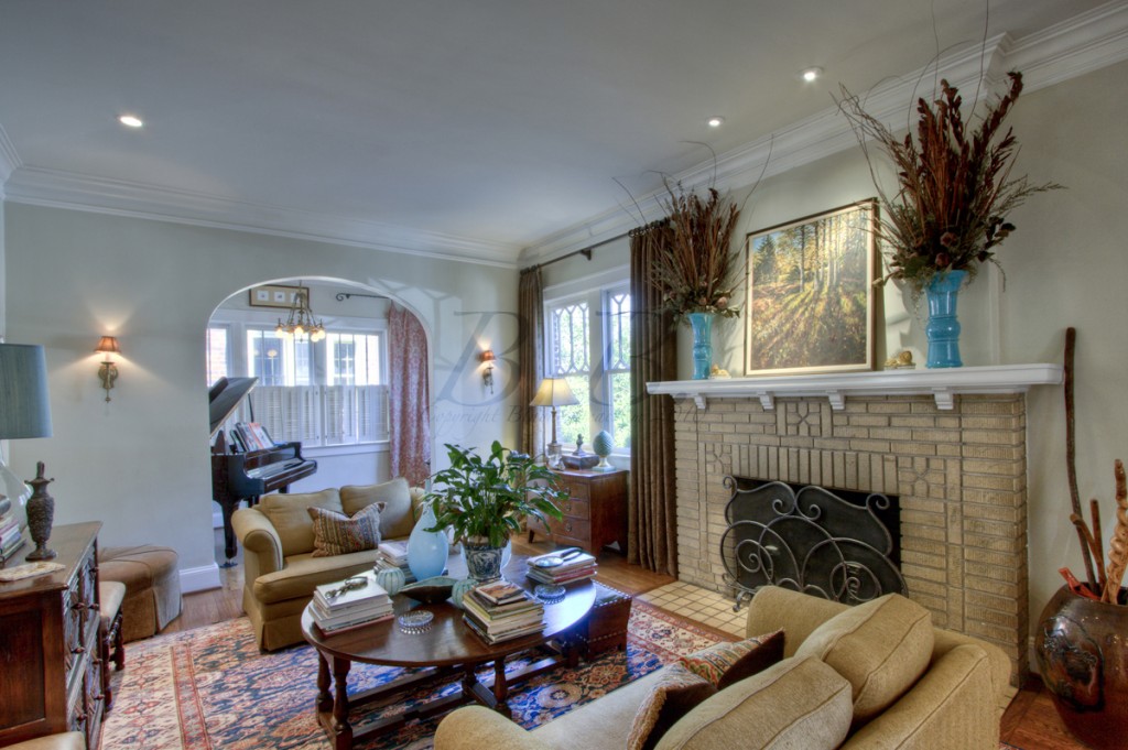
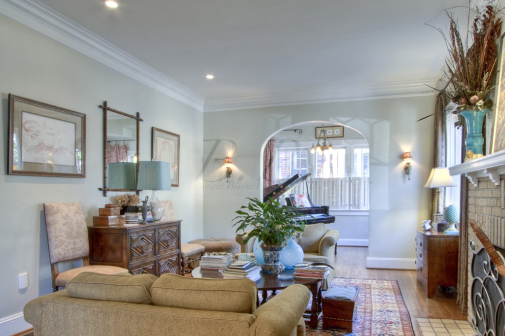
Here is the formal living room, which is to the the right as you walk in the front door.  Isn't that fireplace beautiful?

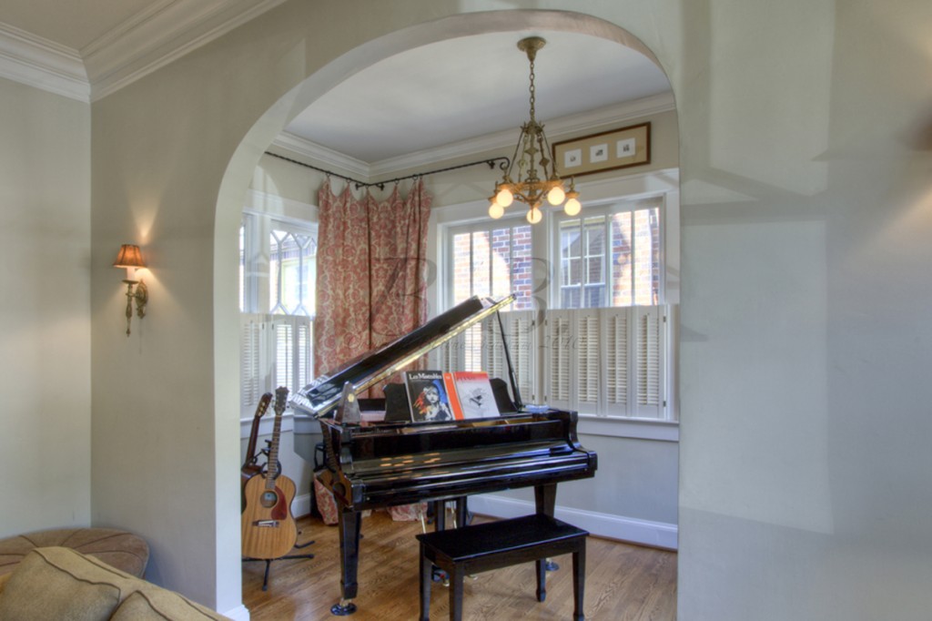
Same room from the other side.  Don't you love the view into the music room?


If I was at all musically inclined (which I'm not) I could spend hours in this room.

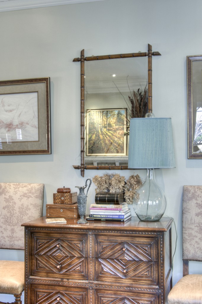
This detail shot is from the living room.  The colors and so soothing and and the cabinet has such rich detailing.


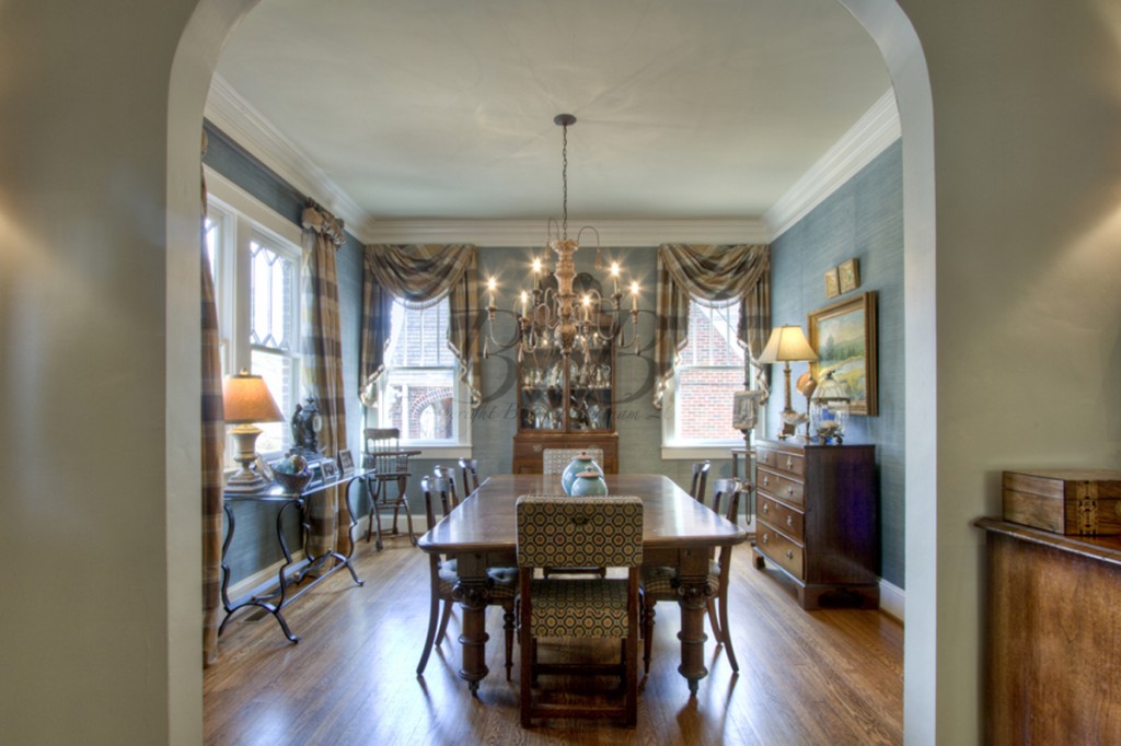
The dining room is to the left of the entryway (across from the living room).


My favorite part about this room is the windows.   I always love to look at windows in older homes.

This is the view of the kitchen from the dining room.  It is so bright.  I love that it is open to both the breakfast area and the family room.  Since some people spend so much time in the kitchen, it's great when it's open to the rest of the house.

Here is the kitchen from the family room.  Wouldn't this be a great place to spend time?


And one more view just because I like this picture.  I also love the art hanging in the breakfast area.  Isn't it happy?

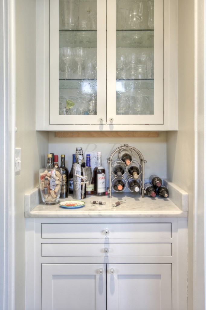
We can't forget to show the wet bar... a very important place in any home!

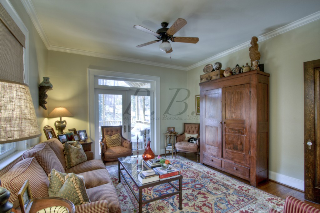
And here is the family room off the kitchen.  This would be a great place for the kids to hang out while the parents cook.

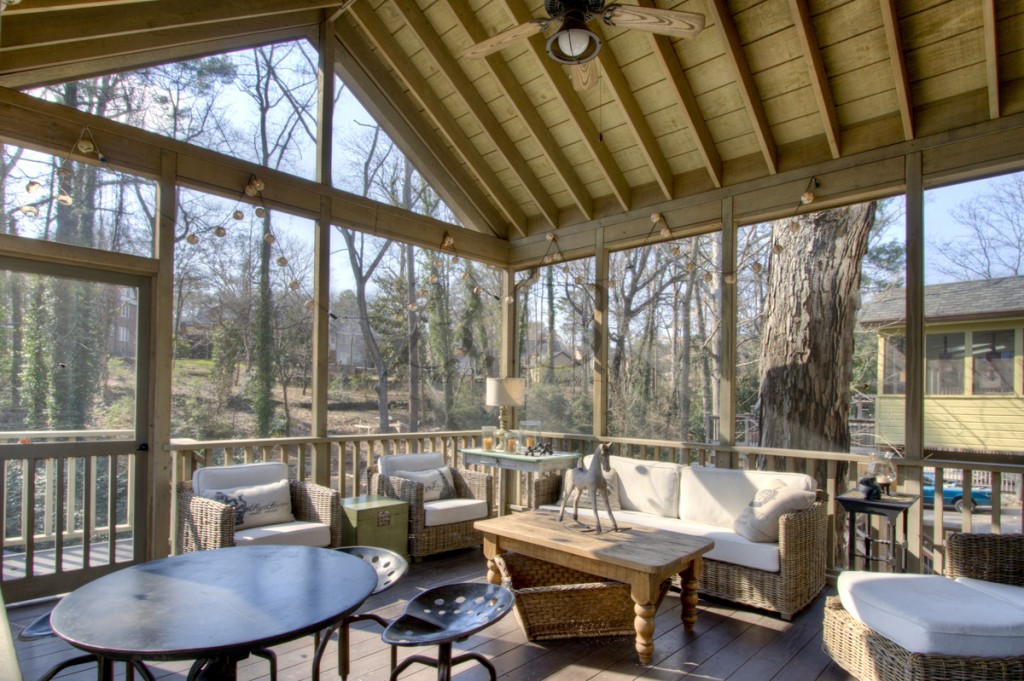
The family room leads to this fantastic screened-in porch.  I would spend so much time out here!

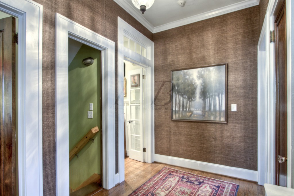
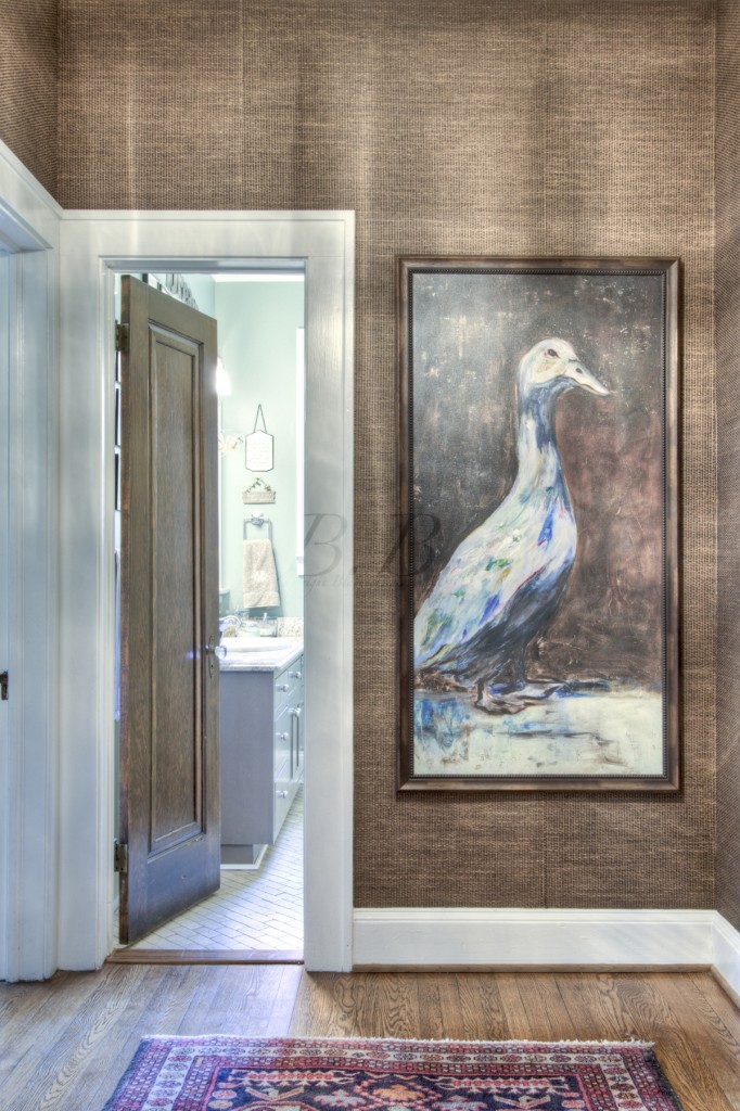
This is also on the main level.  The family room is to the right and the main hallway is through the glass doors on the left.  On a personal note, this wallpaper is fantastic!  I have been thinking a lot about putting wallpaper in my own home (I know! Right after I got it all finished...) and this would be perfect.

This is the other side of that hall, which I show because I am obsessed with that duck painting!!  Also, you can see that wallpaper really well in this picture.

Now lets go to the terrace level :)  Are you ready for a completely different look?

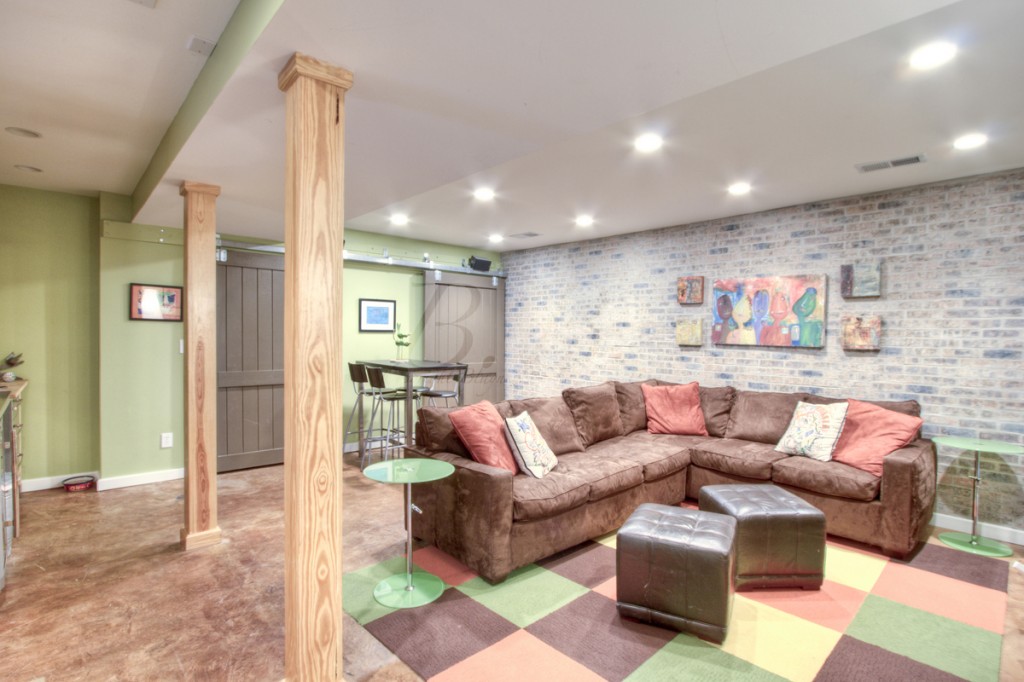
Isn't this cool?   This room has fantastic elements... the exposed brick wall, the sliding barn doors (remember these), and natural wood beams, and stained concrete floors.

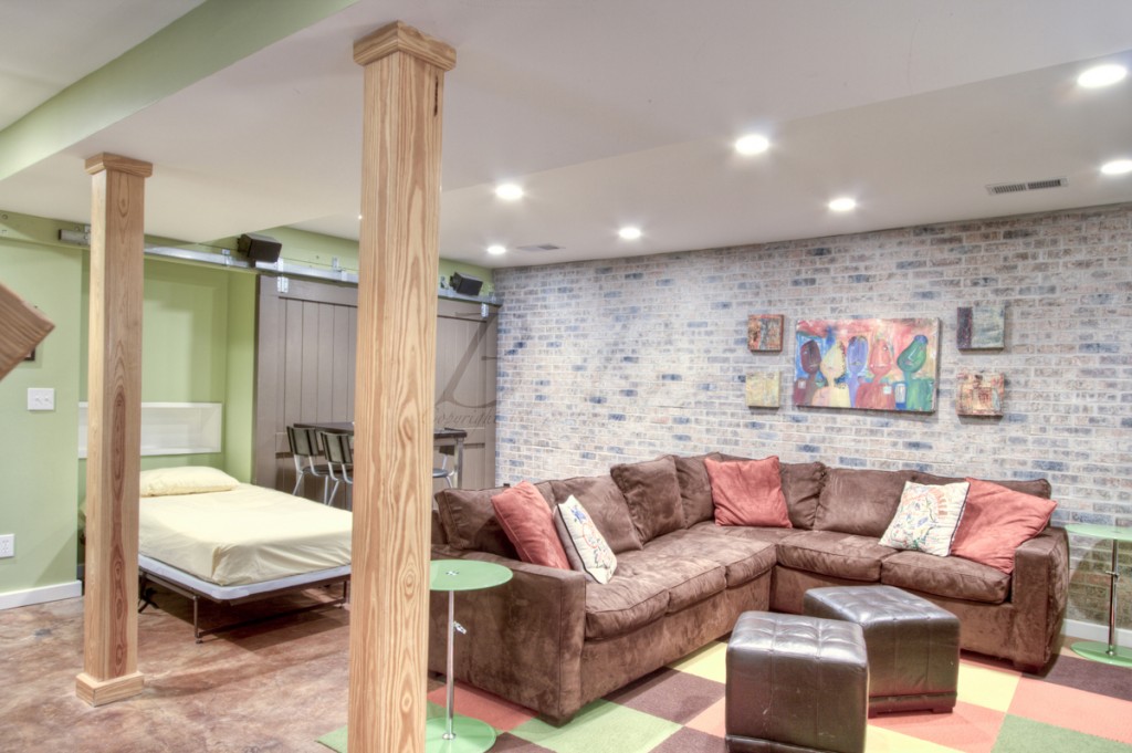
You can see that behind the sliding doors are murphy beds!  That is so perfect for a slumber party!  And in case you didn't really feel like getting out of bed, there is a kitchen right next to you!

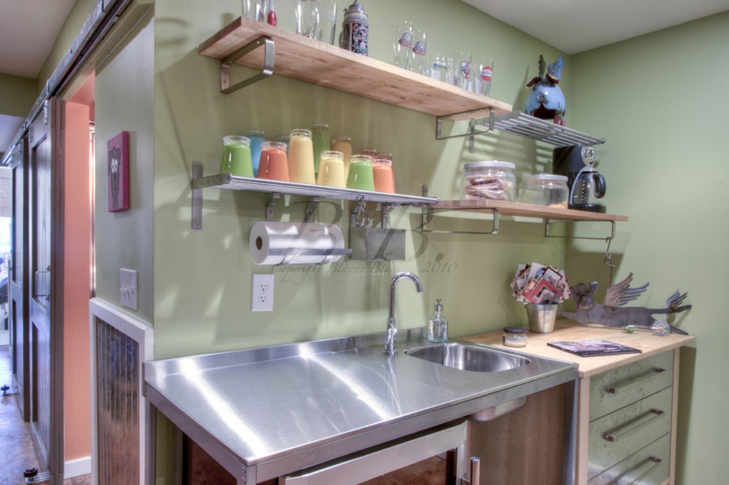
Isn't this a great idea?   I love the industrial look, as wella s the sliding barn doors you can see down the hallway.

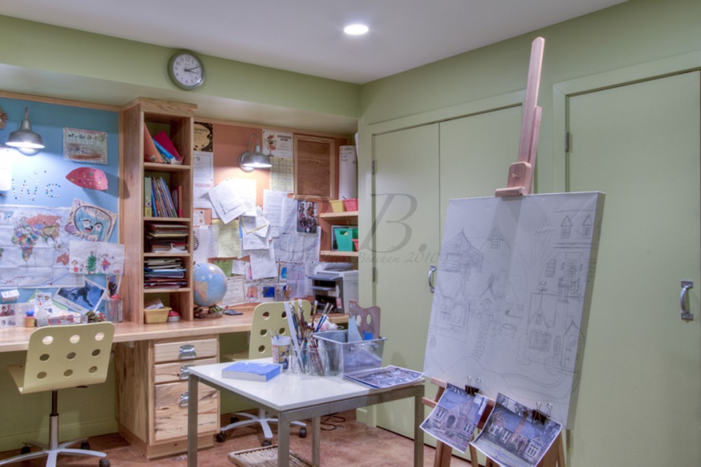
This is an arts and crafts area!  Isn't this cool?  I would do so much art in this room!

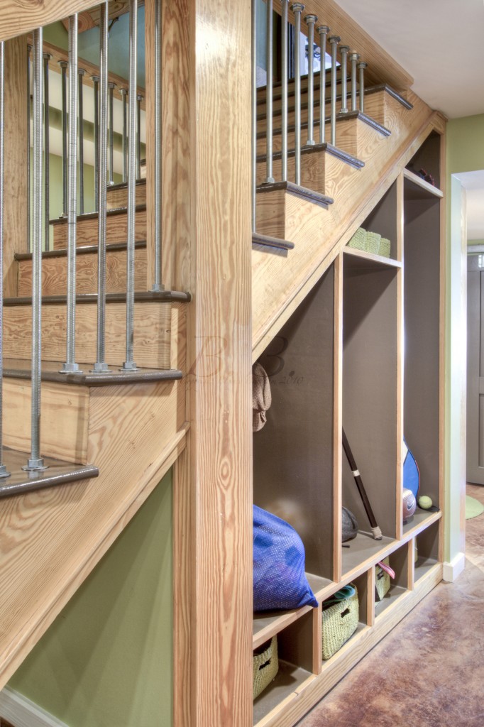
I love these cubbies underneath the stairs!  They are like lockers :)

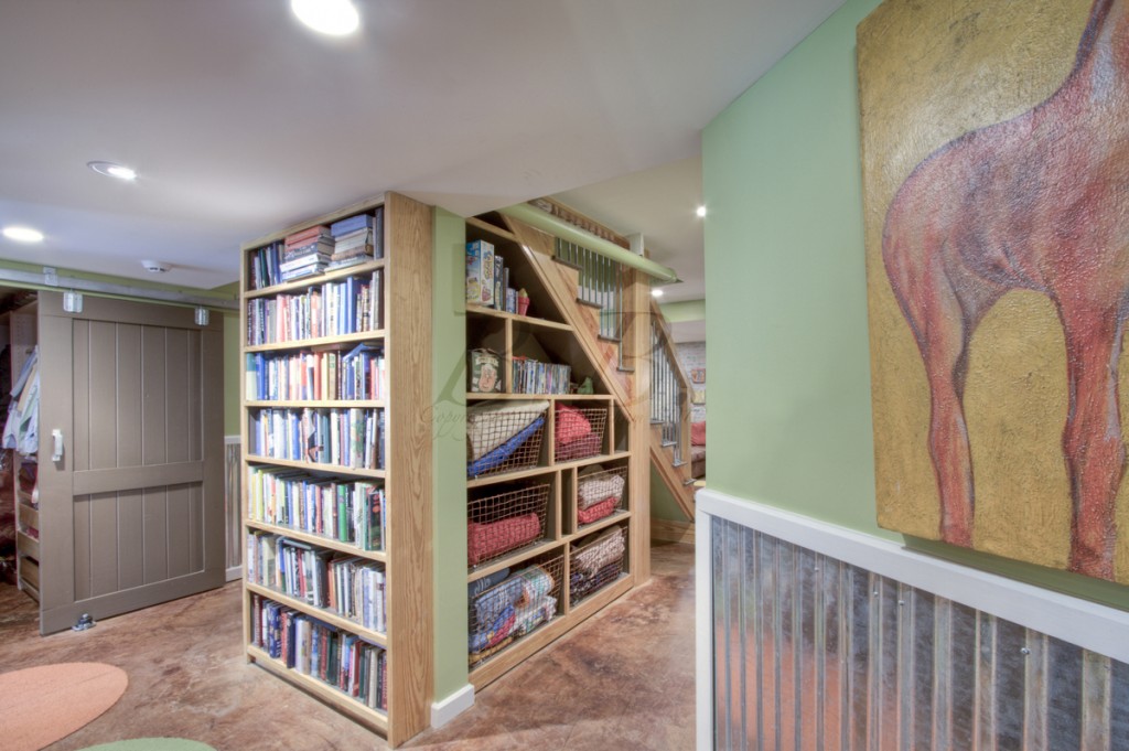
This is the other side of the stairs.  Great storage space.

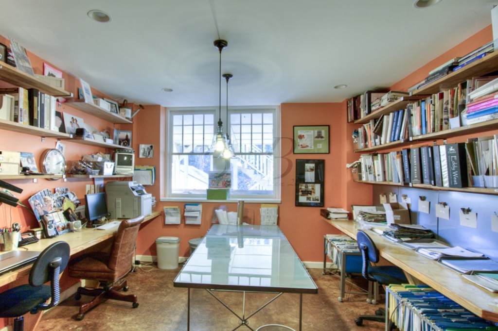
And here is the office space.  I love the orange!

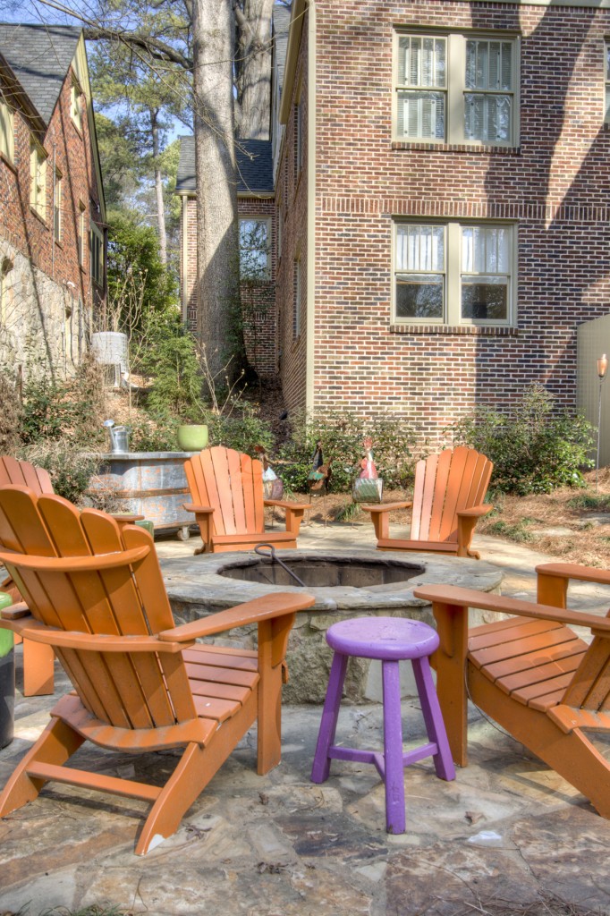
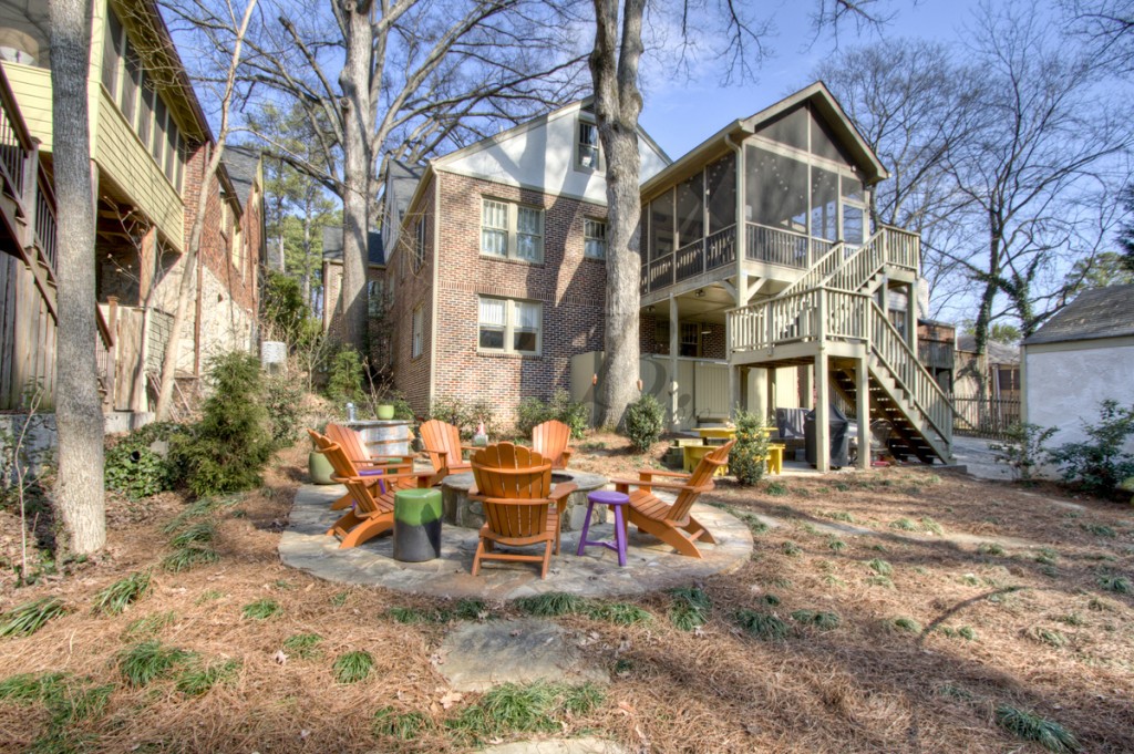
Here's  the fire pit in the backyard.  Wouldn't it be great to hang out with all your neighbors and have a glass of wine?  I'm very jealous!

And finally we have the back of the house.  Can you see why it went under contract so fast?  It's very cool.  Catherine Wilson of Catherine Wilson Interiors did a fantastic job.  The new owners are very lucky!

So there we have it.  The first post on the new blog.  Please take a second to leave a comment and let me know what you think of the new space?  I can still make changes if needed.

Homework: Brian Patrick Flynn at Home and at Work

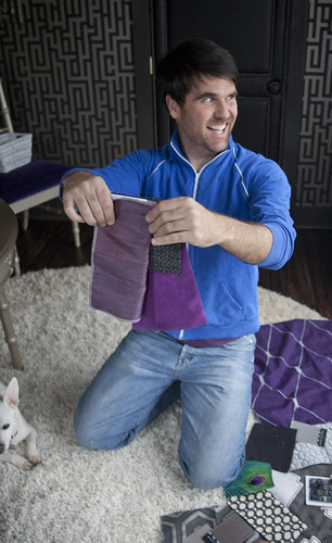
The first time I saw Brian Patrick Flynn of Decor Demon, I thought, "I don't know who he is, but he's important." 99.9% of the time I am way too intimidated to speak to people like that, but luckily Brian spoke to ME (I was holding "The Beacham Series," which he recognized... yea!). It seemed I was the last person in Atlanta to not know of him. You may have seen him in Atlanta Homes & Lifestyles 10 Under 40 feature this month in which he talks about being completely self-taught. We got to know each other when I went to shoot something for him to use in one of his editorial design projects for HGTV. Yes, he produces, writes and styles shelter magazine content, photography and video...for HGTV! People around the world dream of that job and he actually has it, plus the network handpicked him to write posts for their blog, Design Happens and he hosts a web series on hgtv.com called "Fast Fixes" which he describes as "higher-end DIY". He also let it slip out during our shoot that he's been the home and garden producer for Movie and a Makeover on TBS as well as the show's on-air design talent for 7 years. Yeah, he's actually on TV! Brian doesn't really talk about it and doesn't think it's a big deal...at all. As if that weren't enough, in his free time he takes on his own design clients, writes and produces DIY articles for houzz and writes Decor Demon; every single magazine-quality image was created from scratch specifically for the site with Brian art directing and prop styling every shot himself. Are you kidding me? I'm so jealous of his job and his swanky retro modern home he decorated himself with almost all custom or vintage pieces! I think he's amazing, and was thrilled to work on this blog post with him. I asked the questions and took the pictures. He answered the questions and told me which shots we needed to bring the answers to life. We had so much fun getting ready for this together, even running to Yogurt Tap for White Chocolate and Graham Cracker frozen yogurt topped with multi-colored gummy bears. I hope you enjoy getting to know my new friend as much as I have.

Screen shot 2011-02-09 at 11.21.10 AM
1. Why do you call yourself a decorator even though you design almost everything from scratch?
Denial, I think---and possibly the harsh ramifications of the American legal system. I'm self-taught and lack the ASID or NCIDQ stuff.  Technically, I'm a decorator.
2.  If you could work as a designer/decorator in any other city, what would it be?
Kinda-sorta L.A.; I'm on an inspiration-high each time I'm zipping around the Hollywood Hills, but I don't necessarily wanna LIVE in Los Angeles. The midcentury modern homes there are SICK; my dream would be to work on 1950's and 1960's Hollywood homes full-time but still actually live in Atlanta. I love it here. Atlanta and I are meant to be together. We're like Spencer and Heidi, Carrie Bradshaw and Manolo Blahnik, or perhaps, Naomi and Wynonna.
 

3. Pet peeves and cliches that drive you crazy...or not?

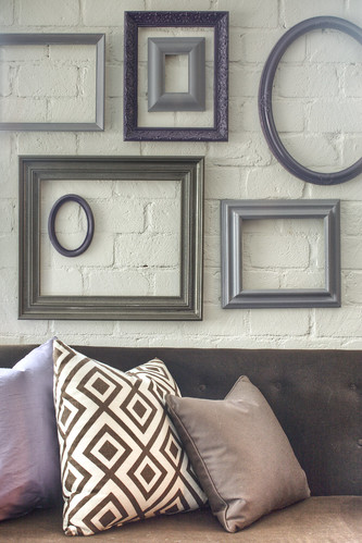
Frames
As far as pet peeves go: sticks in a vase shoved in a corner, themes in kids' rooms, "art" bought at big box retail stores, swag window treatments, leather rolled-arm club chairs in manspaces...I could keep going but then people who like this stuff would hate me on the Interwebs and pull that let's-leave-scathing-comments-on-blogs-about-this-dude-and-totally-ruin-his-day nonsense. No thanks! Now, as much as I wanna be over the empty-frames-grouped-and-hung-on-a-wall-thing, I kinda still like it. In fact, I did it above my media room sofa using spraypaint in violet, plum and bronze tones.
4. If you were forced to hire a designer to do your personal home, who would you use and why?
floor - lighter
Phoebe Howard. Everything Phoebe uses is timeless, classic and made from the finest materials and/or craftsmanship. She's also uber-refined whereas I paint red-orange zig-zags on wood floors and upholster walls with royal purple velvet; it would be a complete escape from my borderline-living-on-the-edge routine, plus I'd learn a great deal about restraint...in a good way.

5. What are you working on right now?
Pick up your camera, meet me in Inman Park at 3:15pm and I will show you. I'm just about to start a floor-to-ceiling redesign on an industrial-chic loft.
Dining room_DARKER
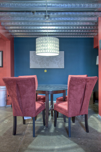
My client, Meghann, is a publicist. Her existing interiors make me wanna punch a squirrel. It's all starter stuff with colors that just do NOT work with the space. We're toning it down, BIG TIME.
paint colors
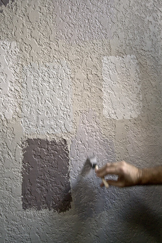
We've decided on a handful of greys and plums. I always pick up $5 testers from Sherwin-Williams, then paint all potential choices in groups on walls in different areas of the space to see how they play with the supplied light. Our winning color? "Mystical Mauve" but since anything referred to as mauve is scary as hell, I will simply refer to the color by its product number. Once the space is finished, I'll confess---kinda like when you serve someone tiny chicken empenadas at a cocktail party, then once they rave about the taste, you admit they were actually reindeer or polar bear.
Wallpaper
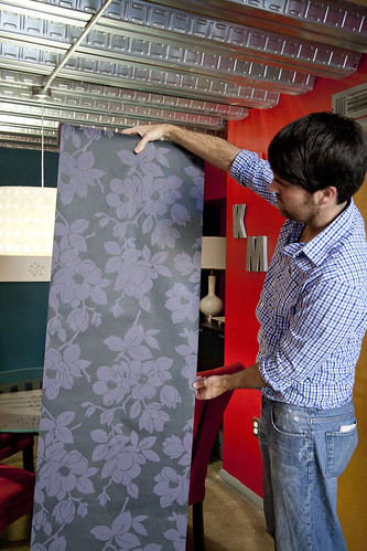
Although I'd have opted for fabric on the dining room walls, budget called for low price-point wallcovering; we stuck with a modern floral from Graham & Brown which we ordered online. It showed up only three days later.
fabric
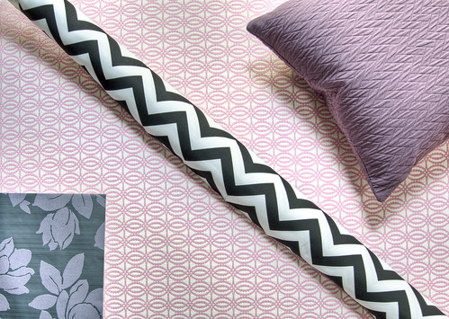
Meghann wants feminine, but more Wilhelmina Slater from Ugly Betty than Holly Hobby or tea party-poodle-skirt-girlie. We're using modern and vintage lines, then mixing in some femme tones like the pink/grey geometric from Duralee and a budget-saving black/white zig-zag we found at Forsyth Fabrics for about $10 per yard.
lamp
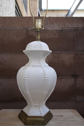
I kinda despise new things unless I can design them from scratch; I prefer vintage whenever possible. Since I'm creating a custom bed, we're
forced to save as much as possible in regards to all other purchases. We scored this lamp from Highland Row Antiques for a cool thirty bucks. Once the room is put together, we'll top it with a new lampshade. I'm thinking it'll be hot pink, then we'll spraypaint the bottom of lamp the same hue.
Pillows w blur
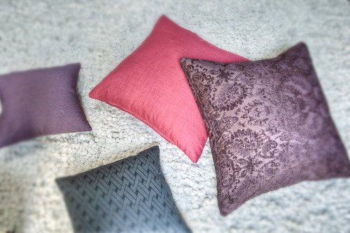
All of the living room furniture we'll be using was picked up at flea markets. In fact, the sofa, side chairs, bedside tables, dining chairs and table base all came to less than $500; however, we'll be splurging on upholstery and refinishing. The furniture is in production right now but my seamstress already knocked out the pillows. From the hot pink linen to the rich, plum velvet, these are the tones that will flow throughout the entire space.
6. What does your own home look like?
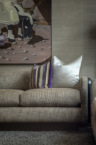
Bedside Table better Sofa better

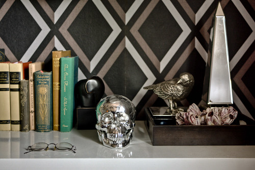
Come over with your camera and see for yourself but don't get too excited, all we can do is shoot tight, detail shots. Ain't no way I'm gonna blow my chances with a national glossy shelter pub. They'd be all like "Awe, hellz nawe. You can't be up in here if your crib's already been published, dawg." and I'd be all like "Y'all need to step off and chill, dawgs. The twitters and the blogosphere is where it's at, ain't y'all heard? Y'all better recognize". You get the point. It's a mashup of 1960's and 1970's set inside a 1955 midcentury modern ranch. Tons of texture through fabrics like silk-linen, velvet, boucle, Belgian linen and also through my grasscloth-covered walls. I've got pretty much all vintage pieces in grey tones accented with black, violet and tons of bronze and metallics. While it's masculine, it's also kinda elegant.
7. The last thing you bought for your own home?
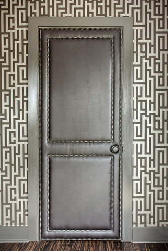
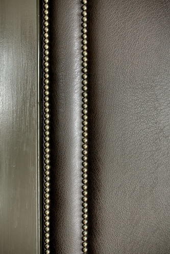
 

Leather Door (1) Door Detail

Leather upholstered doors with bronze nailheads. Well, they were the existing doors, I sent them out to be upholstered. I bet you've never had someone tell you that before, huh?
8. Mood boards or sketches?
also good
tray
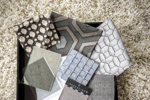
Trays. I fill trays with fabric, tile, flooring and finish options first, then once that's solidified, I move on to space plans and sketches.
 
9. If you had 10 minutes to do a "Supermarket Sweep" of Home Depot, what would you get and why?
50 gallons of porch and floor paint, 3 HVLP paint sprayers, 5 cases of white gloss spray paint, 2000 linear feet of 1X8 MDF trim, stainless double door refrigerators, noiseless stainless dishwasher, 2000-sf of decking planks, exterior landscape up-lights, 2 tons of pea gravel, oil-rubbed bronze door hardware, 25 sheets of 4X8 beadboard and the most expensive pressure washer they stock. Yes, I have thought of this situation before. Many times.
10. If you won the lottery what would you do?
Purchase small homes in the following places, then spend two years living in and fully re-doing each one: cabin in the North Georgia Mountains, townhouse in Chicago, cottage somewhere on a lake, loft in downtown Denver and a two-story house somewhere in the Pacific Northwest.
11. Fill in the blank.  If I never saw the color ___ again I could die a happy man.
Beige. There is no other choice. I loathe beige.
12. If you were stranded on a desert island (this is my favorite game) and could only bring one of the following, what would it be? [blanket, pillow, book, kitchen utensil, swimsuit, pair of shoes, T-shirt]
Blanket. I could use it wisely as shelter, fold it nicely as a pillow, wrap it around my head and play dress-up, wear it like a cool island sarong or stake it in the ground with a branch, then let it blow in the breeze as a get-me-the-@$#%-off-this-island flag. Well, as long as the blanket isn't beige, that is.
Love. Him. - bb