Hello everybody! How are you guys? I feel like it's been forever since I've talked to you. It has been so busy around here at Beacham & Company! You would not believe it!Anyway, while I LOVE to be busy I miss getting to spend time with you guys... so in order to make it up to you I am offering you a once in a lifetime post.
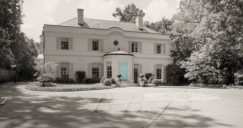 If you've ever read my blog before, I'm sure you know my COMPLETE OBSESSION with this house. I have gone on and on about it in the past... In fact, in a very strange way it's the house that got me to start this blog.
When I saw this post on Holly's blog "Things That Inspire," I contacted her to ask her a few questions. She told me a little about blogging, and here I am.
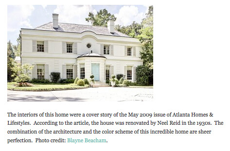
So, to continue with the story, I started this blog, but never featured the house... And then Holly wrote about the house again, but this time on the AH&L blog in a post called Twenty Beautiful Homes, Take Two.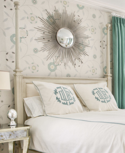 While that post was up, I decided it was finally time to feature the home on my blog and show some never-before-seen pictures of the house.
And guess what? People out there were reading...
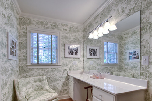
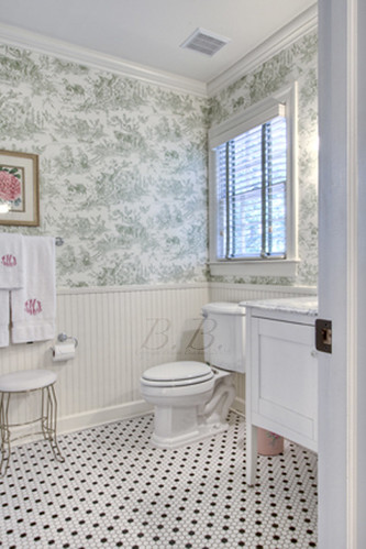
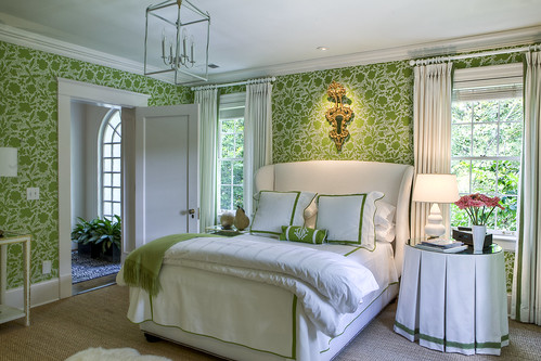 first of all, I got to meet Margaret Bosbyshell, who was the interior designer for the home. I got to go to lunch with her and her daughter. I loved just sitting and talking to them... of course I went on and on about my love for the famous green wallpaper. Thank you again so much for lunch Margaret. I loved meeting you guys.
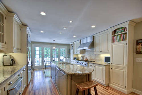
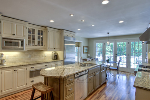
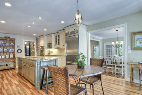
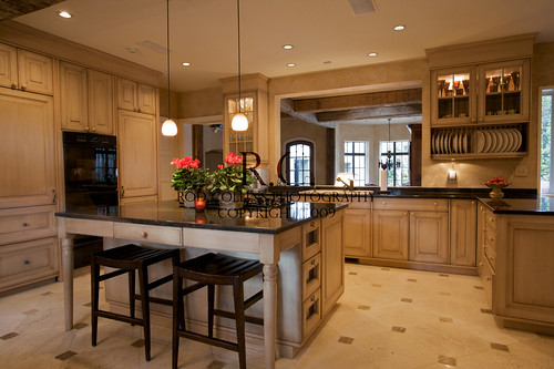
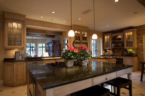
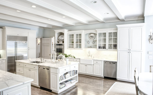 Someone else out there was reading too, and she agreed with me that this is the best looking kitchen she had ever seen, and you know what? SHE BOUGHT THE HOUSE!! (Home was listed by Linda Williams and Neno Schildgen of Beacham & Company)
Can you believe it?? Is that the most amazing blogging story you're ever heard, or what?
Well, it gets better. The lady who was buying the house asked me to lunch. So I got to meet her, and she's amazing! It's like we had been friends for years. We talked about our mutual love for the house, and there was an instant connection.
And the story gets even better. Right after I had lunch with her I had to call architect Duane Stone about a completely unrelated topic, and we started talking about the house. I am not sure if I have mentioned this before, but he did a total renovation of the house. I wasn't sure until I started talking to him what exactly he was responsible for, but it turns out it was a lot. He agreed to meet me and the new homeowner over at the house and walk through it with us. And not only that, but he brought presents!
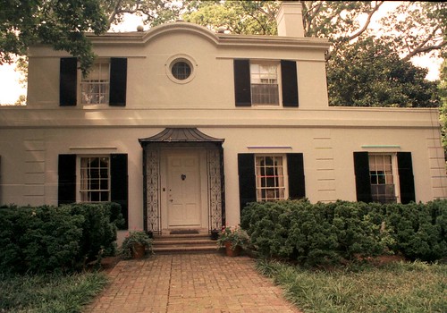 Duane brought pictures of the house before he designed the renovation, and he also brought the plans. I was like a kid in a candy store.
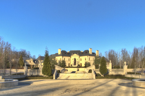
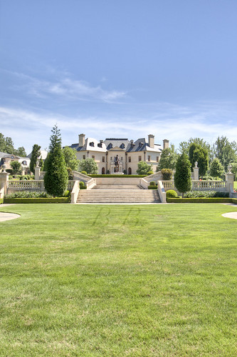
So, for this post I went back through all the pictures of the house I have taken while it's been on the market. Usually when I go shoot a house I take "test pictures" that I never end up using. In this case I actually saved them, so I have a few "undoctored" and never-before-seen pictures of my own I am going to show you just to give you a sense of how much the house has changed.
The above picture shows the front elevation before Duane started working on it. You may notice it's missing the now famous rotunda.
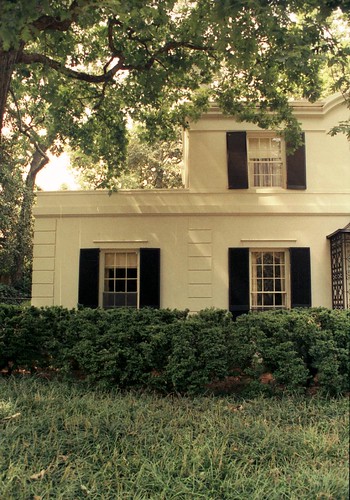 Here is a picture of the side of the front elevation. You can see how they expanded the top level...
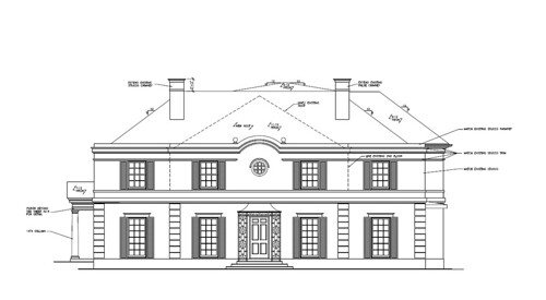 This is the plan of the front elevation as he originally drew it. You can see it does not have the rotunda. It actually kept an entrance similar to the one on the original house, but before they started construction he and Sumter Bradwell (the builder) both thought it needed a little something more.
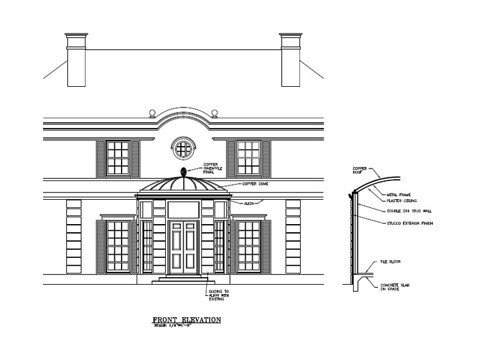 And that's how they created the rotunda! When we were there I noticed that the windows were actually curved, which I had never noticed.
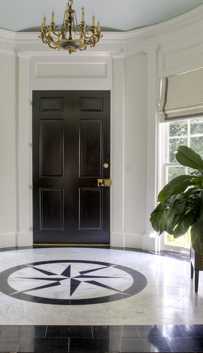

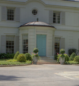
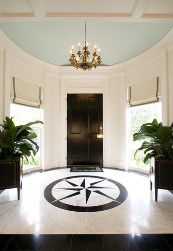 You can see the curved windows in these "test photos."
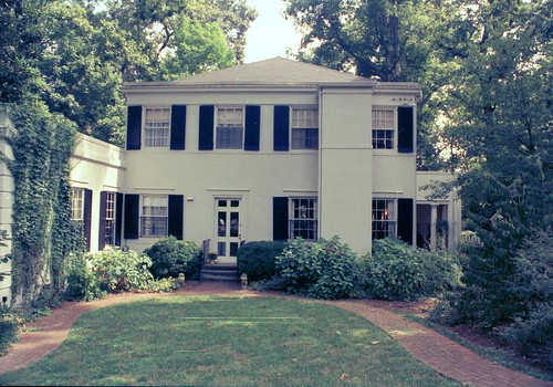 He also showed us the photos of the original back of the house. The thing that looks like a chimney was actually an elevator shaft, which has since been removed.
 This view is of the side of the house.
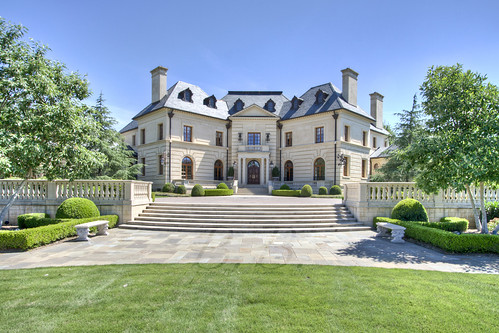
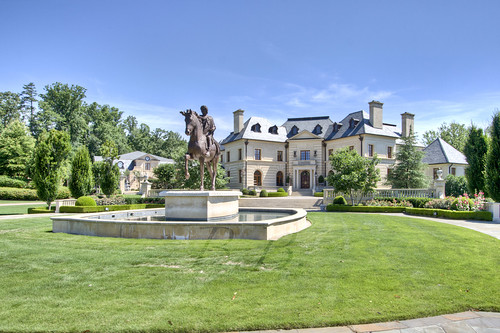
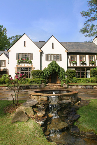
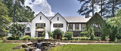
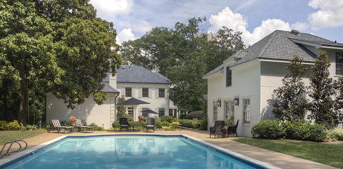 This is a photo of what it looks like now. Can you believe the difference?
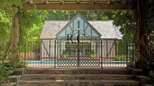
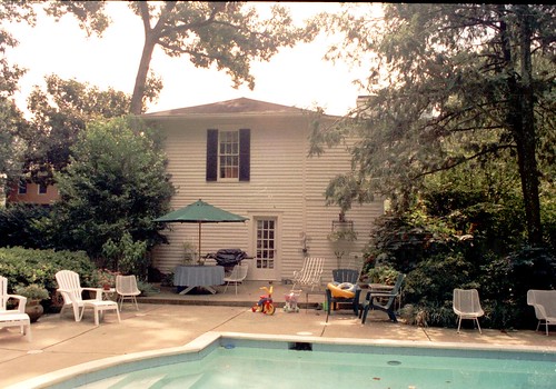 And this is a picture of the garage/guest house before it was renovated.
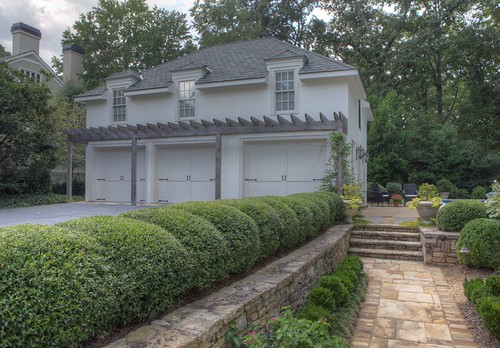 And this is a picture of it now. This picture is from the front and the other picture is from the side, but you can see the improvements.
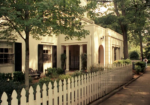 This is a photo of the side porch that leads into what is now the dining room.
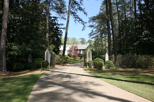
 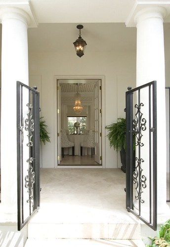 Here is a picture I took of the same area the first time I went to the house. It seems like the gate and columns are the same, but the dining room is all new.
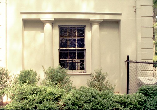 This is the side of the house looking into the dining room before Duane's renovation...
 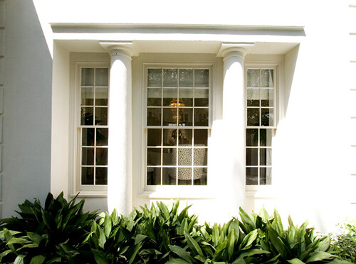 And this is the beautiful window he and Sumter added.
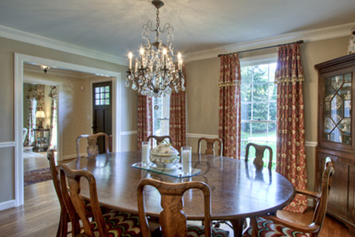
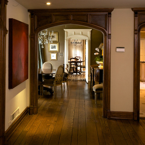
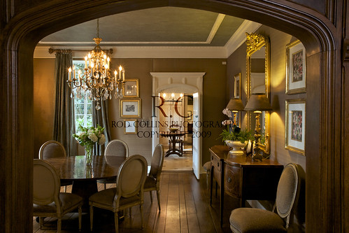
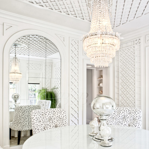 You may recognize the dining room from the cover of "The Beacham Series" a while back. Well, until I met with Duane I thought that the dining room was all Neel Reid. Wrong.
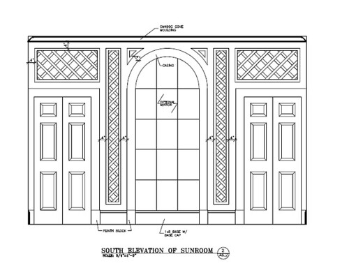 Does this look familiar? With this once piece of paper Duane convinced me he is a genius. He created the room I dream about. This space is always in the back of my mind, setting the bar for architectural elegance and mastery.
 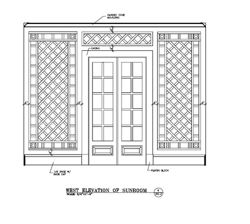 These are the doors we saw above through the columns. Even the drawing is breathtaking.
I want to say a special thank you to new homeowner and for Duane Stone for including me in the meeting. It was better than meeting the author of your favorite book. Duane, you did a masterful job, and to this day it's my favorite home in Atlanta. Congratulations to all!


