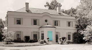
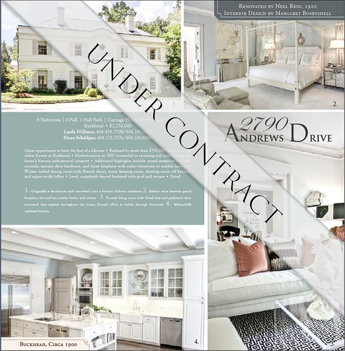
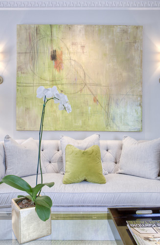
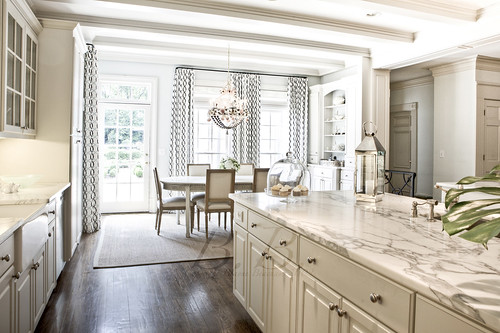
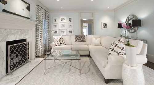
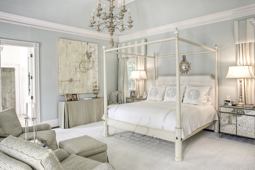
This is the first page of the most recent "Beacham Series."
Does that house look familiar? Guess what? It's back on the market, and it could be yours! This is literally the deal of the century. If I could buy it, believe me, whatever it took, I would!!
Any guesses why it should look familiar?
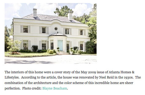
Holly Street from Things that Inspire did a guest post on The Atlanta Homes and Lifestyles Blog called Twenty Beautiful Homes, Take Two, and this house was on the list.
It was also the cover of our Fall 2009 Issue of "The Beacham Series."
Basically, it's one of may favorite homes OF ALL TIME. It is listed with Beacham & Company agents Neno Schildgen and Linda Williams.
Click Here to see the listing.
Built circa 1900
Renovated by Neel Reid in 1920
Interior Design by Margaret Bosbyshell (amazing!)
6 Bedrooms
6 Full, 1 Half Bath
Carriage House above 3-car garage
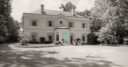
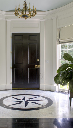
This was the picture we used on the invitation of the magazine release party when it was on the cover. (To read about our most recent release party click here.) I love how the monochromatic feel makes the door pop even more.
Here's some shots inside the rotunda. Can you see the inlaid star in the foyer? I really love the matching paintings that flank the foyer.
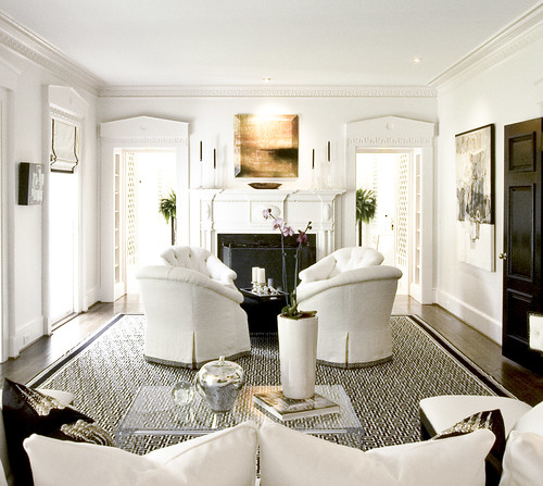
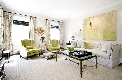
I shot this house twice. During the two shoots they did a little re-mix... It's fun to see how things changed. The first time I shot the living room it looked like this.
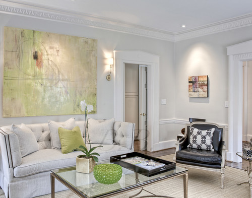
And here it is the most recent time I shot it.
Don't you love seeing one room two ways? This goes to show that everything looks great with beautiful, classic architecture!
This is a detail of the painting above the fireplace. Does anyone know who the painting is by?
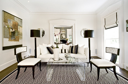
The other side of the living room, taken on my first shoot.
And here it is on the second. Notice the way the Greek Key pattern on the molding is echoed in the pattern on the rug.
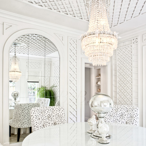
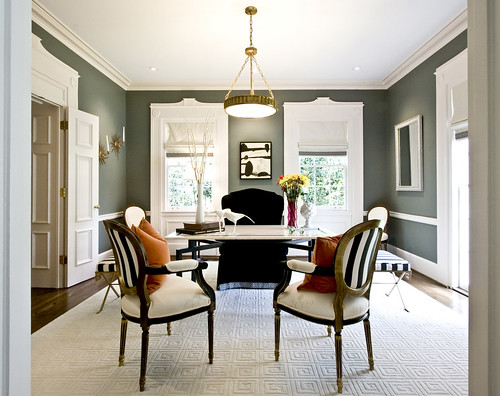
Gasp! Can you believe how beautiful this dining room is? It is right off the living room. You can see the lattice work through the doors of the first pictures of the living room. There are so many things I love about this photograph.
1. Reflections - an almost must have for a strong photograph.
2. Texture and repeating shapes - another must have ... plus, look at the reflection in the mirror of the texture and repeating shapes. Bueno!
3. It's a square picture, but everything is slightly off center, which makes it evenly weighted on both sides without feeling bogged down in the middle. Killer :)
4. The contrast of the black dots on the white chairs make them feel almost 3-D
5. I LOVE that the whole photo could almost be in black and white, but then there is the pop of the green fern... It's the interplay of something so structured and man made with the bright organic living form.
And that my friends, is why is in one of my favorite pictures ever, taken at one of my favorite houses ever!
Would you like to continue on the tour?
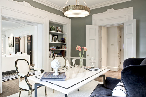
Here is the office the first time I shot it. Do you recognize the orange pillows?
And this was the second time. The sculptural quality of the artichoke against the natural shape of the birds is so strong. Don't you love all the birds in this house? How many have you seen so far? Hint, there are two birds in the dining room picture.
I think this would be considered the drawing room. It is across the hall from the formal living room. This is the first shot...
Second shot.
I believe I've said before that green and white is my favorite color combination, making this my second favorite room in the world (you will see my favorite in just a bit).
This is the view of entering the kitchen from the den. Look at those counter tops. Swoon.
Here it is from the family room. Does anybody know anything about this kitchen? Who did it? I wish they would do mine :)
And a close up of the breakfast area. Can you see the sea shells in the chandelier? What about the curtain pattern? It's funky and classic at the same time.
And of course the family room. I could hang out in here, couldn't you?
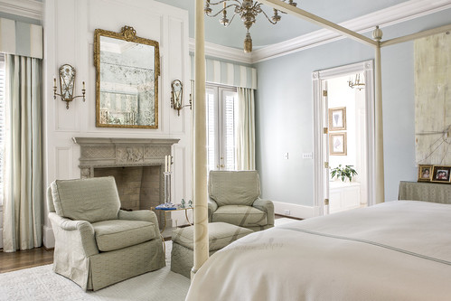
And on to the master bedroom. Amazing, right? Can you imagine getting to sleep in here very night? You'd never have to travel! Does anyone know who did the painting on the wall? Isn't it gorgeous?
This is the master from the other angle. Look at the mirror! It's like it was made to hang there!
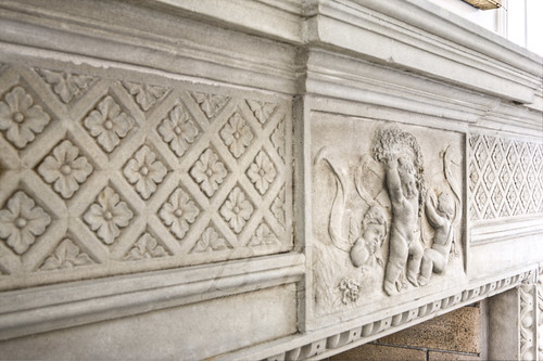
And a close-up of the mantel. Does this look familiar to you? It should :) It's on the banner. Now you know where it came form :) It just screams Neel Reid to me. You?
Let's head upstairs.
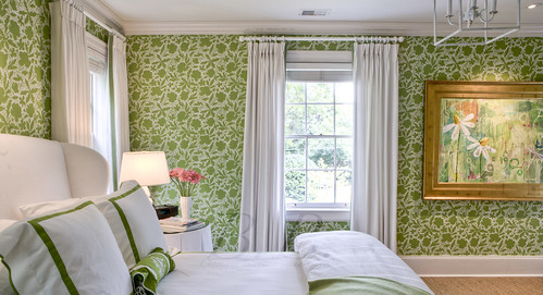
First stop, my all time favorite room. I said I like green and white didn't I? It's so fresh! I might just take a little nap... kidding.
Do you just adore the painting? The gold frame is ideal. (artist?)
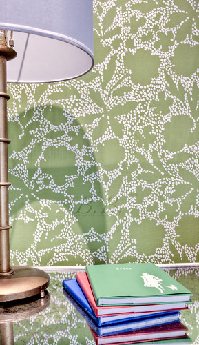
And the little side table!!! I might have to try to find that book just to have a piece of the room.
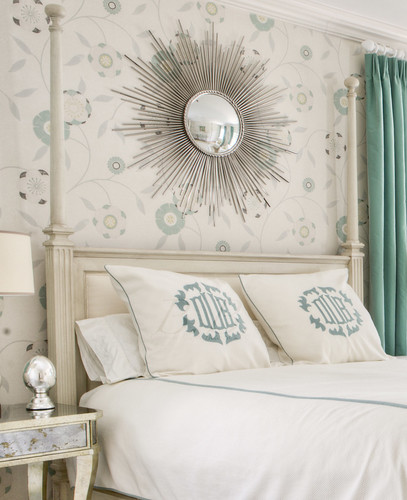
Here is a second upstairs bedroom. What can I say, it's perfect.
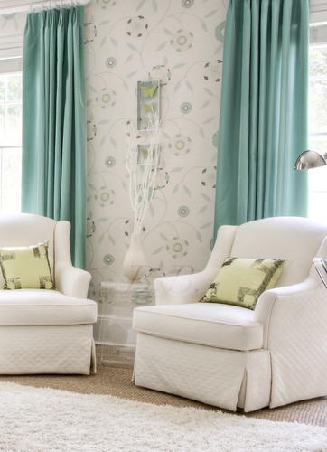
The little sitting area.
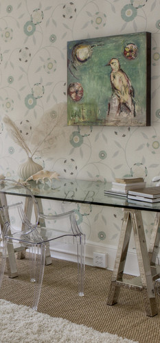
This painting is by my good friend Kenson Thompson (it's a bird, are you counting?). If you don't know Kenson's work you should get to know it. She is literally a genius.
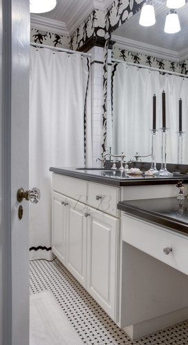
This is the hall bath. The graphic wallpaper and the tile floor make me drool :)
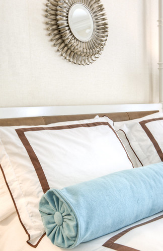
And here is a detail from the other bedroom upstairs. The brown and blue work so well together.
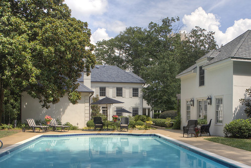
And the secluded back yard. Wanna go for a swim?
See, I told you, it is the best deal in Atlanta Real Estate! When you buy it, will you promise to invite me to all your parties?
Love, Blayne
So, which room would you pick to be YOUR room?
Did you count the birds? How many did you get?
