The Perfect Storm!
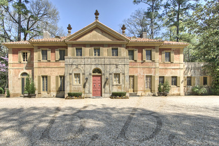
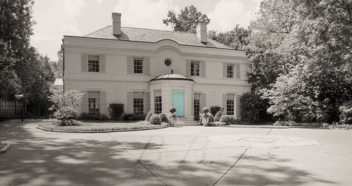
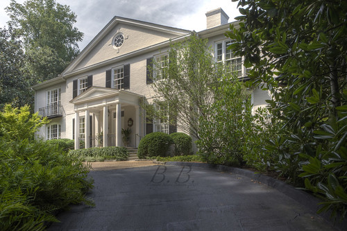
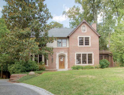
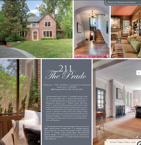
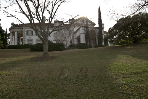
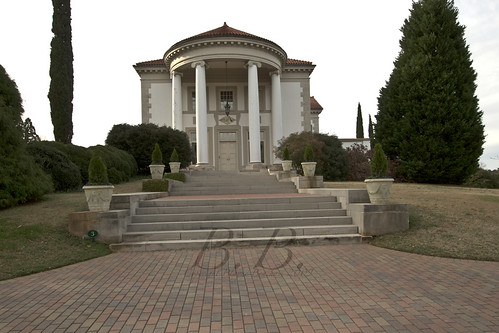
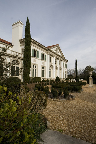
This classic Ansley Park home is truly unique. It was recently listed by Sally George of Beacham & Company, REALTORS. Click here to see the listing. It was built in 1928 and designed by the powerful architectural team of Francis Palmer Smith (1886-1971) and Robert S. Pringle (1883-1937), who are responsible for such classic Atlanta landmarks as...
Photo Source
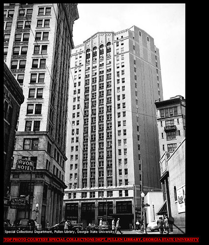
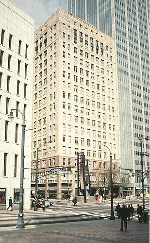
the Rhodes-Haverty Building (Atlanta's tallest skyscraper until 1954) ...
Photo Source
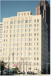
The William Oliver Building (Atlanta's first Art Deco skyscraper),
Photo Source
and the W.W. Orr Doctor's Building (an Atlanta skyscraper at eleven floors)
To read more about this pair and how the helped shape the Atlanta skyline, read this article on the Georgia Encyclopedia
Note: I could not find too much information about Pringle and Smith via Google. I know that there are stores of information out there, but I can't find them! If you know where they are could you point me in that direction?
So, back to the house that's the focus of this post.
211 The Prado
Year Built: 1928
Architects: Pringle & Smith
Interior Design: John Oetgen
Bedrooms: 3
Bathrooms: 3 Full, 1 Half
The first time I went to the house was this summer to shoot it for "The Beacham Series" Fall 2009 edition.
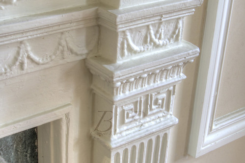
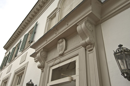
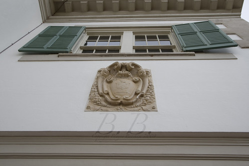
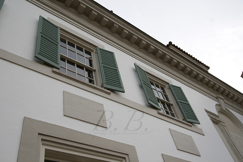
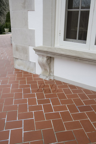
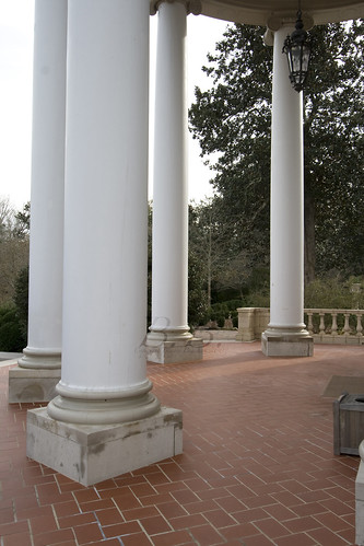
I knew then that John Oetgen was the designer, but he had not finished. Since I walked into a work in progress, I was less concerned with the design and more focused on the architecture. The owner told me about how thy restored the home, and how many of the architecture details were original. Some are even signed and numbered on the back by the original construction team! (Things like that make me very excited). I was so impressed with the care they used in restoring it. The pictures I took for that shoot reflect my awe over the architecture. I am going to put up some larger pictures, so hopefully you can see the details.
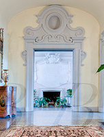
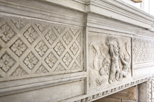
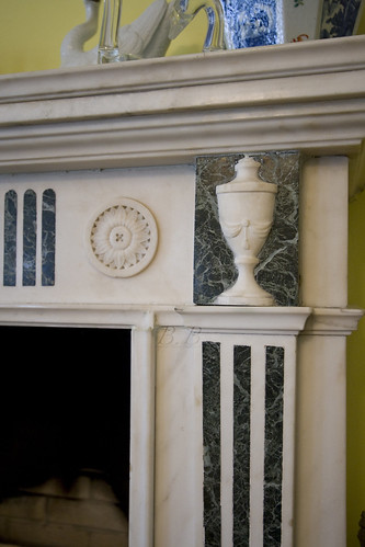
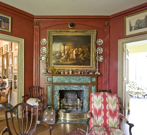
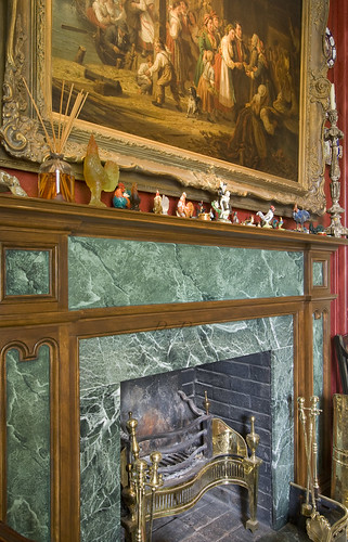
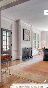
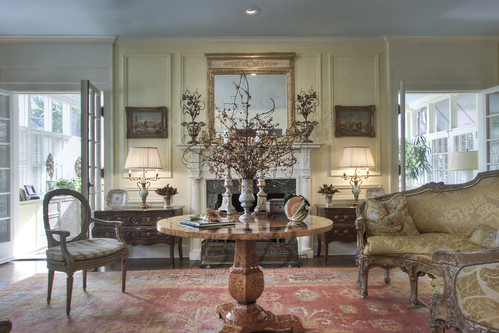
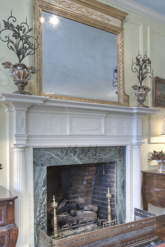
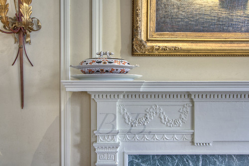
This lines of this mantel are so clean and fabulous.
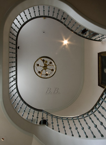
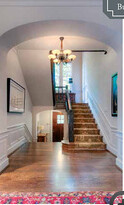
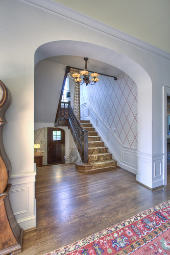
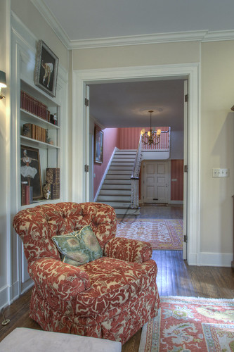
Look at that archway. I think this staircase looks a lot like some I have seen in Neel Reid homes. This one particularly (also listed by Sally George).
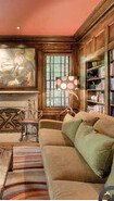
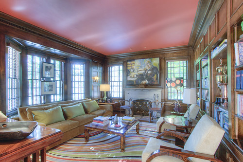
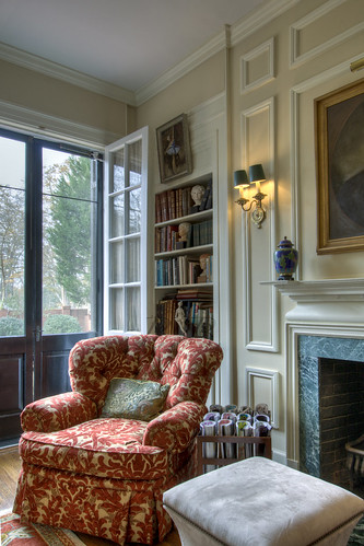
Study with one of the most beautifully carved mantels I have seen.
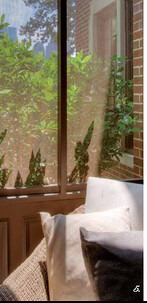
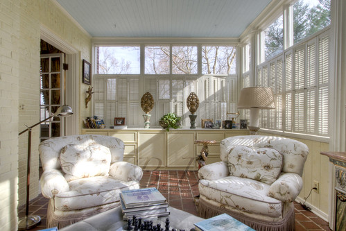
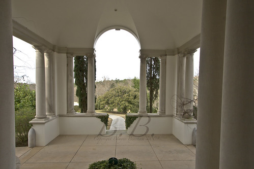
Porch framing Midtown views.
...
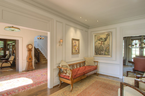
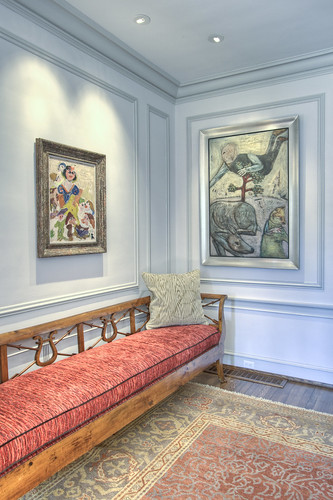
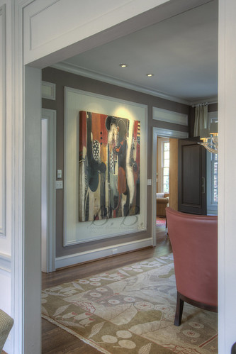
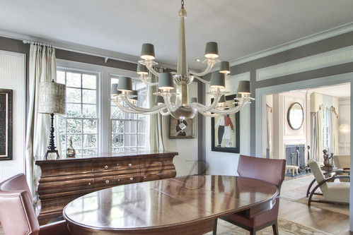
On Tuesday I went back to shoot the finished product. I was literally blown away. John Oetgen finished, and it is amazing. I think what makes it so amazing is the classic architecture juxtaposed with such modern design. The tension between those two creates something truly breathtaking. Just like icing on the cake, the homeowners have phenomenal art. YOU KNOW I LOVE GREAT ART! The homeowners are involved in Mason Murer Fine Art, and it looks to me like a lot of the art came from there, but I am not totally sure about that. (again, I would love more information about that) It's amazing anyway! Something about striking art placed within the context of classic architecture makes it even better. Get ready for an amazing tour. I know many of you like to know the floor plan, so I am going to try and show the photos and explain them in a way that demonstrates that.
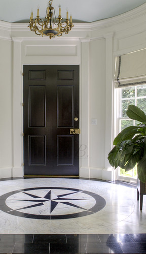
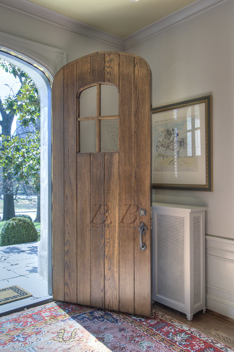
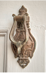
Detail shot of the front door. Arch, which has been repeated in the window... low doorknob... no knocker. All things I love.
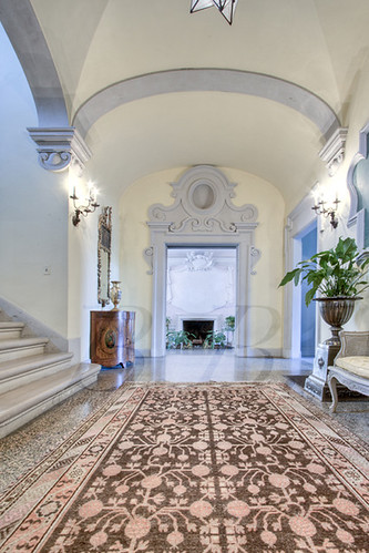
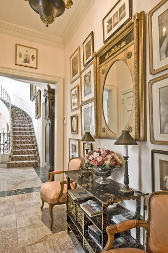
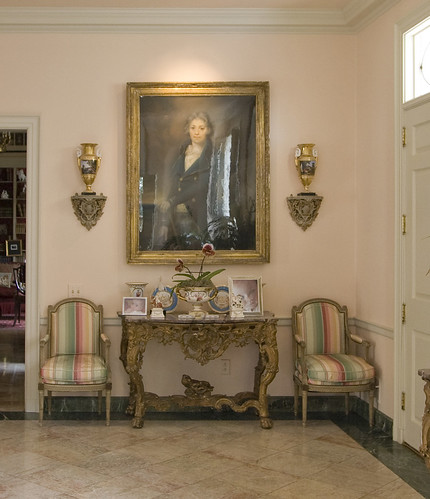
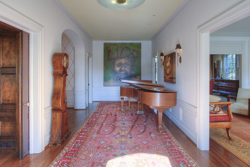
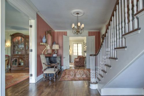
Foyer shot walking through the front door. Study is through the first door on the left. Stairs to upstairs through second arched doorway on the left. Kitchen through third doorway on left. Pantry area and keeping room behind the wall with the green painting. Living room through first doorway on the right, and the dining room is through the second doorway on the right.
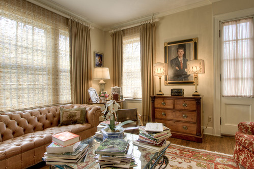
Study. for those of you who want to see a transformation, scroll back up to the original study picture. Wow! Also, I know this artist! It's Steve Penley! In addition to flowers, presidents and a host of other items, Steve is famous for his scenes at UGA, especially the arch. We alumni love him.
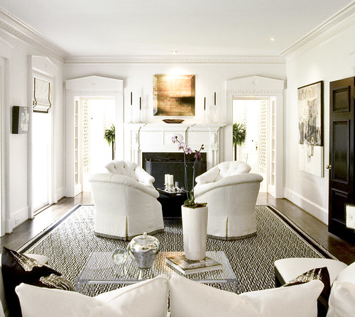
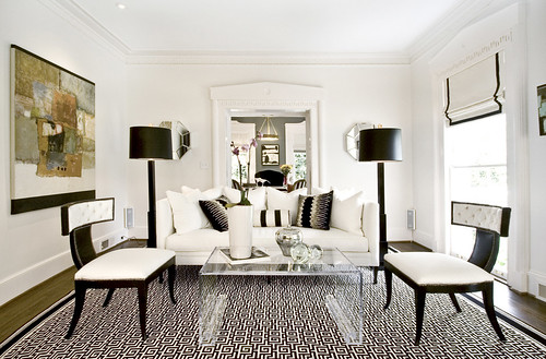
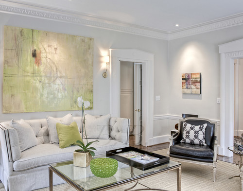
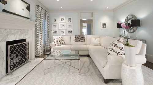
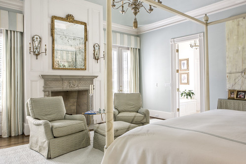
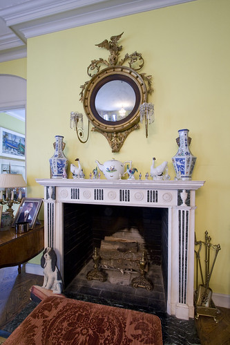
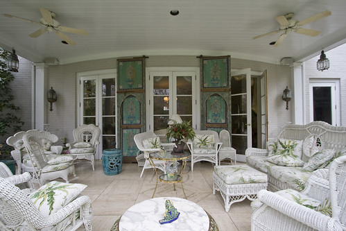
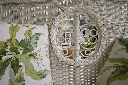
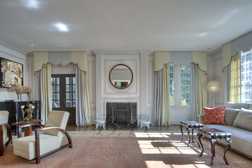
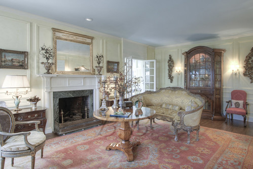
Ok, here is the living room, which is across the hall from the study. There is a screened-in porch through the doors on the left. Again, scroll back up to the mantel in the before section, and look how much better it looks with the circular mirror.
Living room detail looking out the front of the house.
And here we are turned the other way... Do you know where you are now? (Don't forget to keep an eye on the molding)
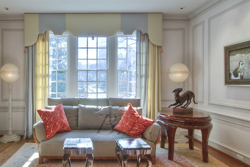
And a detail shot. I am thinking this might be my favorite shot of this house, but I am not sure. (I have a few others I will mention as well).
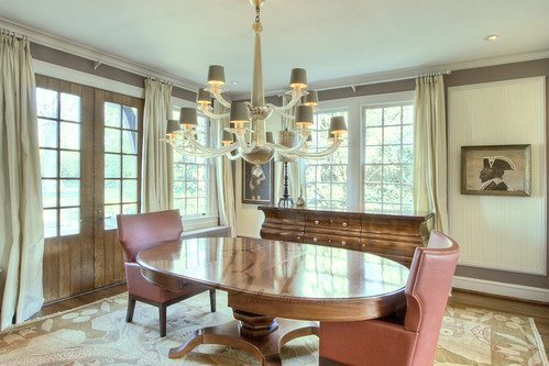
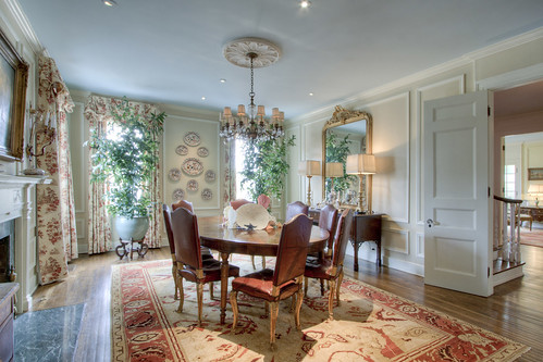
This is a view from the living room into the dining room. You can see the keeping room just beyond on the right.
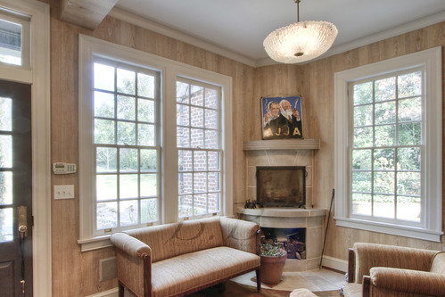
View from the keeping room.
And from this view you can see the doors, which are beautiful. They open to a patio with a huge fireplace.
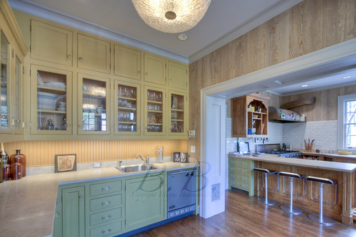
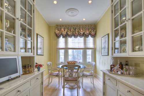
So this is the view when you walk through the dining room. Isn't the color of these cabinets great. If you turned 90 degrees to the right you would see the keeping room...
Great fireplace, right?
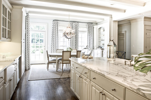
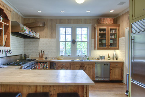
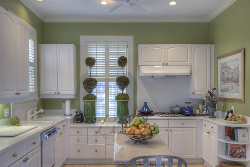
And here is the kitchen. Love the subway tile and the hood. Obviously a place for some serious cooking, so sign me up. I am jealous of the cookbook storage. There is a laundry in that door to the right that you can just see...
Now we head upstairs...
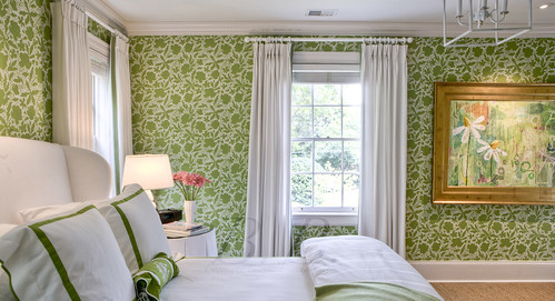
So, I feel like this wallpaper was just an excellent choice. I mentioned earlier how fond (understatement) I was of this staircase. This wallpaper is so great because of the transition it created between the decor downstairs and up. To me, the downstairs is more refined and elegant, while the upstairs is just plain fun and fabulous (Carrie Bradshaw flashback).
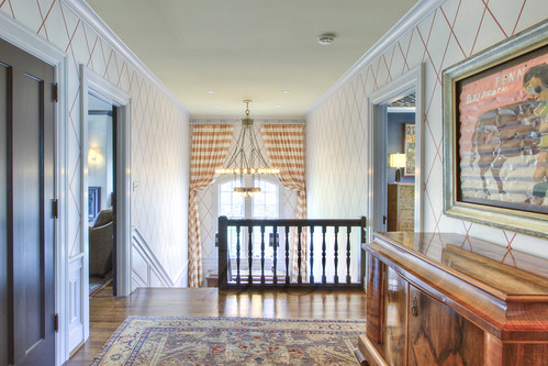
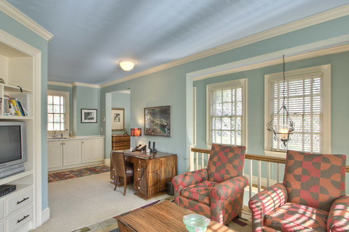
So here we are in the upper foyer. Layout: room with fireplace and awesome red chair is to the left, room with the best ceiling I have ever seen (you'll see) is to the right. Master office/sitting room to my back right and master bedroom to my back left. Oh yea, that chandelier is... I am out of good words... beautiful, amazing, perfect... take your pick.
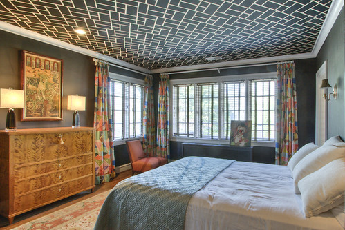
Here we are in the room with the best ceiling ever. No explanation needed.
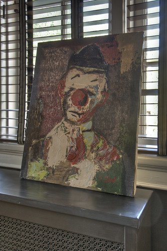
And the detail shot... I actually love this both as a painting, and as a photograph of a painting. I like the detail in the radiator (I think that's what it is) and the window treatment.
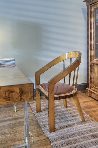
Here is a little detail shot of the master office. It is actually a large room, but I took this so I could remember the rug. It is straps of leather that run horizontally, and they are held together with metal rods running through them vertically. Hope I didn't confuse you :)
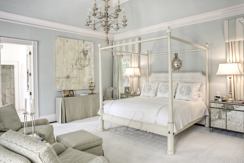
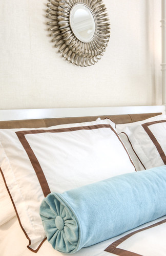
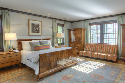
And here we are in the master! Look at the walls! I can't even describe them, but I think they are some type of faux leather (I mean, I don't know, it might be real! or it might not even be leather at all... I'm just a photographer, what do I know?)
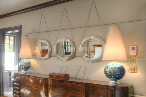
This is what you would have seen if you turned just a little to the right. Those mirrors almost seem nautical to me.
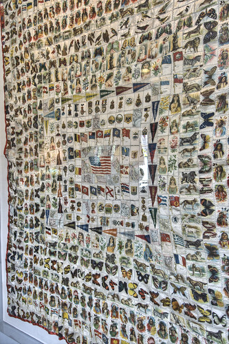
This quilt was behind my back when I took both of those pictures, but it was so beautiful I couldn't resist showing it.
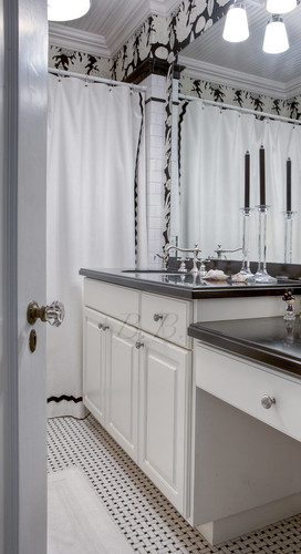
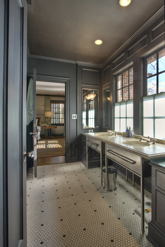
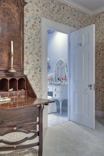
This is the master bath looking into the master from the room with the awesome red chair (see below). This is my second picture in the running as possibly my favorite. I like the geometric pattern of the tile and the reflections in the surfaces. There is one more, so stay tuned!
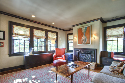
Finally, the famed red chair. Was I right, or was I right? It's awesome! Of course, I like the rest of the room too.
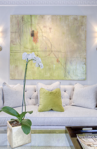
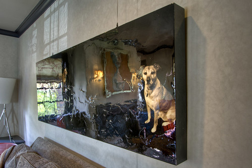
This is a piece hanging behind the sofa. Does anyone know the artist? It is one of my top 10 favorites of all time. Not to be strange, but this is my third option for a favorite photograph. Ii it a little awkward when you take a picture of someone's art. The focus is supposed to be their art, not yours. I absolutely respect that, and would never try to claim any of the glory, but I do love the photograph. I love the way it is situated within the frame. I love how clear the dog is, but my very very favorite part is that you can see the rest of the room reflected. You can see the window on the left side of the piece, and then you see the light streaming in right above it. Sorry to get off track.
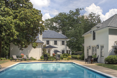
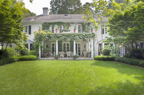
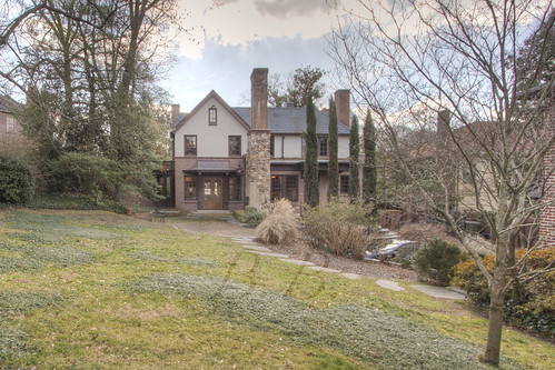
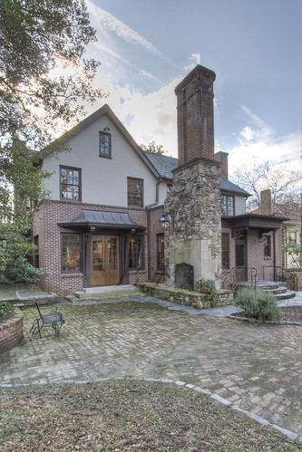
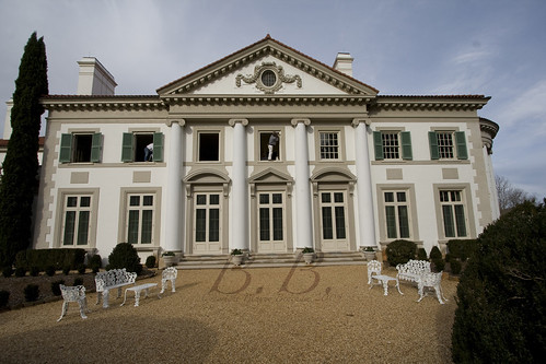
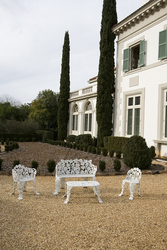
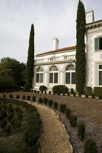
Here is the back of the home. The homeowner told me that where I was standing was actually part of the battlefield of Peachtree Battle. If I got this wrong I'm sorry. I think I remember his saying that!
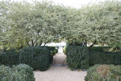
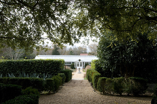
There is a guesthouse to the right. You can just see the brick corner.
Here is a picture from the living room of the guest house. It is great too!
And finally we end back at the patio and the stately fireplace. I could sit there for hours.
I hope you all enjoyed the tour of this home. I'd love to stay and chat more, but I am going to an opening at Huff Harrington Fine Art tonight, and I am very excited. Did you know? They started a blog! I can't wait to start reading it! See you next week :)
-Blayne
