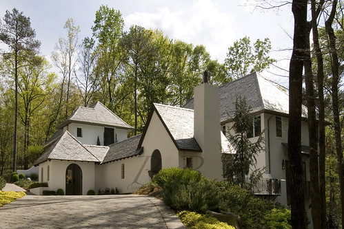
As many of you who read this blog regularly know, I am a huge fan of Keith Summerour's. Click here to see the post. The earlier post gives some background information on this amazing architect. He designed many of my favorite homes in Atlanta, including this Glennis Beacham listings.
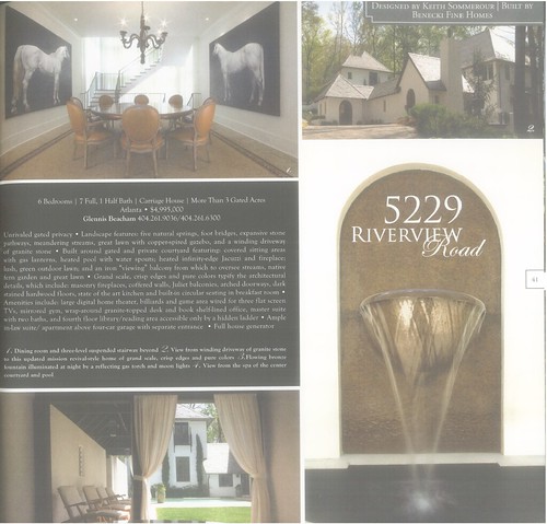
5229 Riverview Road
Architect: Keith Summerour
Builder: Benecki Fine Homes
Landscape Architect: Joe Gayle
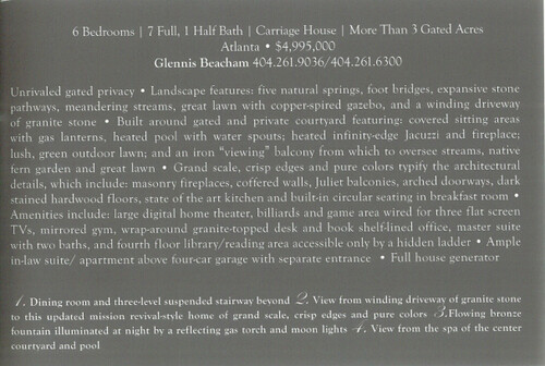
6 Bedrooms
7 Full, 1 Half Bath
Carriage House
More Than 3 Gated Acres
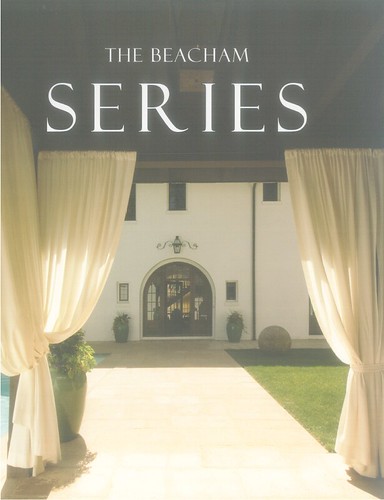
It has been featured on the cover of "The Beacham Series."
After listening to The Skirted Roundtable podcast the other day when they interviewed Grant K. Gibson, I got inspired to to interview someone myself. I wrote Keith Summerour an e-mail and asked him some questions about the house. He was so kind to respond.
Blayne: Since I do not have a background in architecture, it is sometimes hard for me to figure out exactly what style a house is. I have gone back and forth with this particular style, because I feel like it is something more than just “European.” I have settled on mission revival style. Am I close?
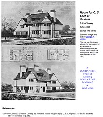
Keith:"The style is English, influenced by the work of Charles Voysey. He was an English Architect and furniture designer who also designed wall papers and fabrics."
Don't worry guys, I went ahead and did the research for you...
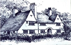
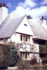
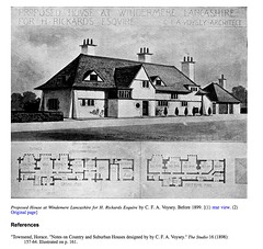
According to Wikipedia, Charles Francis Annesley Voysey (1857–1941) was an English architect and furniture and textile designer. Voysey's early work was as a designer of wallpapers, fabrics and furnishings in a simple Arts and Crafts style, but he is renowned as the architect of a number of notable country houses. He was one of the first people to understand and appreciate the significance of industrial design. He has been considered one of the pioneers of Modern Architecture, a notion which he rejected. His English domestic architecture draws heavily on vernacular rather than academic tradition, influenced by the ideas of Herbert Tudor Buckland (1869–1951) and Augustus Welby Northmore Pugin (1812–1852). Voysey designed every detail of his houses, including the furniture. His houses were inspired by English vernacular sources of the 16th and early 17th centuries, featuring white roughcast walls with horizontal ribbon windows and huge pitched roofs, and used rough plaster, slate and other materials typical of English farmhouses.
Here are some example of Voysey's work...
I can absolutely see the influence! Can't you? I think the very first picture is the best match to 5229 Riverview. What do you think?
Back to the interview...
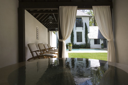
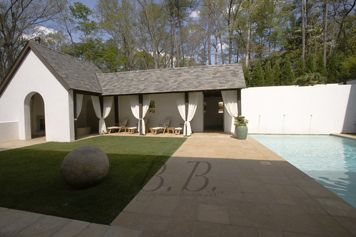
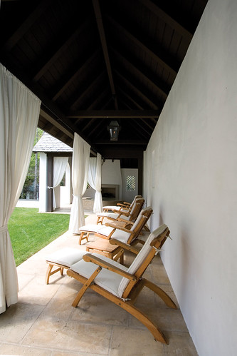
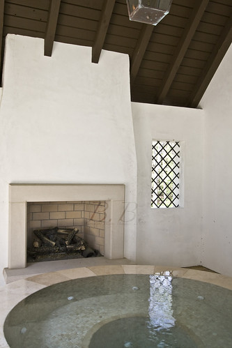
Blayne:What was your inspiration for the courtyard in front of the home? I am not sure I have ever been inside a home where I have to walk by the pool to the front door. I love it! It’s such a secluded space, and the spa area with the fireplace is just amazing. Have you done that on any of your other homes?
Kieth: "I am not sure where the idea for the pool came from, it was the only place for a pool on the property so I thought that the intimacy of the water seemed the right thing to do."
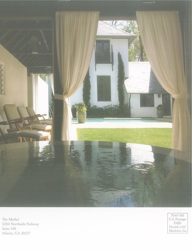
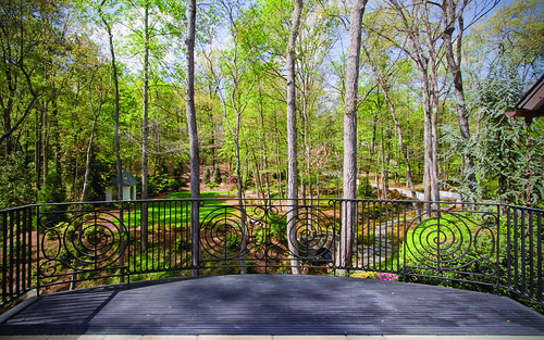
I absolutely agree with his decision. This pool area is so private, and it really sets the scene and mood as you walk into the home. Here is the view from the pool courtyard.
I could look out at that, couldn't you?
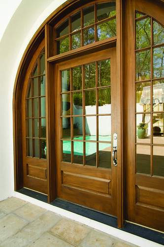
Blayne:The front door of this home is amazing. I noticed it is very similar to the doors you used in your personal home featured in Garden and Gun. Are the doors the same?
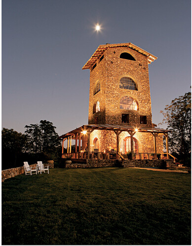
Keith: "The doors are the same as the ones I used at my tower."
Here is a picture of Keith's tower from the Garden and Gun article...
And here is a photo of the door from Riverview Road.
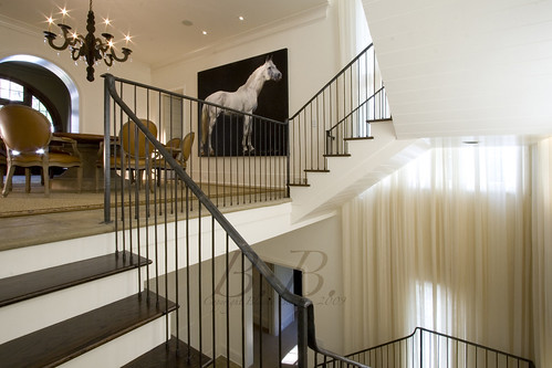
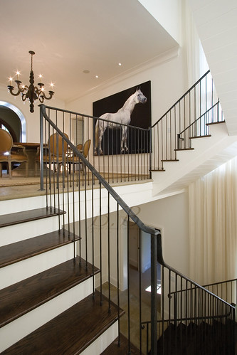
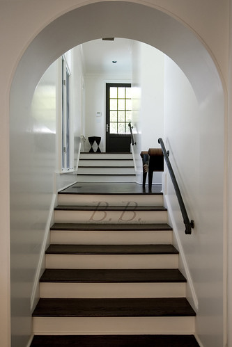
Blayne:Every time I write about this house I lead with the stairway. Even though I try to change it up, I always settle with something like, “the three-level, wrought iron suspended stairway is truly the heart of this home.” It is! Did you design the rest of the home around this central staircase.
Keith:"I did design the home around that stair case. It was the core idea and it actually made the house efficient to layout."
I just want to say thank you to Keith Summerour one more time! I really appreciate you taking the time to answer the questions.
Before I leave you guys, I wanted to give you a quick tour through the rest of the home.
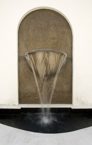
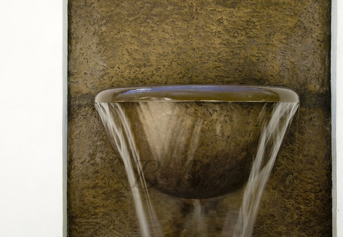
This is the Bronze fountain you see before you walk into the courtyard.
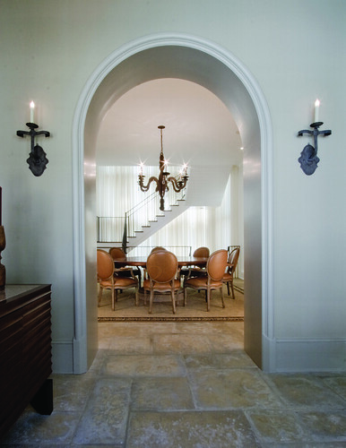
This is the view walking through the front door. You can see the dining room through the doors and then the staircase beyond.
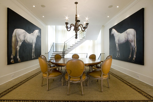
Dining Room. You could go to the right here and go into the formal living room, or take a left and go into the family room and kitchen.
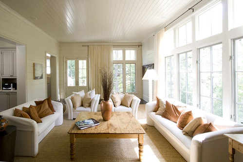
The family room.
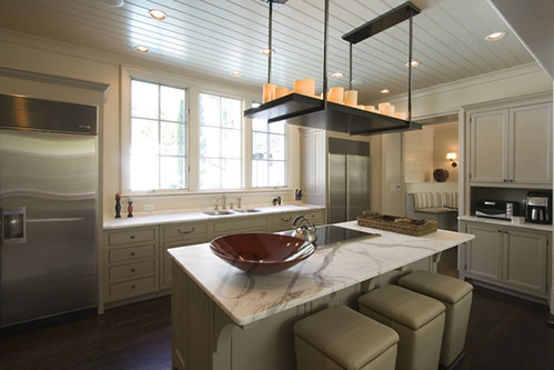
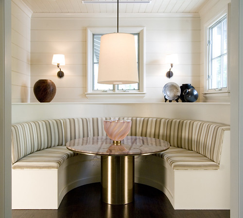
And the kitchen. You can see the breakfast room through the kitchen.
If you took a left you would go down the back hall.
There is an office space directly to the left of where I'm standing, and a guest room to the right.
Guest Room.
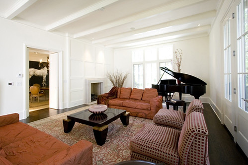
Let's go back to the Living Room.
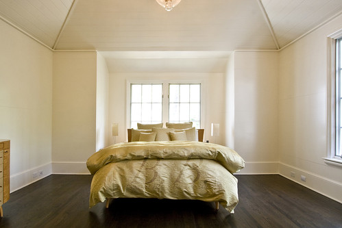
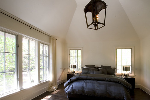
And finally we will go up and see the master.
Now back outside...
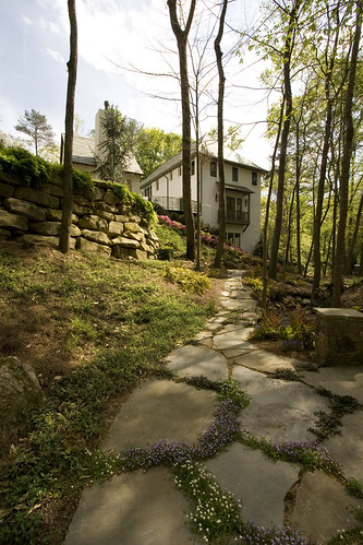
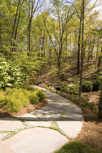
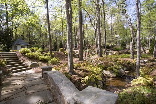
Joe Gayle did an unbelievable job on the landscape architecture. Hope you enjoyed the tour through the home!
Please be sure to check out Keith Summerour's book.
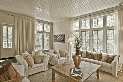
For those of you interested in the photography aspect, these images were not taken with HDR. If you go back to my last post and look at the images, can you tell a difference?
Question, did you enjoy the interview? Did you think it helped you understand the house? What questions would you have asked? Is this a feature we should try again?

