This is another of my all time favorite houses in Atlanta... one day I am going to have to do a list of them :) Anyway, I have driven by this house a thousand times, and every time I do I slow down a little as I pass. 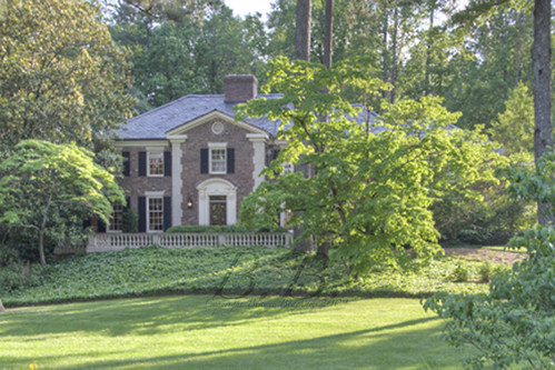 This home represents historic Atlanta, with the gracious Southern porch and doorway, and the warm brick. It's located in one of the best family neighborhoods in Atlanta, Kingswood.
This home is listed by Nan Haverty of Beacham & Company, REALTORS. Click Here to see the listing.
Year Built 1963 5 Bedrooms 5 Full, 2 Half Baths Over an Acre Lot
This is the first house I've ever shot for Nan, and all I knew was that it was on Foxcroft. As I drove down the street looking for the right house, I saw this house at the end of the street. As I contemplated whether or not to drive by it before or after I met Nan, I realized IT WAS THE HOUSE I WAS GOING TO SHOOT! Slightly panicked, I ran up to the front door, met the homeowner, and blurted out, "I love your house! I have been obsessed with it forever!" Maybe too much? :)
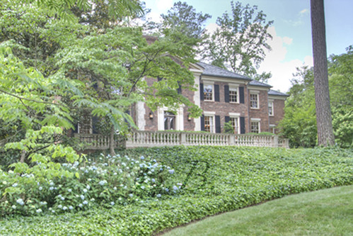 Nan told me that the house was renovated by Ketih Summerour, and I think you all know how I feel about his work (love).
 Keith renovated the home in his signature clean-lined, classically finished-style. The homeowner decorated the home herself, and Nan offered suggestions about the best way to present/market the home. This is one of Nan's special services as an agent. She comes from a design background, has an incredible eye, and is able to make easy and affordable suggestions to her clients. Wait until you see her work in the master bedroom.
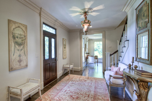
So, this is the foyer. The front door with the leaded glass detailing is classic and beautiful. If you walk through the door in front of you, you would be in the formal living room. If you turned around 180 degrees you would be looking into the dining room.
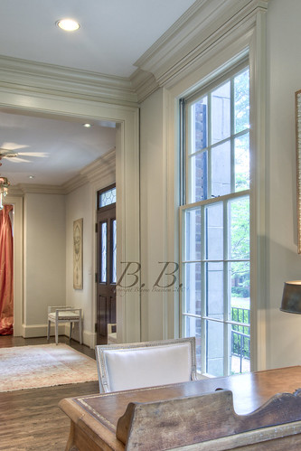 Here is a photo from the desk in the formal living room looking back through the foyer and into the dining room. I love how the rug picks up all the hues in the floor, and then it echoes those Nectarine curtains in the dining room.
Note: Nan told me that the same paint color was used throughout the main level. It's such a great color. It seems to pick up the attributes in each room, and sort of mirrors them in a way.
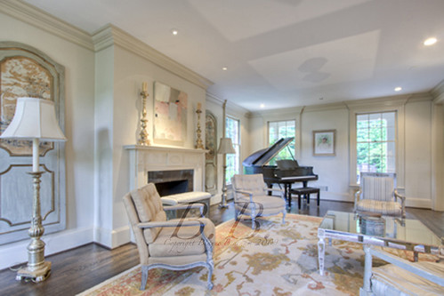 Here we are in the formal living room. The window size is really something to notice here. They are larger than most windows, which allows for plenty of light in both the morning and afternoon.
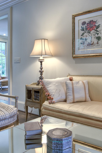 Detail shot of the table and sofa. The pinks and golds mix so well together. The doorway at the back of the photo leads through to the family room.
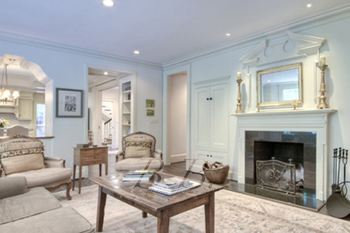 Here is the family room with the pass through window to the breakfast area.
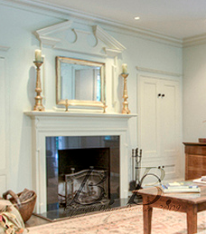
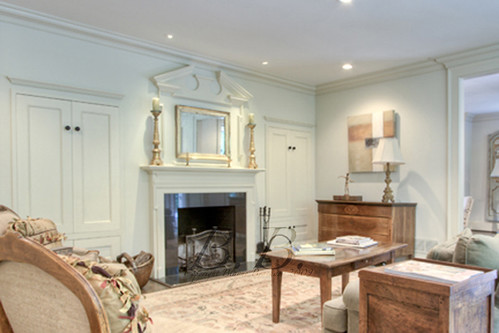 See how the paint here seems much more yellow than is did in the other two rooms? I love the fireplace here and the mix of the elegant marble and mantel with the rustic furniture.
If you turned a little to the right you would see this...
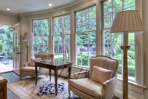 Two things to notice here, the wall of windows along the back, and the dark stained wood floors, something very characteristic of Keith.
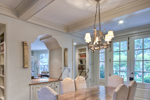 Here is the breakfast area. Doesn't the paint seem almost like a taupe with a little pit of light pink?
See those little bookcases built into the hallway? That's something you don't think about a lot, but it's the mark of a well-designed/built home. I never thought about them before Glennis put them into her personal home, but now I see them from time to time and always think about what a great idea they are. You may have seen them before in the dining room/cover shot from this home.
 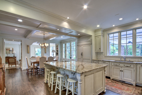 How amazing is this kitchen? The finishes are so clean and neutral!
So, if you turned around 180 degrease, you would see the stairs to your left and the back hall/office/mudroom to the right.
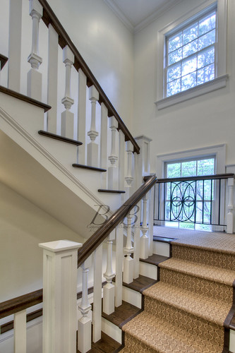 My favorite thing about these stairs is that the middle window on the landing actually passes through the landing, so you can see the other half of it as you go to the terrace level. I also really love that the iron detailing echoes the pattern of the leaded windows in the front door and door surround.
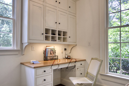 This is the desk in the back hall.
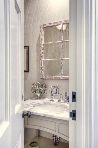 And the elegant powder room in the back hall.
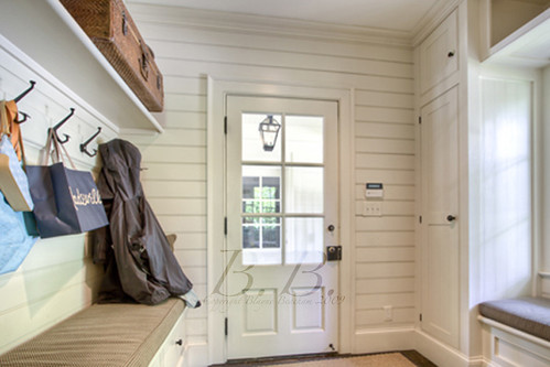 And the back entrance with the coat rack and the window seat.
Now we are going to circle back around to see the dining room, which connects the foyer and the kitchen.
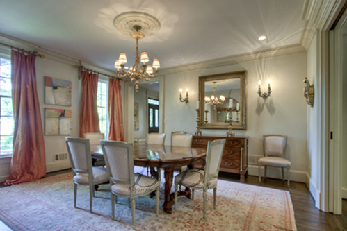 Isn't it beautiful?
 This photo gives a good idea of the home's floorplan.
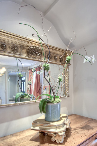 This is the niche on the left side of the dining room. You can see in the top of the photo that the niche is the same shape as the window between the breakfast area and the family room.
Want to go upstairs and see the master bedroom transformation?
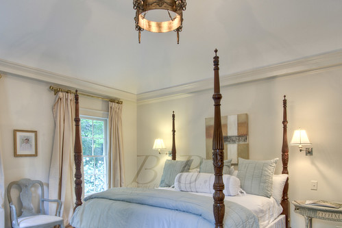 Here is the master bedroom the first time I went to the house. I think it looks beautiful, but Nan had a different vision for the room.
 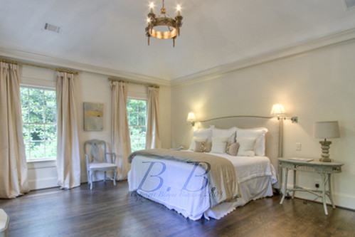 According to Nan, "As a realtor, I advised the sellers to let me stage the home, in particular the master, as it was such a fabulous room and she had used furniture she had from another style home. We did it in a budget. We bought the neutral headboard at Havertys and the linens on the bed at Linens and Things. I wanted the room to have a warm, elegant feel, as the ceilings are high and the space is large. We also pulled up the rug, which was heavy in color, and once it was removed and the beautiful hardwoods were available to the eye, it totally transformed the room all was done for about 1500."
Can you believe how much the larger the room looks? I was blown away. Are you?
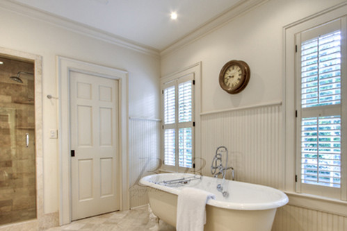 Master bath. Excellent, right?
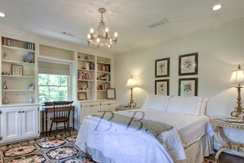 This is the guest room. Look how beautiful the fixture and the built-ins are. I think Nan is planning on doing a make over in this room as well, so we will have to check back.
Now to the terrace level...
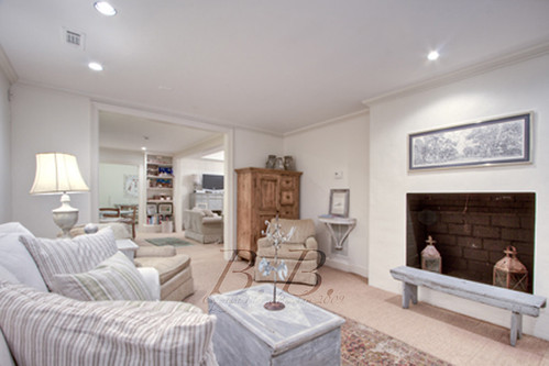 How great is the fireplace? There is also a gym and a guest suite on the terrace level.
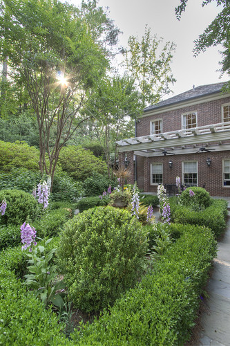 Now we are in the back formal garden. The master suite is above the covered eating area.
 This window door leads into the kitchen/breakfast area.
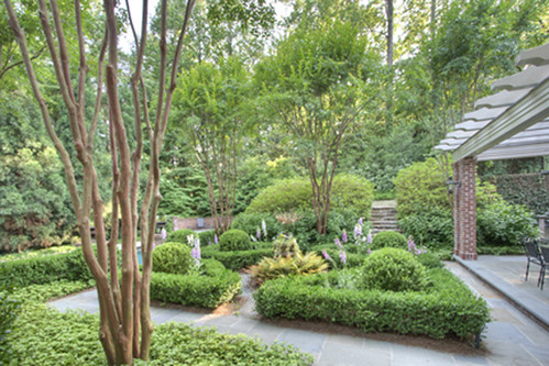
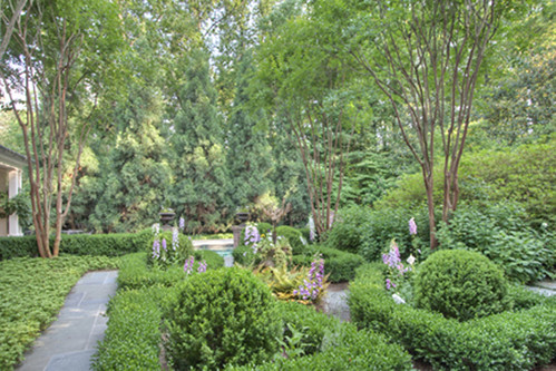
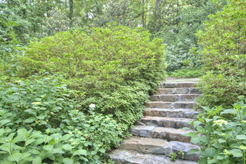 This path leads to the upper yard.
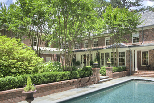 Back of the home.
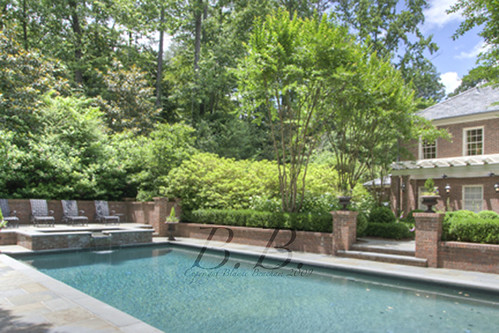
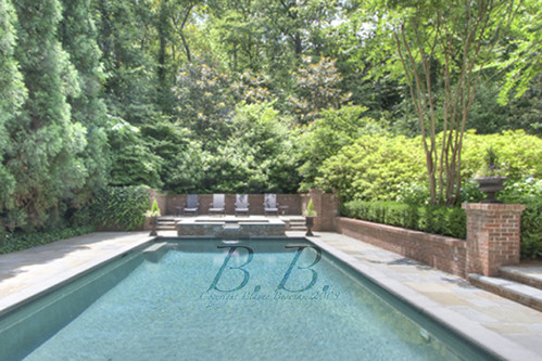
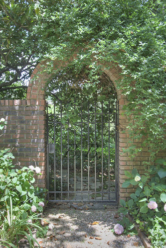 This gate is in the lower yard, and it leads to this path, which goes along the stream in the front of the house.
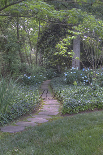
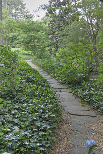
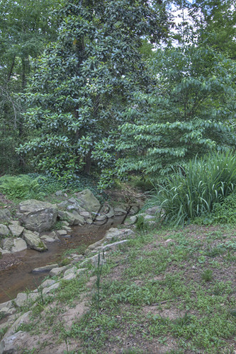 So, what do you guys think? What did you think about the paint color, the mater bedroom redesign, the grounds?
You guys will not believe the giveaway that starts in a week or two! It's worth $1200 and something every woman will want!
Two words, black pearls.
You may want to sign up to get this blog delivered to your e-mail so you don't miss it!
