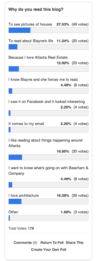
Fine. I heard you. You like houses :)
 The results of the poll are in, and the results are STAGGERING. #joke. Thank you to my sweet friends who read because I force you. Hey, I do nice things for you, too!
 You said that you would like to see more houses, interior design and architecture on this blog. LESS Blayne, MORE houses!! Well here you go! :) (It's ok, I know you still love me.)
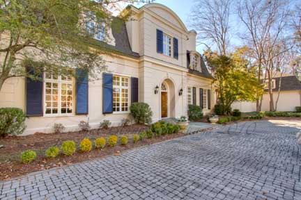
 Nan Haverty, a top agent with Beacham & Company, has 3224 Paces Bend Court listed (Architect: Norman Askins). I shot this home a few months ago when it was empty. It has a great shell... or what agents call, "great bones," but it was hard to imagine what it would look like with someone living there. The interiors feel really Country French to me. The entry way is imported tile and the wood throughout the home is also imported. Nan asked her friend/client Barbara Culbreath, who is world renowned designer and antique dealer, to stage the home. Barbara used modern/artistic/handsome furniture and art. It creates an amazing juxtaposition to the traditional interiors.
-Study-
Here is the library/study the first time I shot it. It looks so big and empty, and the chairs are dwarfed by the ceiling height and space in the center of the room.
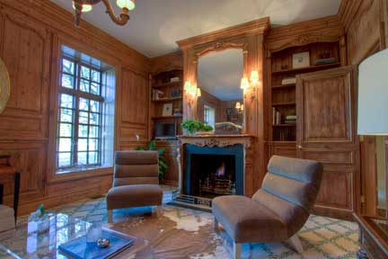
 Here it is now. Can you believe the difference? The rug is the same, but she laid down an animal skin rug on top of it to break it up a bit. I love the sofa moved to the center of the room. It feels so much more cozy. The bookshelves were arranged and the large armoir moved. The acrylic table seemed to disappear in the room before, but now it adds a cool contemporary feel to the warm furnishings. It also looks as if sconces were added above the fireplace, which brings in a lot of warm light.
Here we have the dining room when I first saw it. There are the imported tile floors I was telling you about. I really like them, but maybe some people would have a hard time imagining what a dining room could look like with brick/tile floors.
Here it is now. It looks so much better. The large scale of the artwork is perfect. I also really like the round table in the square room. It breaks it up and makes it feel livable. I'm also glad she moved the fireplace screen... I don't know why. I just am. I don't have anything against fireplace screens or anything... who knows.
-Living Room-
Here is the before living room.
Here is an overview of what it looks like now. Things to notice: that rockin' table in the middle of the room serves to break the room into two halves, and the herringbone pattern floor is visible now that the rug was lifted.
Love... especially that flying dragon piece of art in front of the window.
That's a great piece of art. Note: when staging a house or trying to make it feel more "finished," ORCHIDS ARE A MUST. Tattoo that to your forearm if you like, but don't forget it. Very important. Hydrangeas also help.
-Kitchen-
The first thing I notice about this before picture is the wallpaper. While, yes, wallpaper is coming back in style, this type of wallpaper is not. It's all I can look at. Very Dorothy from the Wizard of OZ. Don't act like you son't know what I'm talking about.
Check it out! No wallpaper. See what painting your home neutral can do. I think that's the number one piece of advice agents give clients when asked what people can do to get their house ready for the market. Paint your house neutral! See what a difference it makes?
-Breakfast/Family Room-
Here is is. Again... wallpaper is really all I can see... well, wallpaper and that AWESOME fireplace!
And here you go. How much better does this look? Neutral walls? Check. Great art? Check. The circular table helps also. The white table cloth does a lot to soften the space. She also ditched the tv on the stand, which is always a plus. Have a tv? We all do. Want to sell your house? Hide it.
Here is a close up of the Family room. I just adore this space. That sofa is incredible. I've never really thought of not having arms on a sofa, but this one doesn't have them and I like it! Also, the architectural qualities of that fireplace are superb. I love that they went with white and not brick. Brick would have been too heavy.
-Master-
The master bedroom is my favorite transformation in the house. Here is the before shot. You know, a ton of people have two beds in the master bedroom. It is much more common than you would think. Even though I see it all the time I am still a little shocked every time I encounter a two-beded master. It's just not what I think of when I think "Master Bedroom." If you are a two-beded (that joke was so good I threw it in again) master person I want to say to you, "you are not alone," but for the sake of selling your home you may want to go for just one bed. It's more relatable.
Doesn't that look better? I can imagine living in that room even though the painted ceiling and curtains are not my favorite things in the world. Just by adding a contemporary bed I can visualize myself there. Can't you?
To see the rest of this house, please view Nan Haverty's listing.
In case any of you are looking for an last minute gift ideas for me, STOP. You don't have to look any further. I want these. Free People strikes again. #ugh. Why do I love everything they make??
Speaking of Christmas (see the segue there)...
I was quoted in THIS article int the AJC Homefinder about how to decorate for Christmas when your home is on the market. Do me a favor and read it. PLEASE. Those of you who are my friends, I'm not forcing you, I'm just strongly suggesting.
Deck the Halls Y'all(s).
To become a fan of this blog on Facebook, click here.
To receive this blog by email, click here.
To follow me on twitter click here.


