Beautiful home on Valley... and THOSE LAST FEW LBS!

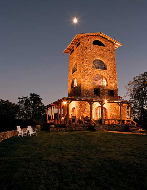
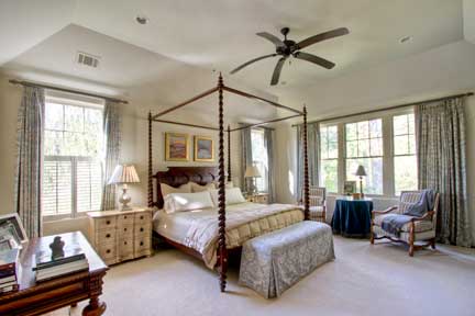
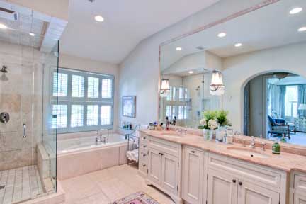
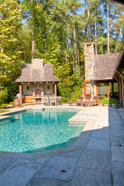
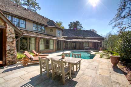
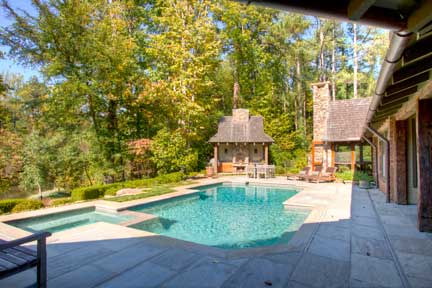
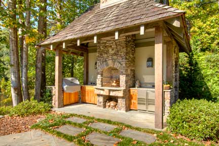
Before I left for vacation I shot Glennis Beacham's beautiful new listing at  285 Valley Road.  Rod Collins went back a few days later and got some amazing night shots.  I wanted to share the photos with you. 285 Valley Road  060

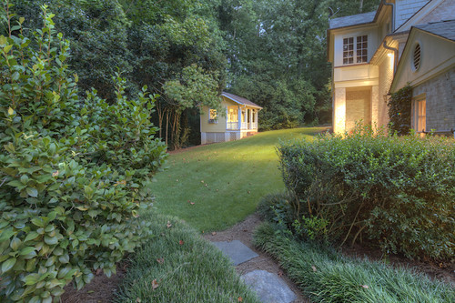
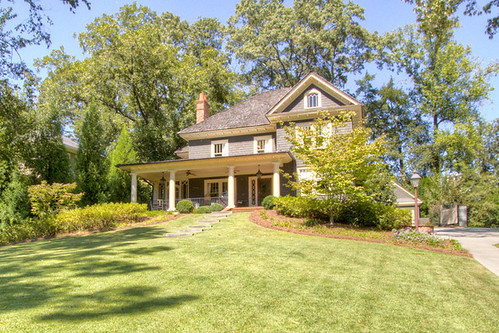
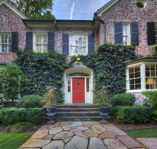
The approach to this Frazire and Bodin house is breathtaking.

285 Valley Road  005

The home was built in 1934 but totally renovated/updated by Spitzmiller and Norris in 2000. I love the look of ivy growing on a house.  It's such a classic Atlanta look.

285 Valley Road02

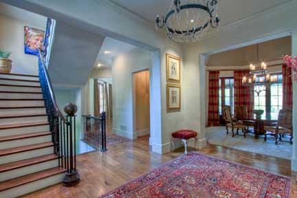
I loved the foyer as soon as I saw it.  A curved staircase gets me every time!

285 Valley Road06

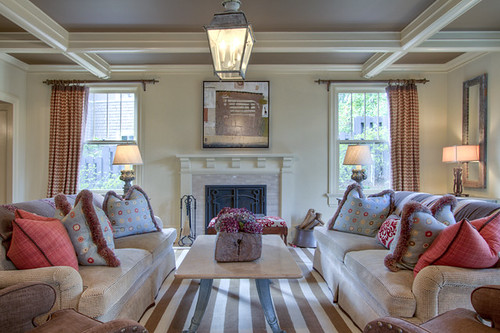
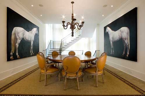
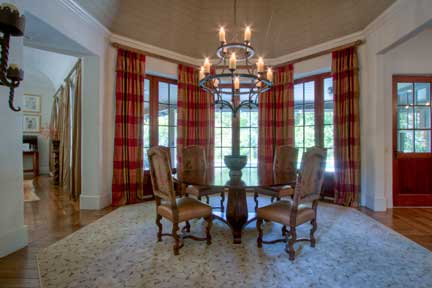
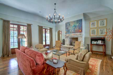
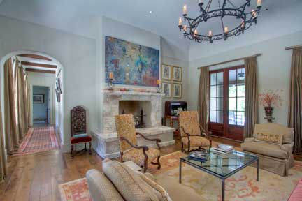
285 Valley Road11The formal living room and dining room are perfect, and they both have that "old Atlanta" look.

285 Valley Road20

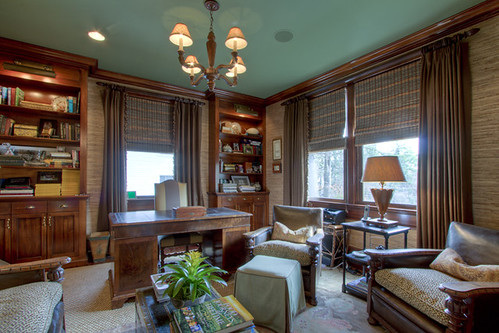
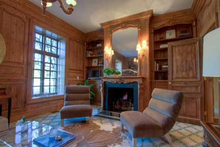
This is my favorite room in the house.  It's a study with a fireplace off the master where you can curl up with a good book.285 Valley Road59
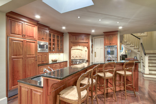
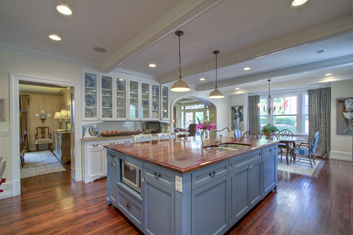
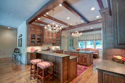
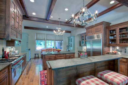
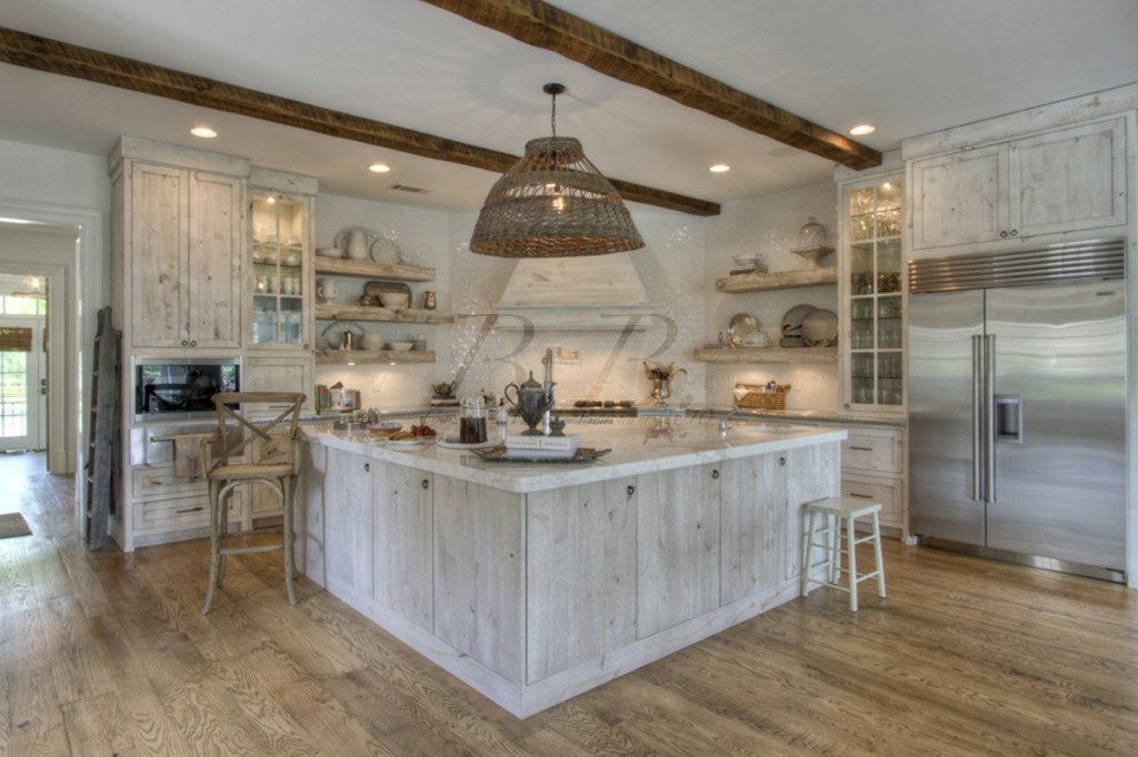
The chef's kitchen has an office and looks out over the family room.285 Valley Road63
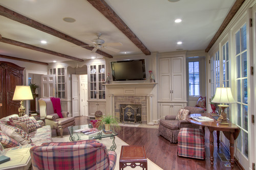
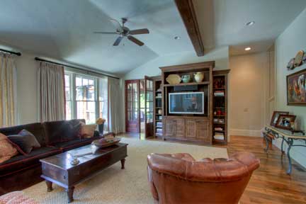
This warm family room with beams and a fireplace opens to an exquisite screened porch overlooking the pool.285 Valley Road72

Here it is!285 Valley Road40

The wine cellar has the coolest ceiling.  I could spend some time in there for sure.285 Valley Road35
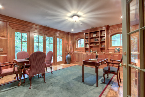
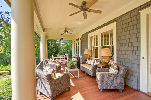
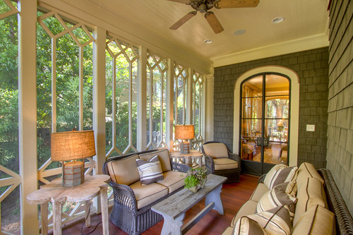
This is my other favorite room, a cool office on the terrace level.  I would never go to work again.  I'd just be writing this blog from my own personal in-home office.285 Valley Road  053I'm loving this night shot.  It really shows off the porch.
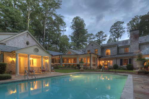
285 Valley Road  055

And we end with the darling play house. How cute is that?  I want it!

There is also a three car garage with a full apartment above it.

For more information on this listing please go to beacham.com.

In other news I started a new diet on Monday... gag.  I don't really like dieting.  About 2.5 years ago I went on a major diet/lifestyle change to shed leftover college weight.  I am not the most athletic person... and by that I mean carrying in my groceries and putting them away sometimes exhausts me, but I started doing bootcamp.  I got a "stress fracture" (questionable) within the first two weeks and decided to stop.  Determined to lose the weight, I started swimming at the Piedmont Hospital Gym.  With regular swimming and changing a few things I ate, the weight slowly came off of me.  After about 8 months I lost 20 pounds.  That's great, right?  Well, it is except that my goal was to lose 25 pounds for regular life and 30 pounds for my wedding day.  (Yes, I was thinking about my wedding day 2.5 years ago.  I've probably thought about it every day since I was like 18.  Pathetic?  Probably, but it's true.)  So, after I lost 20 pounds I accepted that it was about all I was going to lose and decided to stop dieting and enjoy life.  That's when I met Jimmy.  Throughout our relationship I've managed to basically maintain the same weight, which I'm pretty proud of to be honest. :)

Screen Shot 2012-08-24 at 3.17.10 PM

Now that the threat of walking down the aisle and having people stare at my back (not my favorite feature) is real, I've decided to kick it into high gear and lose those last few pesky pounds (I'll be honest, two weeks of sipping frozen drinks on vacation didn't really help).  While I was shooting a house on Monday someone mentioned the Dukan Diet to me.

I remembered hearing about this when Kate Middleton got married.

Screen Shot 2012-08-24 at 3.46.12 PM

And if it works for her it could obviously work for me... right? (fingers crossed).

So I decided to give it a try.  Click on this link to read Cosmo's summary of the diet.  Basically you eat just protein for a few days and then eat protein and green vegetable for a little while until you reach your goal weight.  Easy right?

I started on Tuesday and I've already lost 3.4 pounds!  It's like magic!  I'm pretty pleased with the results, except that it makes me feel a little light headed and makes my muscles ache a little bit. (Alarming?  Possibly.)

Yesterday was my first day eating vegetables, so I celebrated with a nice stir fry.

You can also eat oat bran pancakes.  I know they may sound gross, but believe me, after two days of eating straight meat they tast like the absolute best things in the world.  Ask Jimmy.  I think I sighed a little when I tasted them for the first time.  It was like cornbread right off the griddle.

I was really impressed with the meal and think I could probably stay on the diet for a little while.  So have a great weekend enjoying your beers and your french fries...  I'll be dieting.

Who am I kidding... I'm trying a gluten free beer right after work ;).

Love you guys!  See you next week!

To become a fan of this blog on Facebook, click here.

To receive this blog by email, click here.

To follow me on twitter click here.
To follow me on Pinterest click here. 

To follow me on Tumblr click here.

I caught the bouquet + Cates Ridge

First up...

Screen Shot 2012-05-09 at 3.12.23 PM

If you haven't already ordered your copy of Historical Concepts' new book, "Coming Home: a southern vernacular," then you need to... now.  The book is beautiful... plus I took some of the pictures... so go get one already.  If you are feeling lucky, you can WIN a SIGNED copy of the book.  How?

Go to the Beacham & Company Facebook Page and check out our album of listings.  All you have to do is like or comment on a photo, and you will be entered to win a signed copy!  The agent who's listing gets the most likes or comments also wins a copy of the book.  How easy is that?

Good luck!

Screen Shot 2012-05-09 at 3.22.16 PM

In other news... Beacham & Company got 15 new listings last week!  We also got 21 homes under contract.  It's safe to say the market is officially hot!  If you are interested in hearing the specifics of the Atlanta Real Estate market, please check out the latest issue of "The Beacham Insider."  It is packed full of the latest statistics and market information, so take a look.

All those new listings means I have been VERY BUSY.  Can you imagine?  15 new listings in one week.  They don't photograph themselves!  Thank goodness my uncle photographs half the houses, or I wouldn't be able to sleep!

Screen Shot 2012-05-09 at 3.07.37 PM

One of my favorite houses I've photographed recently is Troy Stowe's listing on Cate's Ridge.  (Clearly I did not take this PARTICULAR photograph.  I don't own a plane.  Duh.)

Screen Shot 2012-05-09 at 3.35.31 PM

Screen Shot 2012-05-09 at 3.06.02 PM

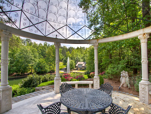
This property has one main house and THREE additional houses... plus a lake... with fish in it!  That little house in the distance there is the guest house!  The guest house is basically my dream house.

Screen Shot 2012-05-09 at 3.06.39 PM

See?  How cute is that?

Screen Shot 2012-05-09 at 3.06.17 PM

You also get this amazing view...

Screen Shot 2012-05-09 at 3.06.31 PM

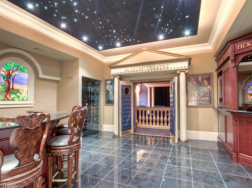
and you can go the the movies whenever you want, in your own home!

Next?

Screen Shot 2012-05-09 at 4.53.20 PM

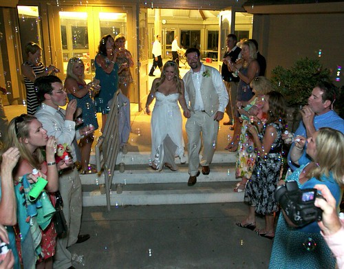
I got a new family member this weekend!  My cousin Beau married Elizabeth, and my family is so happy!  It was a beautiful wedding in Hilton Head.  I just love family events, and this one was no different.  It's so nice when we can all get together.

One funny thing from the weekend... I caught the bouquet.

Screen Shot 2012-05-09 at 3.11.21 PM

It was sort of by accident.  FOR REAL.  See those two girls in front of me?  The bouquet bounced off their hands and was flying in the air.  THIS IS NOT A JOKE.  I thought to myself, "the flowers are too pretty to hit the ground!"  So then I sort of lept for them in a very awkward/unladylike way, and BOOM.  I got the bouquet.

Believe it or not.

Screen Shot 2012-05-09 at 4.52.17 PM

It was my very first time catching a bouquet, and I was THRILLED.

Screen Shot 2012-05-09 at 3.11.50 PM

On the other hand, Jimmy looked terrified.

That's all I've got for now.  See ya!

P.S. Enter my contest by choosing your favorite listing!  Please.  I asked nicely.

P.P.S.

Charlotte's the cutest dog in the entire world.

To become a fan of this blog on Facebook, click here.

To receive this blog by email, click here.

To follow me on twitter click here.

To follow me on Pinterest click here. 

To follow me on Tumblr click here.

"Beacham Series" Party Tomorrow Night + Catch Up!

I'm sorry ok.  I know I have been gone forever.  If it makes you feel any better, the latest issue of "The Beacham Series" is finished!  Thank God.  It is a massive amount of work for three people to do... but Laura and Rod and I managed to finish it up and are convinced it is "the best one ever" (quoting Glennis).  Tomorrow night is "The Beacham Series" party, but before we go into that, lets play a quick game of catch up.  Here's what's happened in the past month...

Glennis and I went to the Leading Real Estate Companies of the World conference in Orlando.  According to beacham.com, Leading Real Estate Companies of the World® (www.LeadingRE.com) is the largest network of top independent local and regional brand-name brokerage firms in the residential sector of real estate. The 550 firms affiliated with Leading Real Estate Companies of the World® are represented by 4,600 offices and 140,000 associates in more than 30 countries worldwide. The organization's leadership is demonstrated by the fact that its affiliates comprise 15 of the top 25 real estate companies in the country. Collectively, LeadingRE affiliates produced nearly 800,000 home sales valued at $225 billion in the U.S. in 2010. In addition, LeadingRE locally-branded affiliates hold the Number One position in sales in 40% of the top 96 markets in the U.S., more than any national franchise organizations. For complete information on LeadingRE statistics, visit http://stats.leadingre.com/.  <--  BIG DEAL. :)

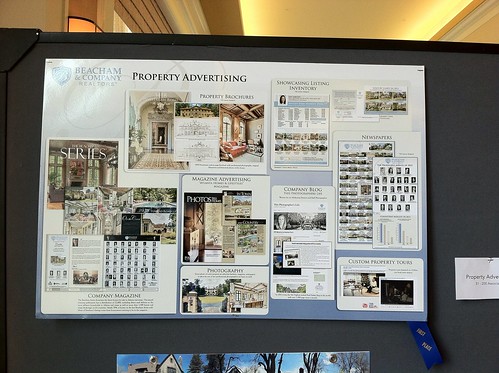
We won first place in the Property Brand Advertising category of the marketing contest!

We also got second place in the "New Media" category...  so many thanks to all of you for reading this blog...  Thank you! Thank you!

Glennis and I worked the whole time, but we took a few minutes to stick our feet in the pool...

and celebrate our wins with a Miami Vice.

Jimmy and Charlotte were very proud of us!

Once we got back I went straight into picking a cover for "The Beacham Series."

Rod and Laura and I went over to Janey Lowe's listing at 94 Peachtree Way and started scouting shots.

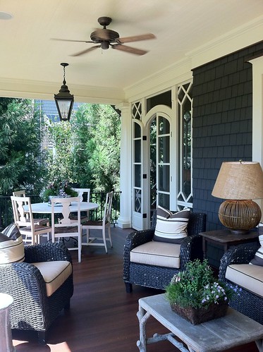
We loved this porch shot...

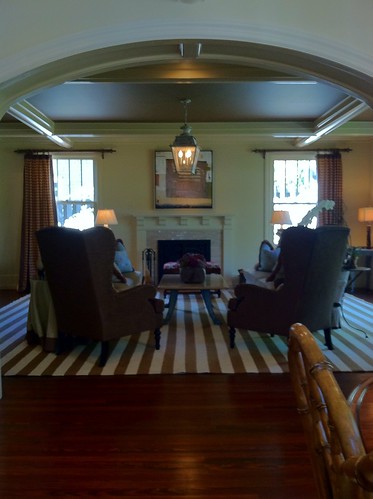
We also loved this picture going into the family room.  Isn't that archway pretty?

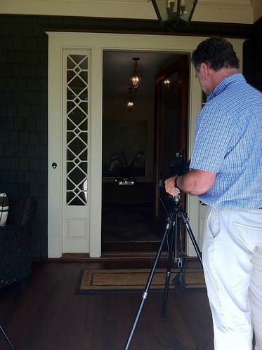
Here is Rod setting up for a shot through the front door.

There I am holding the reflector. :)

After we picked the cover we had to get the ad designed for the WINNER OF THE AD SPACE COMPETITION: Calligraphy by Kristen Flournoy Hay

We were thrilled that she won, and we love her ad, don't you?

Screen Shot 2012-04-18 at 3.43.31 PM

After the ad was ready, we sent the magazine out to Tucker Castleberry to get printed.

That was a cause for celebration at Local Three!

I spent last week at Tucker Castleberry making sure all the colors were right.

The magazine looked amazing...  So I left it in Kent's capable hands and went to Palm Beach with my love to see his family.

P1000783

We had such a nice time, and I came back refreshed and ready for "The Beacham Series" party tomorrow from 5:30 to 8 PM.

House 3

The party is at Janey Lowe's listing on 94 Peachtree Way.  The house is such a treat.  According to Janey's remarks: Stunning to the studs renovation & restoration of this 1900 era home designed by Frank Neely & Davey Construction. Photographed & published nationally. Sweeping front lawn leads to porch with redwood floors. Bright family kitchen with walnut island, highest end appliances, 2 dishwashers, 2 refrigerators, hand-painted custom cabinetry, walk-in pantry, bfast area, all opening to a fireside den. Handsome study w/exquisite hand stained built-ins& brass lighting. Mstr bdrm suite with its own sitting area, dual walk-in-closets, 3 large other bedrooms. Herringbone brick patio & fireplace. 2 car garage w/full guest house.

Here is the amazing news: this house is already under contract!  So, this really is your last chance to see it!

Here are a few photos just to get you in the mood to see an amazing house.

fireplace detail

front door and living room

entryway

Front porch from front steps

Kitchen to breakfast

living room

master bath 4

master Bedroom

Study

side porch (1)

I hope to see you all tomorrow night!  Email me if you have any questions.  [email protected]

Screen Shot 2012-04-18 at 3.26.20 PM

To become a fan of this blog on Facebook, click here.

To receive this blog by email, click here.

To follow me on twitter click here.

To follow me on Pinterest click here. 

To follow me on Tumblr click here.

Keith Summerour, the perfect glass of wine, my NYE dress...

For those of you who have been reading this blog a while, you know I am slightly obsessed with Keith Summerour.

If you are looking for a laugh you can read this post I write about him 2 years ago titles "Keith Summerour: What makes it a Summerour?"  I think it was maybe my 3rd blog post ever.  Cute Blayne.

I somehow got the nerves to interview him a year later about this house.  It was a wildly popular post.  Read it if you like.

People like Keith's houses because it is modern without being too modern.  It's clean and European and just a tad bit equestrian.  I adore his work, and that is true for Glennis Beacham's new listing at 5549 Long Island Drive. It's lovely and everything a Summerour should be.

The home is beautiful from the approach.  I love the arches (back right), which are so characteristically Summerour.

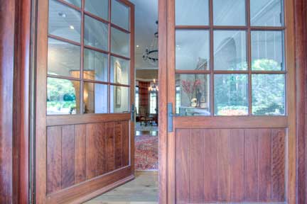
The heavy wooden doors are very wide (like barn doors), which provides a nice entrance to the home.

This foyer is open and welcoming.

Love this dining room with the wood windows and cathedral ceiling.

The best part about the living room is the curved/trey ceiling.  Oh yea, that fireplace is pretty amazing as well.  Oh heck... I love the floors and the arched hallways as well, so it's all great!


What a great kitchen!  There is so much prep space with the center island, and then you can have people eating at the island closest to us in these pictures.  The wood beams on the ceiling tie the kitchen to the rest of the house and echo the floors nicely.

This is the family room right off the kitchen.  You can see how the wood beams are continued in here, and the oversized windows let you look out to the back (we will see that later).

This hallway leads to the master suite, and is so reflective of Summerour's style with the arched doorways, beamed ceilings and wood doors opening to the front porch.

I like the trey ceiling in the master, and all the windows allow for tons of natural light.  That's also a really cool fan that I am just noticing for the first time!

Look at the archway leading to the master bath!  It's interesting how it's open from the bedroom into the bath, but the shower is off to the side, so it's still private.

Let's head outside!


Not to shabby, eh?

Oh yea, this is the approach to the house.  Amazing, right?  It's like something out of a childhood fantasy.  Once again Keith Summerour=Perfection....  duh.

To see the rest of this dream home, click here.


In other news....  (I'll make this quick... I know you only came for the houses!  ha ha.)

1.

My NYE dress came in, and I couldn't be happier!!  If you don't ignore my horribly messy closet behind me I'll die.  I cropped it as tight as I could.   Now I get to wear this $70 dress that looks much more expensive for the Christmas party and New Years!  Shhh.  Don't tell anyone.  Also, sorry for the confusion in the dress post.  I am FOR SURE going to NYC to see Phish at MSG for NYE (wow!).  I have THE BEST boyfriend ever.  He got us 4 nights FREE at the Four Seasons New York and got us tickets to all four nights of Phish.  He is amazing...  I am a very lucky girl with a REALLY cool dress.

2. 

We finally took our Christmas card picture.  This is usually painful because Ben bitches and mom and I always think we look bad.  This year was a breeze!  My uncle, Rod Collins, took the picture.  He's very talented, especially when it comes to people.  Let me know if you would like him to take a picture for you!

3.

I discovered the perfect glass of wine.  Jimmy and I went to Roswell on Saturday and ate at Salt Factory Pub, which Jimmy claims was the best place he's eaten in Georgia... so there.  This glass of wine is called "Knights Valley" by Beringer.  I went to Beringer when I was in Napa a few years ago and and was really impressed.  I have tried a lot of their wine, but this was the best glass I've had by them.... maybe by anyone.  Do yourself a favor and order a case.  Since I don't know how to talk about wine, I am stealing this from The Wine Enthusiast, "an appealing wine showing likable softness and flashy flavors. The palate brings cassis, mocha, licorice, sweet tobacco, sage, Asian spice and smoky oak; finished long and rich. Notable for its superb structure."  See?  Told ya.

Don't say I never gave you anything! Happy Holidays Kid-Os

To become a fan of this blog on Facebook, click here.

To receive this blog by email, click here.

To follow me on twitter click here.

To follow me on Pinterest click here. 

To follow me on Tumblr click here.

Before and After: Tips for Staging Your Home (even during the Holidays)

Fine.  I heard you.  You like houses :) The results of the poll are in, and the results are STAGGERING.  #joke.  Thank you to my sweet friends who read because I force you.  Hey, I do nice things for you, too!

You said that you would like to see more houses, interior design and architecture on this blog.  LESS Blayne, MORE houses!!  Well here you go! :)  (It's ok, I know you still love me.)

Nan Haverty, a top agent with Beacham & Company, has 3224 Paces Bend Court listed (Architect: Norman Askins).  I shot this home a few months ago when it was empty.  It has a great shell... or what agents call, "great bones," but it was hard to imagine what it would look like with someone living there.  The interiors feel really Country French to me.  The entry way is imported tile and the wood throughout the home is also imported.  Nan asked her friend/client Barbara Culbreath, who is world renowned designer and antique dealer, to stage the home.  Barbara used modern/artistic/handsome furniture and art.  It creates an amazing juxtaposition to the traditional interiors.

-Study-

Here is the library/study the first time I shot it.  It looks so big and empty, and the chairs are dwarfed by the ceiling height and space in the center of the room.

Here it is now.  Can you believe the difference?  The rug is the same, but she laid down an animal skin rug on top of it to break it up a bit.  I love the sofa moved to the center of the room.  It feels so much more cozy.  The bookshelves were arranged and the large armoir moved.  The acrylic table seemed to disappear in the room before, but now it adds a cool contemporary feel to the warm furnishings.  It also looks as if sconces were added above the fireplace, which brings in a lot of warm light.

-Dining Room-

Here we have the dining room when I first saw it.  There are the imported tile floors I was telling you about.  I really like them, but maybe some people would have a hard time imagining what a dining room could look like with brick/tile floors.

Here it is now.  It looks so much better.  The large scale of the artwork is perfect.  I also really like the round table in the square room.  It breaks it up and makes it feel livable.  I'm also glad she moved the fireplace screen... I don't know why.  I just am.  I don't have anything against fireplace screens or anything... who knows.

-Living Room-

Here is the before living room.

Here is an overview of what it looks like now.  Things to notice: that rockin' table in the middle of the room serves to break the room into two halves, and the herringbone pattern floor is visible now that the rug was lifted.

Love... especially that flying dragon piece of art in front of the window.

That's a great piece of art.  Note: when staging a house or trying to make it feel more "finished,"  ORCHIDS ARE A MUST.  Tattoo that to your forearm if you like, but don't forget it.  Very important.  Hydrangeas also help.

-Kitchen-

The first thing I notice about this before picture is the wallpaper.  While, yes, wallpaper is coming back in style, this type of wallpaper is not.  It's all I can look at.  Very Dorothy from the Wizard of OZ.  Don't act like you son't know what I'm talking about.

Check it out!  No wallpaper.  See what painting your home neutral can do.  I think that's the number one piece of advice agents give clients when asked what people can do to get their house ready for the market.  Paint your house neutral!  See what a difference it makes?

-Breakfast/Family Room-

Here is is.  Again...  wallpaper is really all I can see... well, wallpaper and that AWESOME fireplace!

And here you go.  How much better does this look?  Neutral walls?  Check.  Great art?  Check.  The circular table helps also.   The white table cloth does a lot to soften the space.   She also ditched the tv on the stand, which is always a plus.  Have a tv?  We all do.  Want to sell your house?  Hide it.

Here is a close up of the Family room.  I just adore this space.  That sofa is incredible.  I've never really thought of not having arms on a sofa, but this one doesn't have them and I like it!  Also, the architectural qualities of that fireplace are superb.  I love that they went with white and not brick.  Brick would have been too heavy.

-Master-

The master bedroom is my favorite transformation in the house.  Here is the before shot.  You know, a ton of people have two beds in the master bedroom.  It is much more common than you would think.  Even though I see it all the time I am still a little shocked every time I encounter a two-beded master.  It's just not what I think of when I think "Master Bedroom."  If you are a two-beded (that joke was so good I threw it in again) master person I want to say to you, "you are not alone," but for the sake of selling your home you may want to go for just one bed. It's more relatable.

Doesn't that look better?  I can imagine living in that room even though the painted ceiling and curtains are not my favorite things in the world.  Just by adding a contemporary bed I can visualize myself there.  Can't you?

To see the rest of this house, please view Nan Haverty's listing.

In case any of you are looking for an last minute gift ideas for me, STOP.  You don't have to look any further.  I want these.  Free People strikes again.  #ugh. Why do I love everything they make??

Speaking of Christmas (see the segue there)...

I was quoted in THIS article int the AJC Homefinder about how to decorate for Christmas when your home is on the market.  Do me a favor and read it.  PLEASE.  Those of you who are my friends, I'm not forcing you, I'm just strongly suggesting.

Deck the Halls Y'all(s).

To become a fan of this blog on Facebook, click here.

To receive this blog by email, click here.

To follow me on twitter click here.
To follow me on Pinterest click here. 

To follow me on Tumblr click here.

"Sit and feast on your life." Part 1

Love the beach?  Well I've got just the thing for you!

Front&nbsp;

Front 

I got to see the most amazing house last week!  Kim Foley, one of our new agents at Beacham & Company, just listed this beautiful home in Roswell, GA.  And here's the best part... the owner reads my blog!  I get so excited when I meet people who read it. :)  It's so flattering!  Well, since she is a reader and since the house is so beautiful, I was thrilled that they asked me to  take pictures.

Foyer into Living Room

The homeowner is so talented!  She did the whole home herself.  When she and her husband bought the house it was not finished, so she really picked all the finishings and interiors!  The light wood and natural elements everywhere reminded me of the beach.  When I asked her about it she said she and her husband love the beach, and it definitely comes through in the home.

I knew the house was special the moment I walked into the door.  The light wood floors were so refreshing.  I have said this before, but I am getting a little bit tired of dark wood.  There is something so refreshing and earthy feeling about light wood.  According to Laura Green of L. Green Studios (who did not design this home), "light floors  brighten and really open up a space, push the walls out and redefine the space."

Study
Study

This beautiful study is to the left of the front door.  I love the natural feel of the antler chandelier!  The dark furniture really pops agains the light floors.

mantel detail
mantel detail

I love this detail!  I was really intrigued my the beaded star on the table.  It looks like a very elegant starfish :)

Dining room
Dining room

Here is the dining room, which is on the opposite side of the foyer.  I was intrigued by those burlap shades over the bottom halves of the windows.  It's brilliant really....  nobody can see inside, but lights still gets through the shades.  To continue with our beach theme, the chandelier looks like driftwood and the wreath looks like a sea sponge :)  It's all so organic.

Stairs into living room

This is the main hallway.  Isn't that stairway beautiful?

Foyer and carved wall

Here is a different angle.  I love that painting...  it looks like the shore after a wave.

art and sofa
art and sofa

See?

Living room 2
Living room 2

I was amazed by the painted fireplace.  I am not sure I have ever seen anything quite like it.  It just blends right into the wall, but has the most beautiful texture.

Living room
Living room

Here it is from the other side.  Don't forget to look at the table!  It's worth it :)
Kitchen
Kitchen

And here we are in the kitchen.  Breathtaking, isn't it?  I am obsessed with the light fixture and the cabinets!
Kitchen shelves
Kitchen shelves

I took this detail to show you the shelves, tile and countertops.  This is one of the most unique combination of elements I have seen in a while.  It all comes together so perfectly.

kitchen detail (1)
kitchen detail (1)

This is the vista from the kitchen back into the living room.  !!!???!!!, right?

kitchen detail
kitchen detail

This pillow just hangs out in the kitchen... :)  It says, "Sit and feast on your life."  Isn't that a peaceful idea?  The homeowner told me that's what she kept saying when she was creating this home.  She wanted it to be a haven where she could sit with her family and enjoy their life together.  I think she achieved that.  Don't you?

There are too many wonderful pictures of this home for me to put them all into one post.  Please check back tomorrow to see... among other things...the master bedroom, bathroom, and closet that would give Carrie Bradshaw a run for her money.

Until then I want to ask you, where do you "sit and feast on your life?"  Is it an actual place for you, or simply a place in your mind?

For me it is my bedroom...  

Yes... this is my personal bedroom.  Every morning I like to spend the first few minutes after I wake up looking around and relaxing.  I try to clear my mind and think about all the wonderful blessings before me... my family, my friends, and a job and home that I love.  I spend just a few minutes feasting on my life.  Then I get my butt out of bed and go to the gym.  Duh.

Gallery Block
This is an example. To display your Instagram posts, double-click here to add an account or select an existing connected account. Learn more