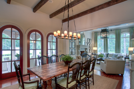
"Beacham Series" Party Tomorrow Night + Catch Up!

I'm sorry ok.  I know I have been gone forever.  If it makes you feel any better, the latest issue of "The Beacham Series" is finished!  Thank God.  It is a massive amount of work for three people to do... but Laura and Rod and I managed to finish it up and are convinced it is "the best one ever" (quoting Glennis).  Tomorrow night is "The Beacham Series" party, but before we go into that, lets play a quick game of catch up.  Here's what's happened in the past month...

Glennis and I went to the Leading Real Estate Companies of the World conference in Orlando.  According to beacham.com, Leading Real Estate Companies of the World® (www.LeadingRE.com) is the largest network of top independent local and regional brand-name brokerage firms in the residential sector of real estate. The 550 firms affiliated with Leading Real Estate Companies of the World® are represented by 4,600 offices and 140,000 associates in more than 30 countries worldwide. The organization's leadership is demonstrated by the fact that its affiliates comprise 15 of the top 25 real estate companies in the country. Collectively, LeadingRE affiliates produced nearly 800,000 home sales valued at $225 billion in the U.S. in 2010. In addition, LeadingRE locally-branded affiliates hold the Number One position in sales in 40% of the top 96 markets in the U.S., more than any national franchise organizations. For complete information on LeadingRE statistics, visit http://stats.leadingre.com/.  <--  BIG DEAL. :)
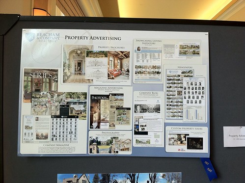
We won first place in the Property Brand Advertising category of the marketing contest!

We also got second place in the "New Media" category...  so many thanks to all of you for reading this blog...  Thank you! Thank you!

Glennis and I worked the whole time, but we took a few minutes to stick our feet in the pool...

and celebrate our wins with a Miami Vice.

Jimmy and Charlotte were very proud of us!

Once we got back I went straight into picking a cover for "The Beacham Series."

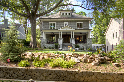
Rod and Laura and I went over to Janey Lowe's listing at 94 Peachtree Way and started scouting shots.
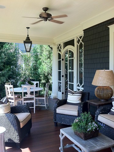
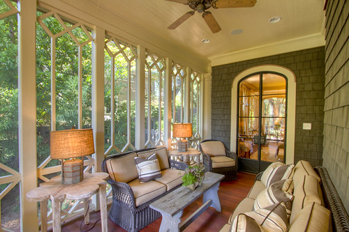
We loved this porch shot...
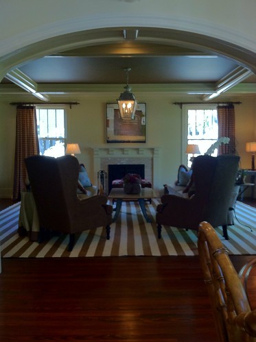
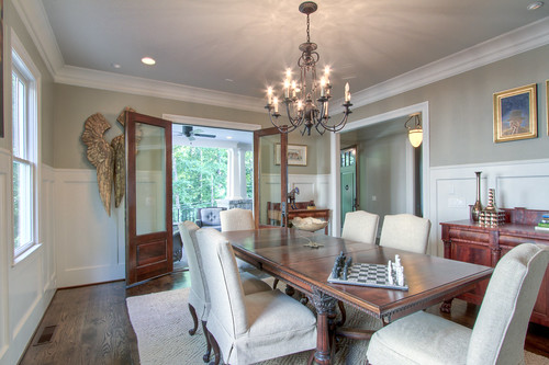
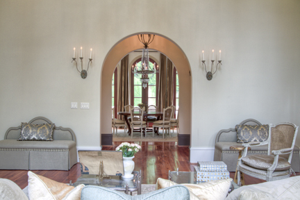
We also loved this picture going into the family room.  Isn't that archway pretty?
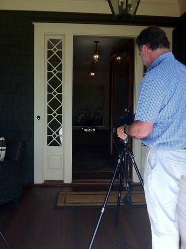
Here is Rod setting up for a shot through the front door.
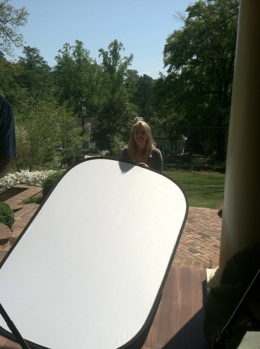
There I am holding the reflector. :)

After we picked the cover we had to get the ad designed for the WINNER OF THE AD SPACE COMPETITION: Calligraphy by Kristen Flournoy Hay

We were thrilled that she won, and we love her ad, don't you?

Screen Shot 2012-04-18 at 3.43.31 PM

After the ad was ready, we sent the magazine out to Tucker Castleberry to get printed.

That was a cause for celebration at Local Three!

I spent last week at Tucker Castleberry making sure all the colors were right.
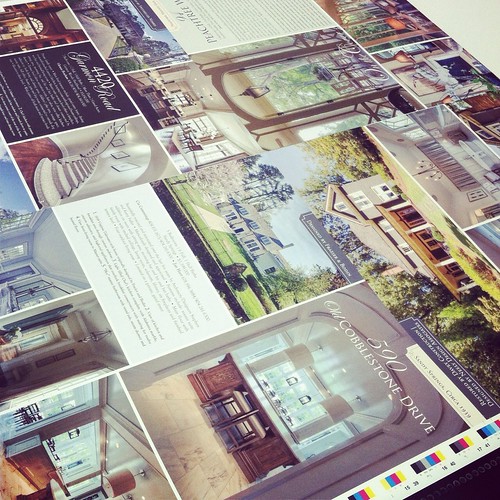
The magazine looked amazing...  So I left it in Kent's capable hands and went to Palm Beach with my love to see his family.

P1000783

We had such a nice time, and I came back refreshed and ready for "The Beacham Series" party tomorrow from 5:30 to 8 PM.
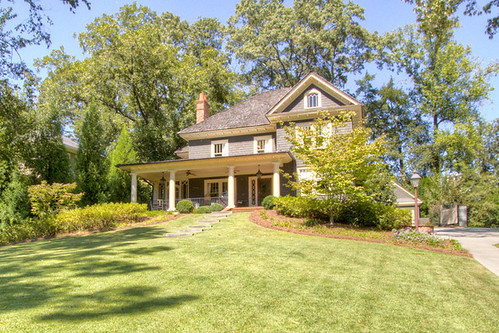
House 3

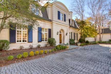
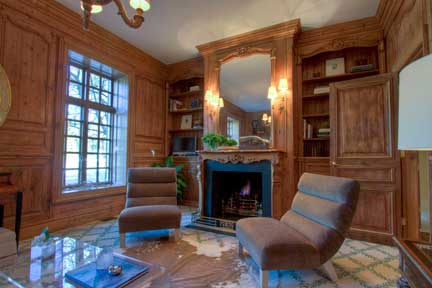
The party is at Janey Lowe's listing on 94 Peachtree Way.  The house is such a treat.  According to Janey's remarks: Stunning to the studs renovation & restoration of this 1900 era home designed by Frank Neely & Davey Construction. Photographed & published nationally. Sweeping front lawn leads to porch with redwood floors. Bright family kitchen with walnut island, highest end appliances, 2 dishwashers, 2 refrigerators, hand-painted custom cabinetry, walk-in pantry, bfast area, all opening to a fireside den. Handsome study w/exquisite hand stained built-ins& brass lighting. Mstr bdrm suite with its own sitting area, dual walk-in-closets, 3 large other bedrooms. Herringbone brick patio & fireplace. 2 car garage w/full guest house.

Here is the amazing news: this house is already under contract!  So, this really is your last chance to see it!

Here are a few photos just to get you in the mood to see an amazing house.

fireplace detail

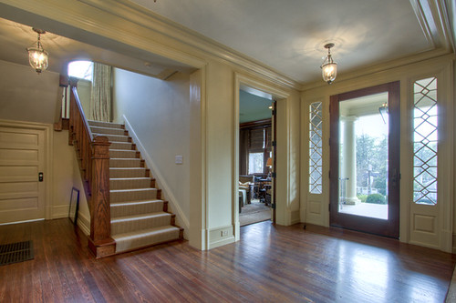
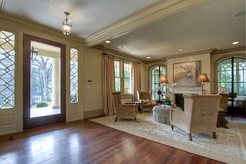
front door and living room

entryway

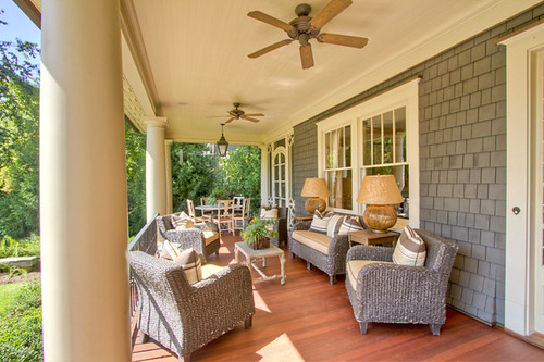
Front porch from front steps

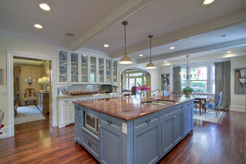
Kitchen to breakfast

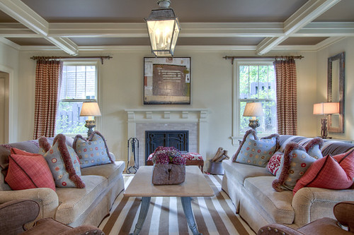
living room

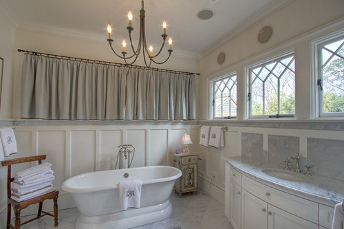
master bath 4

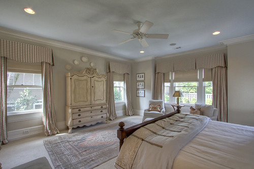
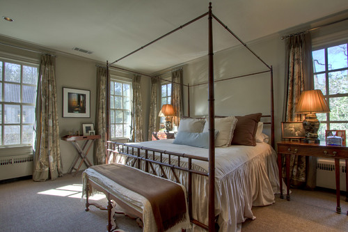
master Bedroom

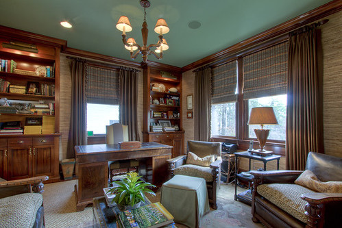
Study

side porch (1)

I hope to see you all tomorrow night!  Email me if you have any questions.  [email protected]

Screen Shot 2012-04-18 at 3.26.20 PM

To become a fan of this blog on Facebook, click here.

To receive this blog by email, click here.

To follow me on twitter click here.
To follow me on Pinterest click here. 

To follow me on Tumblr click here.

That Dog is Such a Ham. Aren't We All?

Hey kids.  Did you all have a nice weekend?  I sure did.  I went down to spend time with my cousins in Warner Robbins.  I always feel better after a little family time. Yesterday my good friend Katie Oblinger did a photo shoot with Jimmy and me.  She is an amazing baby photographer and trying to get into couples photography.  She asked if we would mind being her "test couple."  Turns out Jimmy and I are really Hammy with the camera.

So Hammy that I forced Katie to iPhone picture me a picture from her camera.  I am sooo excited.  A lot of times when I take pictures for people and they ask me over and over when they will be ready I'm like, "just give me a little time."  Well, now I AM one of those people!  I am just sitting around twirling hair waiting to see those pictures!  Ha Ha.

While I am twirling I thought I would show you some pictures from the home of another ham...  this puppy!

foyer

705 Norfleet, NW (Listed by Rachel Farmer) is home to one of the cutest dogs ever... and the fact that he loves being in pictures makes him even cuter.

Front 5

Rachel asked me to come take photos of this beautiful newer (2008) home located in the sought-after neighborhood of Springlake.  I was immediately drawn to the large front porch across the front of the home.  I was also drawn to the little dog hanging out on the front porch.  Can you see him?  It's the little white spot right at the bottom of the front door.

Dining room 2

This dining room opens right out on the the front porch.  It would be perfect for the type of weather we are having right now in Atlanta!

Office with doors closed

This living room/office also opens to the front porch.  The wall on the right pops out and reveals a work space behind them.  It is such a great idea!

to front door

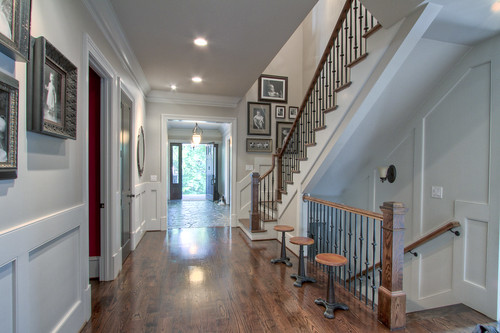
There's my little friend again hanging out by the front door.  Don't you love that stairway?  The railings are beautiful!  I also like those stools a lot.

Kitchen

The kitchen in this home is amazing.  Those glass cabinets on the right are so cool.  I'm not sure I've seen any like them.  Check out the red knobs on the stove.  What a fun pop of color!

Family Room

This family room is located right off the kitchen... and guess what's to the right?

back patio 2

This beautiful porch!  Is that perfection or what?  I know where I would be spending all my time!

Master bedroom

The master also opens up to it's own private porch.  Can you have too many porches?  In a word, no.

Porch off of master

Here we are on the master porch.  Since you all know how much I enjoy a glass of wine... wouldn't this be a perfect place for one?  I thought so!

To see more of this home, including the beautifully finished terrace level, check out the listing here.

See you guys later... I will be trying to find other ways to occupy my time while I wait for those pictures!!

To become a fan of this blog on Facebook, click here.

To receive this blog by email, click here.

To follow me on twitter click here.
To follow me on Pinterest click here. 

To follow me on Tumblr click here.

Photographer Angela West's Personal Home: Before and After

Front

Famed photographer Angela West and her husband were the buyers.  Angela and her husband have decided to sell the home, and they listed it with Glennis once again.  I went to shoot the home last week!  I was so excited.  I have always loved this house....

Angela West got a BA from UGA and an MFA from Yale.  I've seen a lot of her pieces at Jackson Fine Art.

Screen Shot 2012-01-17 at 2.48.51 PM

Screen Shot 2012-01-17 at 2.48.51 PM

Since my main two loves are photography and houses, I was so excited to see the changes she had made to the home.  How did her skills as a photographer influence the choices she made in the house?  Lucky for you guys I have the before pictures (I know, I spoil you), so you can see for yourselves how skilled Angela is not only at photography, but also at transforming a home!  Before the home was done very traditionally.  I loved it then, but I am really enjoying Angela's modern approach to the home.

3198Habkit

Here is the kitchen before..

kitchen

And here is is now.  I never get tired of seeing how fresh paint can change a room.  I love the bare walls and that simple green vase on top of the cabinets.

Breakfast Area

The before breakfast area...

breakfast v

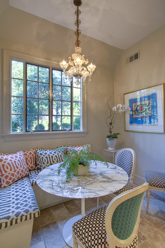
I love the paint color and new pillows.  Did you see the chairs?  The different fabrics on the front and back are really cool.  The table is perfect as well.  It's much lighter.

DiningRoom

Here is the dining room before.  It's very Traditional with the Oriental rug and furniture.

Dining room 2

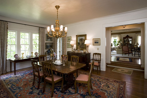
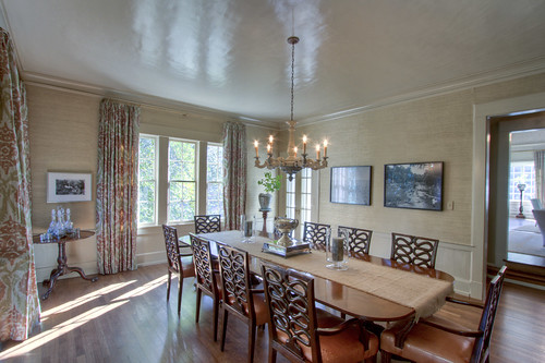
Here it is now.  Obvious changes: wallpaper, curtains, chandelier, larger table, rug removal, de-cluttering.  I am usually a fan of rugs, but these hardwoods are so beautiful I am glad we can see them.  I believe Angela and her husband had all the floors refinished.

Dining Room

Here is another view of the dining room where you can see Angela's beautiful photograph on the back wall!

3198HabLR

The living room is where you can see the biggest difference.  Here is the before picture.  I remember being amazed with how large this room was the first time I shot the house.

Here is an additional before picture form the other direction.

Hab 1

Ready to see it now?

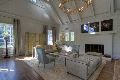
Living room 2

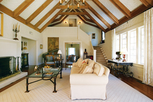
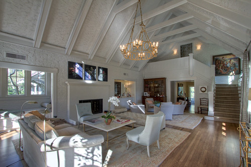
Doesn't that look great?  I love the style of this room now, and the painted beams almost seem to disappear.  The room is light and airy.  They added custom fireplace screens and a built-in bar in the second enclave.  Also, isn't that chandelier beautiful?

Living detail

I wanted you to see Angela's photography above the fireplace.  Those are the same pieces highlighted above on the Jackson Fine Art website.

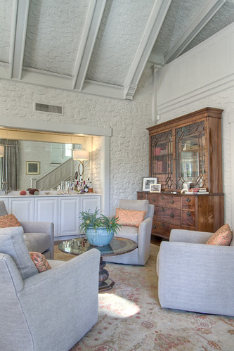
living room sitting area

Here is a better view of the bar they added.

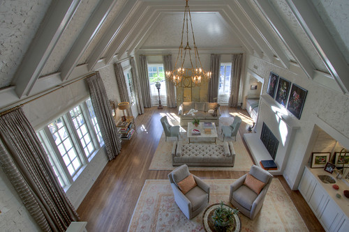
Looking down into living room

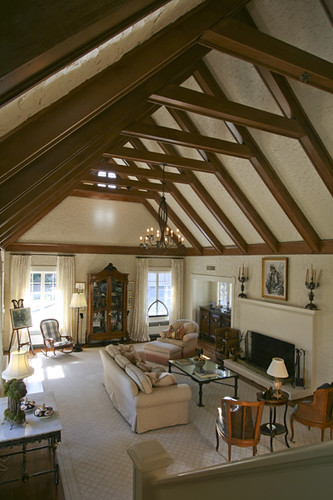
And I include this overview so you can see how large the room really is, and how functional the room is with this furniture layout.  Didn't she do a great job?

To see more of the amazing rooms in the house, including these...

library 2
half bath
master 2

... and to see the gardens...

back garden

... and the guest house...

Guest house main room

Before and After: Tips for Staging Your Home (even during the Holidays)

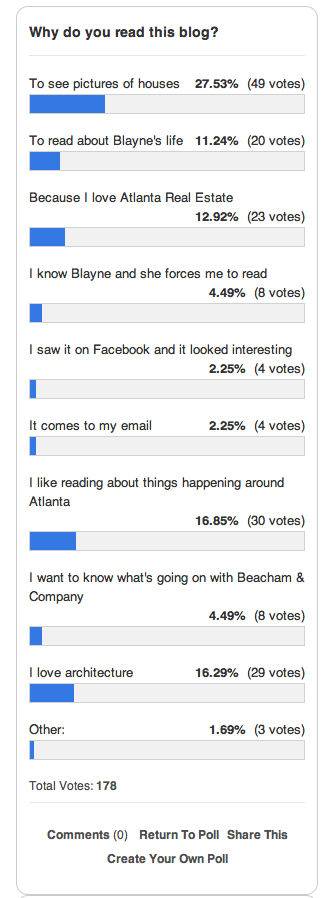
Fine.  I heard you.  You like houses :) The results of the poll are in, and the results are STAGGERING.  #joke.  Thank you to my sweet friends who read because I force you.  Hey, I do nice things for you, too!

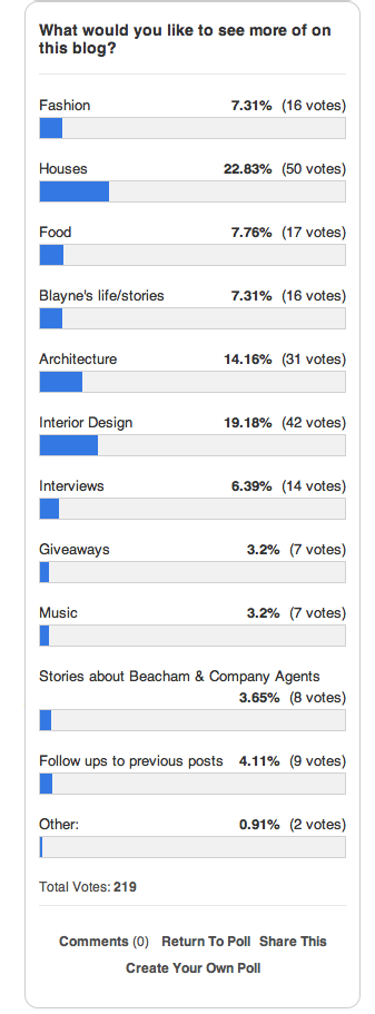
You said that you would like to see more houses, interior design and architecture on this blog.  LESS Blayne, MORE houses!!  Well here you go! :)  (It's ok, I know you still love me.)

Nan Haverty, a top agent with Beacham & Company, has 3224 Paces Bend Court listed (Architect: Norman Askins).  I shot this home a few months ago when it was empty.  It has a great shell... or what agents call, "great bones," but it was hard to imagine what it would look like with someone living there.  The interiors feel really Country French to me.  The entry way is imported tile and the wood throughout the home is also imported.  Nan asked her friend/client Barbara Culbreath, who is world renowned designer and antique dealer, to stage the home.  Barbara used modern/artistic/handsome furniture and art.  It creates an amazing juxtaposition to the traditional interiors.

-Study-

Here is the library/study the first time I shot it.  It looks so big and empty, and the chairs are dwarfed by the ceiling height and space in the center of the room.

Here it is now.  Can you believe the difference?  The rug is the same, but she laid down an animal skin rug on top of it to break it up a bit.  I love the sofa moved to the center of the room.  It feels so much more cozy.  The bookshelves were arranged and the large armoir moved.  The acrylic table seemed to disappear in the room before, but now it adds a cool contemporary feel to the warm furnishings.  It also looks as if sconces were added above the fireplace, which brings in a lot of warm light.

-Dining Room-

Here we have the dining room when I first saw it.  There are the imported tile floors I was telling you about.  I really like them, but maybe some people would have a hard time imagining what a dining room could look like with brick/tile floors.

Here it is now.  It looks so much better.  The large scale of the artwork is perfect.  I also really like the round table in the square room.  It breaks it up and makes it feel livable.  I'm also glad she moved the fireplace screen... I don't know why.  I just am.  I don't have anything against fireplace screens or anything... who knows.

-Living Room-

Here is the before living room.

Here is an overview of what it looks like now.  Things to notice: that rockin' table in the middle of the room serves to break the room into two halves, and the herringbone pattern floor is visible now that the rug was lifted.

Love... especially that flying dragon piece of art in front of the window.

That's a great piece of art.  Note: when staging a house or trying to make it feel more "finished,"  ORCHIDS ARE A MUST.  Tattoo that to your forearm if you like, but don't forget it.  Very important.  Hydrangeas also help.

-Kitchen-

The first thing I notice about this before picture is the wallpaper.  While, yes, wallpaper is coming back in style, this type of wallpaper is not.  It's all I can look at.  Very Dorothy from the Wizard of OZ.  Don't act like you son't know what I'm talking about.

Check it out!  No wallpaper.  See what painting your home neutral can do.  I think that's the number one piece of advice agents give clients when asked what people can do to get their house ready for the market.  Paint your house neutral!  See what a difference it makes?

-Breakfast/Family Room-

Here is is.  Again...  wallpaper is really all I can see... well, wallpaper and that AWESOME fireplace!

And here you go.  How much better does this look?  Neutral walls?  Check.  Great art?  Check.  The circular table helps also.   The white table cloth does a lot to soften the space.   She also ditched the tv on the stand, which is always a plus.  Have a tv?  We all do.  Want to sell your house?  Hide it.

Here is a close up of the Family room.  I just adore this space.  That sofa is incredible.  I've never really thought of not having arms on a sofa, but this one doesn't have them and I like it!  Also, the architectural qualities of that fireplace are superb.  I love that they went with white and not brick.  Brick would have been too heavy.

-Master-

The master bedroom is my favorite transformation in the house.  Here is the before shot.  You know, a ton of people have two beds in the master bedroom.  It is much more common than you would think.  Even though I see it all the time I am still a little shocked every time I encounter a two-beded master.  It's just not what I think of when I think "Master Bedroom."  If you are a two-beded (that joke was so good I threw it in again) master person I want to say to you, "you are not alone," but for the sake of selling your home you may want to go for just one bed. It's more relatable.

Doesn't that look better?  I can imagine living in that room even though the painted ceiling and curtains are not my favorite things in the world.  Just by adding a contemporary bed I can visualize myself there.  Can't you?

To see the rest of this house, please view Nan Haverty's listing.

In case any of you are looking for an last minute gift ideas for me, STOP.  You don't have to look any further.  I want these.  Free People strikes again.  #ugh. Why do I love everything they make??

Speaking of Christmas (see the segue there)...

I was quoted in THIS article int the AJC Homefinder about how to decorate for Christmas when your home is on the market.  Do me a favor and read it.  PLEASE.  Those of you who are my friends, I'm not forcing you, I'm just strongly suggesting.

Deck the Halls Y'all(s).

To become a fan of this blog on Facebook, click here.

To receive this blog by email, click here.

To follow me on twitter click here.
To follow me on Pinterest click here. 

To follow me on Tumblr click here.

NEW ART, an update on your favorite house, and a quick favor (please).

Hey kids.  How is your Thursday going?  I for one am ready to kick it into high gear with this Holiday Party thing.  Bring on the egg nog (which I've never actually tasted, but is sounds Christmas-ie).

Love the holiday parties.  Two years ago I wore this dress (detail of dress in above photo) to the Christmas party, and it was glorious. :)  Tonight I am going to my dad's company party and am trying to decide on an outfit...  To see what I choose become a fan of this blog on The Facebook and I'll post a picture tonight.  duh.

I'm thinking I am going to wear this hot little number I got from Urban Outfitters.  I spied it in the window when we were in Chicago and then waited for it to go on sale on the website for like 70% off...  it came Monday.  #cheap.  The only problem is it's a little short and creates a bit of a middrift issue...  so we'll see what happens.  #gametimedecision

Changing the subject...

As a little Christmas present to me, I was hoping you guys would take these two quick polls.  I am trying to reshape the focus of this blog.  I would assume most of you come here to read about houses, but I'm not quite sure.  Recently I have been trying to broden the focus of the blog a little bit and include more community happenings, things about my personal life, and fashion.  I just want a little feedback.  Maybe you love knowing what is going on with me... or maybe you're like, "shut up Blayne and show me more houses."  Who knows?  Oh... that's right.... you do.  Please please take a quick moment to answer these questions so I can taylor the blog to what you want.  Let's be honest, if you guys don't like the content why am I even writing this?  If you have more you would like me to know (please) you can email me at [email protected] or leave me a comment at the bottom or this post.  There is also a place where you can fill out your own answers, and I am always looking for laughs, so feel free to be as funny as you want.  (You can choose multiple answers as well)

[polldaddy poll=5741684]

[polldaddy poll=5741695]

Thanks so much for doing that guys!

Moving right along...

Remember this house?  I wrote about it here in what I called a "Once in a Lifetime Post."  Sold by Linda Williams and Neno Schildgen of Beacham & Company in 2010.  Architecture by Neel Reid and Duane Stone.

Interiors by Margaux Interiors Limited

Best bedroom I've ever seen in any house anywhere....  now that's saying something!

This is the only home in Atlanta I can actually say this blog helped sell.  The owner loved the post I wrote about the house (to read that post click here) that she ended up buying it!  Go This Photographer's Life!!  It was one of my proudest blog moments.

Through the blog I met the new owner of the home.  We became fast friends.  Apparently she is a fan of my art...  yippie!  She is working with Margaret Bosbyshell and Clary Bosbyshell of Margaux Interiors Limited to redesign the interior of the home.  I had the privilege of getting a sneak peak into the new interiors, and they are unbelievable!  According to the homeowner, "Margaret's experience and talent paired with Clary's edge and fashion-forward approach is the one-two punch that is perfect!"I am so excited to see how they improve something I thought was perfect in the first place!!

The new homeowner actually commissioned me to take photographs of her husband's plane.  I am so honored to have some work hanging in MY FAVORITE house in Atlanta!  I am also so honored that Margaret and Clary said it was ok to use my art.  They have amazing taste.

I love commission work.  It's always so interesting to be presented with an idea but allowed to put your own spin on it.  (If you are interested in commissioning your own art from me, please contact me at [email protected])  She took me out to the hanger, showed me the plane, and said I could do whatever I wanted.  Here are the pieces I came up with...

What do you think?  I hope you all have a nice Thursday :)

To become a fan of this blog on Facebook, click here.

To receive this blog by email, click here.

To follow me on twitter click here.
To follow me on Pinterest click here. 
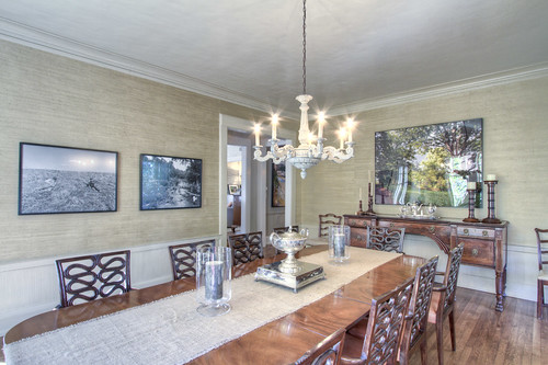
Italian Villa in Buckhead

Jim Warwick and Jo Ellen Bradley  listed this beautiful Italian Villa at 1111 Crest Valley Drive here in Atlanta.

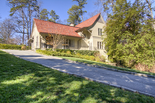
The home is actually turned away from the road, so the view above is the front of the house...

... but this is what you see from the street.

According to beacham.com, "This architectural tour de force was designed by Bill Harrison and influenced by the timeless appeal of a 16th century Palladian villa in Verona, Italy. There are four remarkable finished levels. Wide-plank flooring, soaring groin vault ceilings, five over scale fireplaces, numerous out-door terraces and porches and pool. Formerly the estate of artist Athos Menaboni."

This beautiful fountain is located in the courtyard in front of the home.
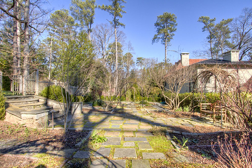
Here is a beautiful archway leading to...
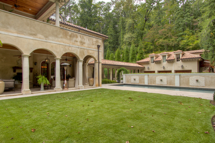
... this area located to the left of the front door at the side of the home.  It is a perfectly flat yard for children to play, and there is also a pool and veranda.  You can see the beautiful portico leading to the guest house.

Here is another view from the pool on the side of the home.  It's all so Italian!  Couldn't you imagine sipping wine out here on a summer afternoon?  The porch above the veranda is located off the master suite, which we will see later.

This is a better view of the back veranda.  Isn't it lovely?

I love this photo because it shows the fireplace.  Wouldn't this be perfect for this time of year?

Here is the view as you walk through the front door.  The curved staircase, the stone floors, and the high ceilings set the "Italian villa" mood.

This is the view from the opposite direction.  Can you see the glass front door?  I love the feel of the heavy wood and the niches on either side of the door.

The central hallway of this home is amazing!  The groin vaulting is so elegant, and the archways allow light in from the front and back of the home.

Here it is from the opposite direction.  Simply beautiful!

The living room has this beautiful 2-story window that overlooks the yard and allows for tremendous natural light.  The fireplace really anchors the room.

This straight on picture gives you a better idea of the scale of the windows.

Here is the view from the window through the hallway and into the dining room.  Isn't the light pretty?

The dining room overlooks the front patio and has those same beautiful wooden doors.

Here is a view looking back toward the foyer.  Be sure to notice the ceilings.

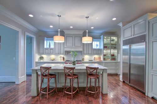
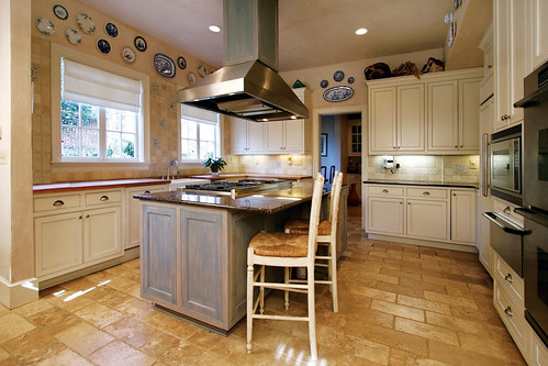
I got so excited about this kitchen!  It's one of the best ones I've seen in a really long time.  The island is huge!  It's perfect for a family gathering.  Don't you love the beamed ceilings?

The view into the breakfast and keeping room.  I just noticed that they used the same wood they used for the cabinets above the kitchen window.  I have never seen this before, have you?

This view of the breakfast room really showcases the three doors that lead out to the back porch.

Isn't this family room unbelievable?  I really like the light fixture and the fact that the curved windows mirror the doors from the above breakfast room.

This study is also located on the main level.  It's through the foyer from the front door.  You can see those three arched windows again.  I love the color of the wood, the coffered ceilings, and the herringbone pattern of the brick in the fireplace.  They all come together to form quite a handsome study!

This is the master, which is located upstairs.  I enjoy seeing hardwood floors in masters.  I recently took the carpet out of my master and replaced it with hardwoods and couldn't be happier.

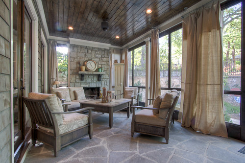
Between the master and the master bath there is this beautiful private porch.  This would be so great at night!

And of course the master bath is beautiful!  I liked the tile in the shower a lot (if you can peek into it).  It looks to me like the cabinets are made from the same material as the ones in the kitchen and the wood in the study.  What do you think?

The coolest part about the upstairs is this secret passageway.  I've only seen a handful of these in real life, and it always makes me so excited.  I'm such a little kid!

The secret passageway leads to this third level loft type area, which is perfect for kids.

The terrace offers this beautiful groin vaulted stone wine cellar...

a kitchen and dining area...

and a huge gym!

What do you guys think? Isn't this home fantastic?  If it were yours, where do you think you would spend most of your time?

It's the perfect Italian getaway here in Atlanta!